
We don’t use utility classes as often as we used to, but they still come in handy on occasion.
One challenge when styling utilities is to provide more value than an inline style without sacrificing versatility.
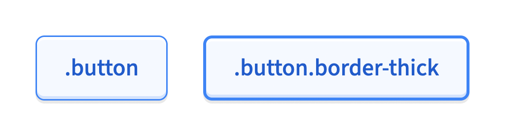
Consider this utility for setting a border size:
.border-thick {
  border-width: var(--size-border-thick);
}
That works great for elements that already have a border style:
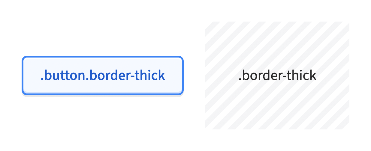
But otherwise, it has no effect. If you wanted to add a border to an otherwise borderless element to offset it from its background, you’re fresh out of luck:
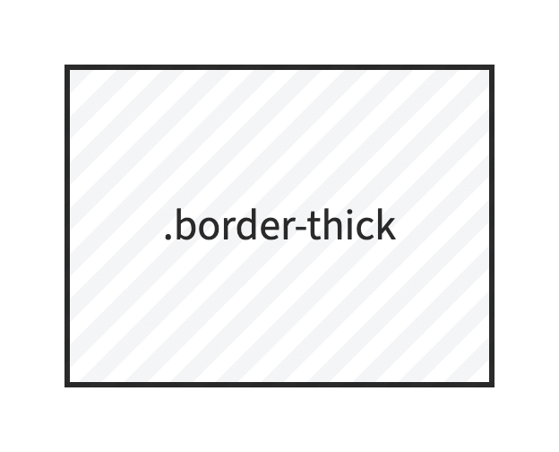
Fair enough, let’s add a border-style as well:
.border-thick {
  border-style: solid;
  border-width: var(--size-border-thick);
}
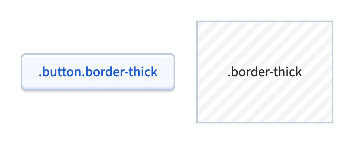
That works, but the border color inherits the text color by default, which feels a little too prominent:
Maybe we should set a default color as well?
.border-thick {
  border-color: var(--color-border-subtle);
  border-style: solid;
  border-width: var(--size-border-thick);
}
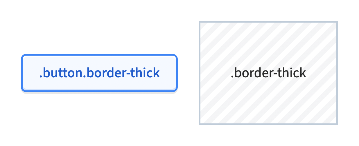
But now we’ve traded one problem for another. Our utility looks great on borderless elements, but look what it’s done to our poor, hapless button:
To make our utility class useful on its own without overreaching, we need to clarify which CSS rules should courageously hold the line (in this case, border-width), and which should roll over and show their belly at the first sign of contention.
Legacy Solutions
Historically, this has been a tough problem to solve.
If you’ve dug into the code of many popular open source frameworks, you might mistake the !default flag for a native CSS feature. But it’s an invention of Sass, the iconic CSS preprocessor. Useful for authoring, but it can’t resolve conflicts in the browser… we must look elsewhere.
We could use Harry Roberts’ class-chaining technique to increase the specificity of certain styles:
.button.button {
  border: var(--size-border-thin) solid var(--color-border-button);
}

.border-thick {
  border-color: var(--color-border-subtle);
}

.border-thick.border-thick {
  border-style: solid;
  border-width: var(--size-border-thick);
}
That works, and it’s useful in a pinch, but it demands a lot of repetition. It would take a lot of diligence to maintain consistent selector chain lengths across a whole project.
We could include our utilities near the beginning of our CSS, and add the !important flag to styles we’d like to act as overrides:
/* utilities first */

.border-thick {
  border-color: var(--color-border-subtle);
  border-style: solid;
  border-width: var(--size-border-thick) !important;
}

/* components later */

.button {
  border: var(--size-border-thin) solid var(--color-border-button);
}
That’s easier to read and write, but it may struggle against the needs of critical CSS or other !important styles.
Reviewing these techniques one after another, I see why many CSS frameworks chose not to bother. It’s a bummer requiring multiple classes for useful results, but that was the simpler option.
Emphasis on was. We’ve got some pretty sweet alternatives today!
Modern Methods
We can move our defaults (the styles we want to chicken out ASAP) to a :where selector. This applies the same rules but with zero specificity:
:where(.border-thick) {
  border-color: var(--color-border-subtle);
  border-style: solid;
}

.border-thick {
  border-width: var(--size-border-thick);
}
Now border-width is applied regardless, but border-color and border-style turn tail at the first sign of trouble:
Hooray! 🎉
Alternatively, we could use a cascade layer. Cascade layers always have lower precedence than un-layered CSS:
@layer {
  .border-thick {
    border-color: var(--color-border-subtle);
    border-style: solid;
  }
}

.border-thick {
  border-width: var(--size-border-thick);
}
But if you plan to do this sort of thing across a whole project, I’d recommend naming your layers ahead of time. You can specify their order of precedence early on in your CSS:
@layer base, component, utility;Now, any styles we add to our base layer will defer to our component layer, which will defer to our utility layer, no matter where those styles are written:
/* components/button.css */

@layer component {
  .button {
    border: var(--size-border-button) solid var(--color-border-button);
    /* other button styles */
  }
}

/* utilities/border.css */

@layer base {
  .border-thick {
    border-color: var(--color-border-subtle);
    border-style: solid;
  }
}

@layer utility {
  .border-thick {
    border-width: var(--size-border-thick);
  }
}
Cascade layers really come in handy for managing style precedence, and this example only scratches the surface. (For a deeper dive, check out Stephanie Eckles’ wonderful introduction for Smashing Magazine.)
Either technique is very well supported. :where achieved baseline support in 2021, cascade layers did the same the following year.
Bonus Tip: More Utilities
If we plan to include more than one border-* utility class, we can expand the first selector to set more defaults and match more classes:
:where([class^='border-'], [class*=' border-']) {
  border-color: var(--color-border-base);
  border-style: solid;
  border-width: 0;
}

/* or */

@layer base {
  [class^='border-'], [class*=' border-'] {
    border-color: var(--color-border-subtle);
    border-style: solid;
    border-width: 0;
  }
}
This attribute selector matches any class beginning with border- (border-thin, border-dots, border-purple, etc.). No need to maintain a big ol’ selector list by hand!
We’re Cloud Four
We solve complex responsive web design and development challenges for ecommerce, healthcare, fashion, B2B, SaaS, and nonprofit organizations.