My buddy Christopher Kirk-Nielsen wanted to mimic the look of a <legend> inside a <fieldset> for a section of a blog post: Specifically, the way the <legend> element magically overlays and partially clips the border of the containing <fieldset>.
Chris posed this challenge on Mastodon, where I suggested a solution he ended up building upon for his 2025 Yearnotes.
Here’s a refined version of the demo I shared:
A few details I’m proud of:
- It’s actually transparent (backgrounds show through)
- The border remains middle-aligned with the “legend,” even when it breaks to multiple lines
- You can easily tweak its appearance via CSS custom properties
So, how’s it work?
HTML
Our markup consists of three elements:
- An outer container (our fake
<fieldset>) - A heading (our fake
<legend>) - A wrapper for the inner content
<div class="legendary">
  <h3>This is not a fieldset</h3>
  <div>
    <!-- content -->
  </div>
</div>
A few quick notes:
- This pattern won’t rely on specific elements. You should use whatever containers, heading levels, etc. make the most semantic sense for your use case.
- The inner content wrapper may not be necessary if you’re willing to accept some compromises. (More on this later.)
- I stole the excellent class name from Mr. Kirk-Nielsen’s implementation. Thanks, Chris!
CSS
Instead of struggling to overlay the “legend” while clipping the border beneath, we’re going to slice the containing shape into three chunks: One for either side of our legend, and one for everything below.
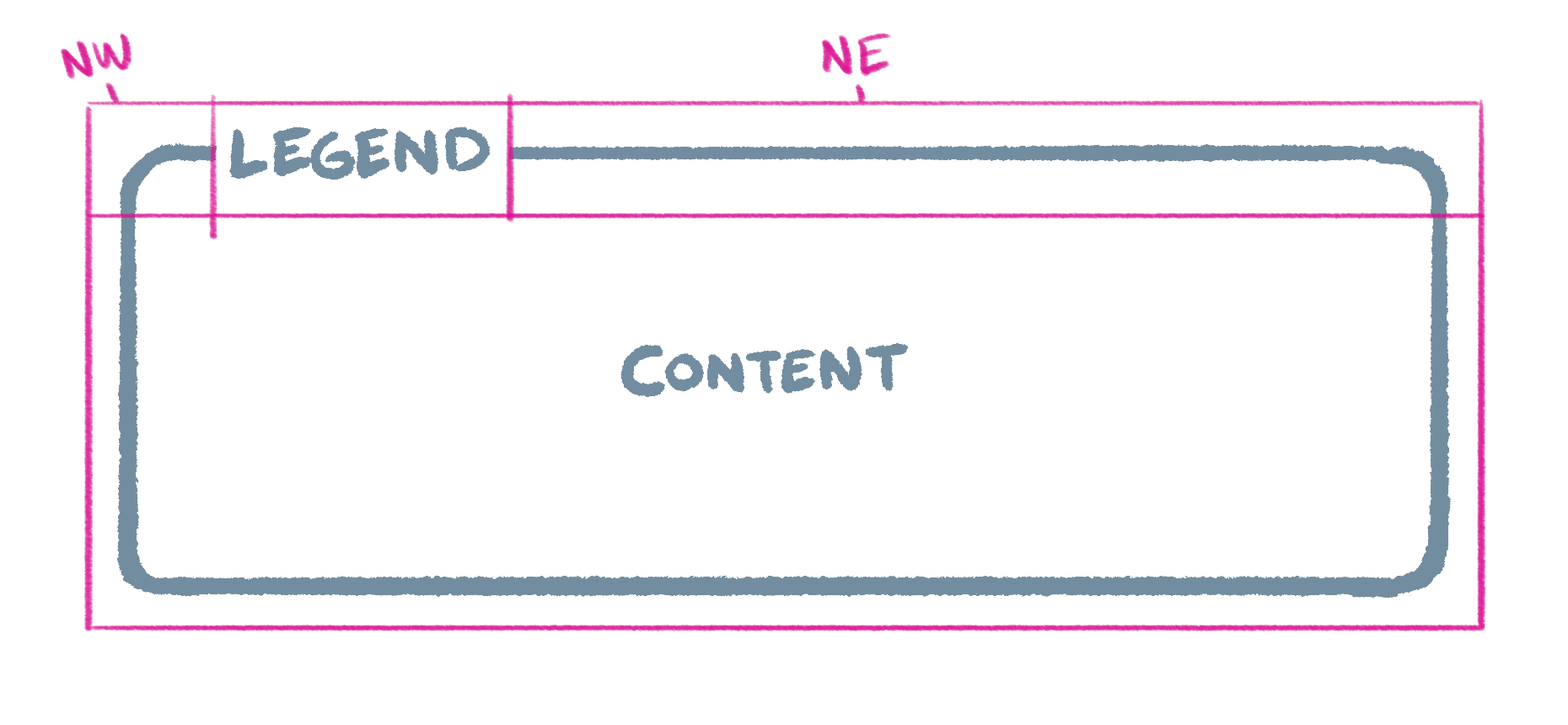
We already have elements for our legend and lower content section. To avoid cluttering the markup, we’ll use pseudo elements to represent the “northwest” and “northeast” slices.
First, let’s translate our sketch to a CSS Grid. I like to use grid-template-areas to make a little text-based representation of the layout:
.legendary {
  display: grid;
  grid-template-areas:
    "nw      legend  ne"
    "content content content";
}
To keep our legend middle-aligned to the top of the adjacent borders, we’ll have it span an additional row (one earlier than the corner areas):
.legendary {
  display: grid;
  grid-template-areas:
    ".       legend  ."
    "nw      legend  ne"
    "content content content";
}
We should also add some column and row definitions so the browser knows to divide the legend space evenly, and to stretch the northeast corner (right of the legend):
.legendary {
  display: grid;
  grid-template-areas:
    ".       legend  ."
    "nw      legend  ne"
    "content content content";
  grid-template-columns:
    1em
    auto
    minmax(1em, 1fr);
  grid-template-rows: 1fr 1fr auto;
}
Now we can use a content view to render the aforementioned pseudo elements:
.legendary {
  /* ...  */

  &::before,
  &::after {
    content: "";
  }
}
And assign the grid areas we’ve defined:
.legendary {
  /* ...  */

  &::before {
    grid-area: nw;
  }

  &::after {
    grid-area: ne;
  }

  > :first-child {
    grid-area: legend;
  }

  > :last-child {
    grid-area: content;
  }
}
Now for the visual appearance!
Since this technique hinges on coordinating the same styles across separate elements, we’ll define a few custom properties up top:
.legendary {
  --border-color: currentColor;
  --border-radius: 0.25em;
  --border-style: solid;
  --border-width: 1px;
  --legend-gap: 0.375em;
  --padding: 1em;

  /* ... */
}
Which we’ll pepper throughout our final styles to draw borders and manage spacing:
.legendary {
  --border-color: currentColor;
  --border-radius: 0.25em;
  --border-style: solid;
  --border-width: 1px;
  --legend-gap: 0.375em;
  --padding: 1em;

  column-gap: var(--legend-gap);
  display: grid;
  grid-template-areas:
    ".       legend  ."
    "nw      legend  ne"
    "content content content";
  grid-template-columns:
    calc(var(--border-width) + var(--padding) - var(--legend-gap))
    auto
    minmax(calc(var(--border-width) + var(--padding) - var(--legend-gap)), 1fr);
  grid-template-rows: 1fr 1fr auto;

  &::before,
  &::after,
  > :last-child {
    border: var(--border-width) var(--border-style) var(--border-color);
  }

  &::before,
  &::after {
    border-bottom-width: 0;
    content: "";
  }

  &::before {
    border-right-width: 0;
    border-top-left-radius: var(--border-radius);
    grid-area: nw;
  }

  &::after {
    border-left-width: 0;
    border-top-right-radius: var(--border-radius);
    grid-area: ne;
  }

  > :first-child {
    font: inherit;
    grid-area: legend;
    margin: 0;
  }

  > :last-child {
    border-bottom-left-radius: var(--border-radius);
    border-bottom-right-radius: var(--border-radius);
    border-top-width: 0;
    grid-area: content;
    padding-top: var(--padding);
  }
}
(Note the use of calc in the first and last columns. This keeps the main content aligned with that of the heading while taking into account gaps between the legend and border.)
Variations
Depending on the needs of your project, there may be ways to adjust or simplify this technique.
If your background is a flat color and known ahead of time, you can give the legend the same background and use a faux container instead of separate corners:
A similar trick could work for varied backgrounds if you’re willing to set a blend mode (and accept any resulting color shifts):
And if minimal markup is the goal, you can pull this off without the inner <div> element, it’ll just impose a few more constraints:
We may one day get a CSS feature for mimicking <legend>’s display (as pointed out by Amelia Bellamy-Royds in the original thread). For now, it’s another fun excuse to solve an interesting (if eerily familiar) challenge with the niceties of modern CSS!
We’re Cloud Four
We solve complex responsive web design and development challenges for ecommerce, healthcare, fashion, B2B, SaaS, and nonprofit organizations.