Interactive charts can transform data into compelling stories, offering valuable insights at a glance. But what happens when these visual tools are inaccessible to those with visual impairments? In this post, we’ll show you how to ensure your interactive charts are accessible to all users, regardless of their abilities.
Before digging deeper, let’s establish what we mean by an “interactive” chart. With interactive charts, users can change the chart’s appearance via different controls. For example, a page used for tracking site traffic—where changing the date range alters the view—is an interactive chart. However, a page that displays student grades that a user cannot manipulate is a static chart.
Below are some best practices for making your interactive charts accessible and ensuring all users, including those with disabilities, can interact with and understand the information.
Choose chart libraries with built-in accessibility features
Accessible chart libraries are typically designed to support the needs of people with disabilities by default, and they approach accessibility with an emphasis on customization and keyboard operability. For example, Highcharts, Recharts, and Google Charts all allow for customization and accessibility support.
Ensure seamless keyboard navigation of interactive elements
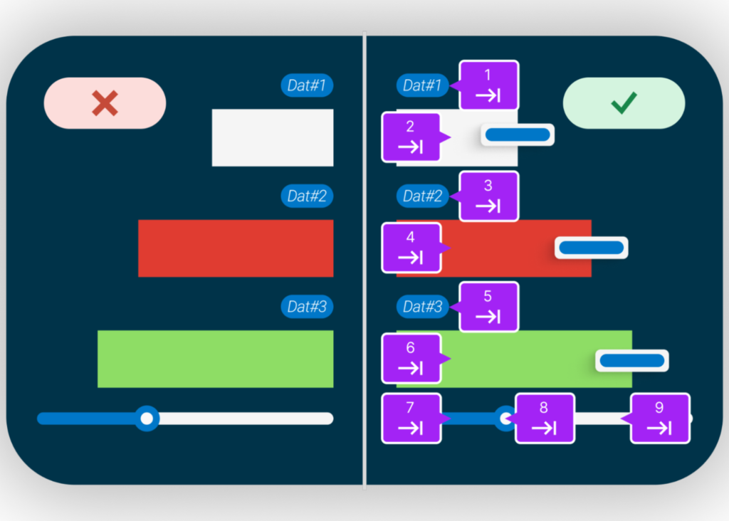
To customize data visualization, interactive charts rely on interactive elements such as buttons, sliders, and data points that describe data at a given point using tooltips. These interactive elements must be operable and focusable using the keyboard alone. It is also essential to have a clear, visible focus indicator for these interactive elements so that keyboard-only users know where their focus is placed and can follow the tab order.
Tab order refers to the sequence in which elements on a webpage, form, or software interface are selected when navigating using the tab key. Tab order helps users, especially those using keyboards or assistive technologies, move through interactive elements in a logical and intuitive order. For example, in the image above, we can see the numbering elements that depict how the focus should move for keyboard-only users.
Enhance screen reader compatibility
Any information that a visually sighted user can get from a chart must include text alternatives that describe the relationships between different data points and any other information that a sighted user receives. All the interactive elements need names to let screen reader users know what the elements are and what they do. You should always prioritize using native HTML elements. However, if you use custom elements, you can use ARIA (Accessible Rich Internet Applications) to provide roles, properties, and states to describe the chart structure, interactive elements, and data to screen readers.
You should also make sure each interactive element and image includes the following to allow screen readers to understand the presented data:
- Descriptive titles and labels for all chart elements
- Summaries or descriptions of the chart’s purpose and main insights
- Accessible tooltips and data values that are navigable via keyboard and readable by screen readers
Address color contrast and use of color alone to convey information
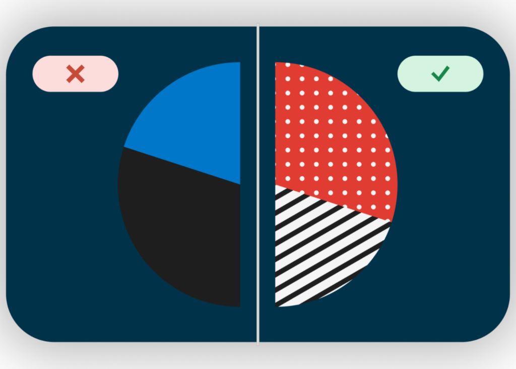
Colorblind users may not be able to understand the intent of the data in your chart if the patterns only use colors. So, you need to be aware of contrast ratios between foreground and background colors. 3:1 is the minimum contrast ratio, but 4.5:1 will provide even greater usability. When presenting text against a background, WCAG guidelines require 4.5:1.
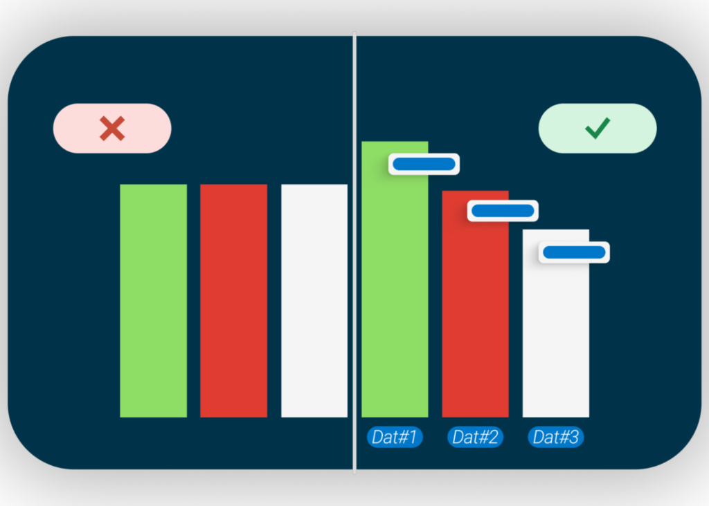
You can also use different patterns to show data instead of relying on colors as the sole method. For example, interactive charts with data labels can deliver a clear understanding to all users about what each bar in a graph represents. If that’s not possible, you should at least provide a text alternative for each part of the graph so that colorblind or low-vision users can still have the same “aha” moment as other users.
Conclusion
By following these best practices, you can ensure that your interactive charts are accessible to all users, including those with disabilities. Start evaluating your charts for accessibility today, and remember that inclusivity is essential for effective data communication.
If you’d like support for remediating charts and making them accessible to all your users, please contact Deque today!
The post How to make interactive charts accessible appeared first on Deque.