I recently nitpicked the WordPress UX for adding alternative text to images. It’s a little clunky, for sure, but not really a big ol’ deal in the grand scheme of things.
That post came a day before I updated to WordPress 7.0. Now I have another nitpick about images because they changed the freaking interface!
Many (maybe most?) themes will create multiple versions of an uploaded image — essentially different sizes that can be used in different contexts. For example there is a “large” size that is downscaled from the uploaded “full size” version. I think that’s a WordPress Core default that you can disable with a function.
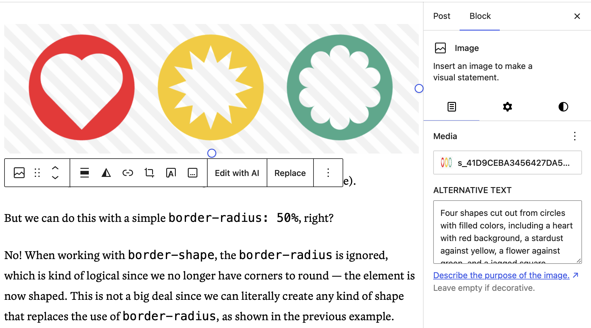
You don’t see those different versions in the Media Library, but you can choose which variation is used in the Image Block settings.
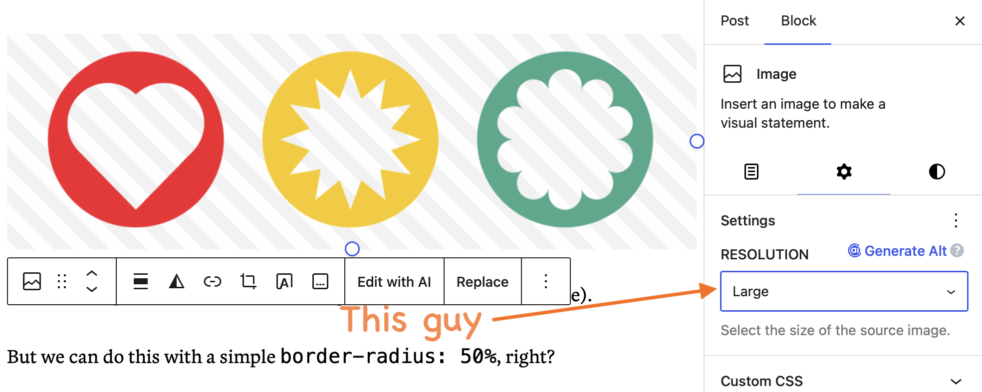
At least for me, “Large” is the default selection. (Though weirdly not all the time. WordPress must have a way of deciding that?) That’s fine enough.
My beef is that WordPress 7.0 haws moved the setting. Notice how it’s in the second of three tabs? That used to be one and the same with the first tab. In other words, you’d select an image and size from the same place.
I’m just whining because I don’t see a reason for the added click to get to that setting. There are only two controls in the first tab: the image selection and alternative text.
Maybe I’m wrong (I mean, this is all about personal preferences in the end, right?) but the size selection doesn’t seem like a big enough control that it warrants breaking it out into its own tab. It’s literally the only control in that tab. Was it really cluttering things up so much? My answer is no way.
But who knows? Maybe this is the first step for more image settings in upcoming WordPress releases. Maybe it allows theme and plugin developers more room and flexibility to hook into the whole thing. Or maybe user testing really did prove that the size selection was unnecessary clutter. I’m open to possibilities.
But for now, gosh dang do I hate that extra click!