New Dec 12, 2024

Making o(m)g:image, Part I: Design Iterations

More Front-end Bloggers All from Jim Nielsen’s Blog View Making o(m)g:image, Part I: Design Iterations on blog.jim-nielsen.com

This is part one of my series of posts describing how I made my quiz game o(m)g:image.


I blogged about my recent project omgimg.jim-nielsen.com and I figured I’d write more details about my process behind making it.

When the idea first struck, I jumped into Figma and started working out the idea. I had a pretty good idea of what I wanted: a quiz-like website that showed one question per page.
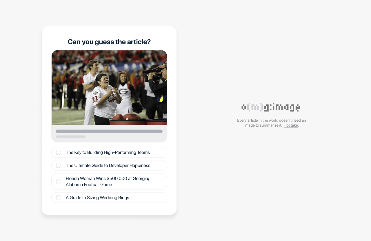
Quiz interface asking ‘Can you guess the article?’ with an image of a football game scene and four multiple-choice options below, including humorous and unrelated article titles. On the right, a logo for ‘omg:image’ with the text ‘Every article in the world doesn’t need an image to summarize it. Hot take.’

Once you answered it gave you the result and prompted you to continue to the next question. Pretty basic stuff. In no time, I had something in Figma that fit the bill.
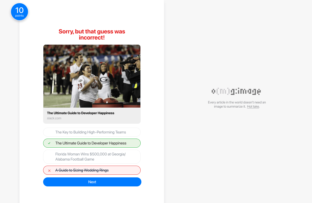
Quiz interface with the message ‘Sorry, but that guess was incorrect!’ displayed in red. The image shows a football game scene, and below it, the correct answer, ‘The Ultimate Guide to Developer Happiness,’ is highlighted in green. An incorrect guess, ‘A Guide to Sizing Wedding Rings,’ is marked in red. A ‘Next’ button is visible at the bottom. On the right, the logo ‘omg:image’ appears with the text ‘Every article in the world doesn’t need an image to summarize it. Hot take.’

From there I was anxious to jump into the code, so I built the Figma mockup in code. (I built it using Web Origami, more technical details later.)

I am hosting the site on Netlify, which has atomic builds for each commit. That means I am lucky enough to go back through my deploy history and view the site at different commit iterations, so I nabbed some screenshots for this post.

The first version was pretty close to the Figma mock.

Side note: Figma, for me, is a tool for settling on the direction of a website’s design and structure, not a “implement this screenshot pixel-for-pixel” tool, so I knew things were going to change and evolve as I built the site in the browser. Building the site is part of the design process.
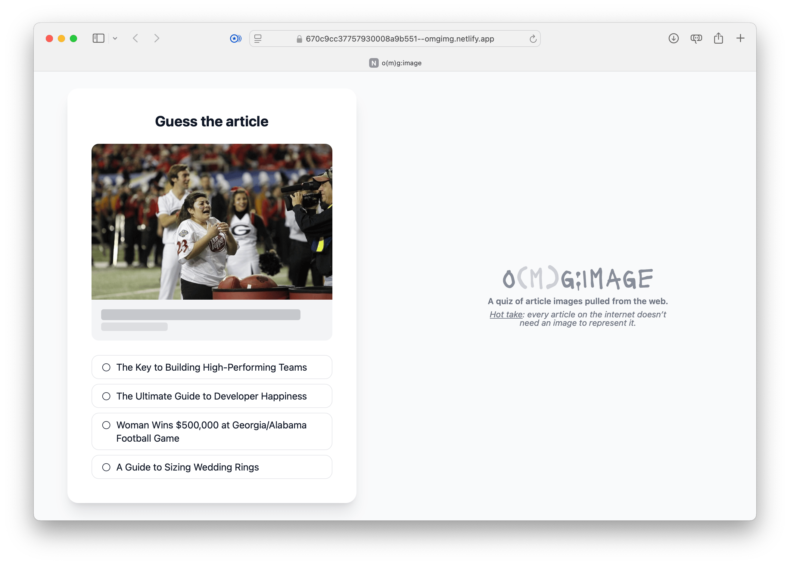
Screenshot of iteration number one for o(m)g:image, showing how the layout changed somewhat from the original Figma mock as the surface the quiz lives on, for example, does not extend to the full heiht of the browser window like it did in the Figma mock.

That worked, but I didn’t love it. The relationships between elements didn’t quite feel right, so I started playing with layout and other small things.
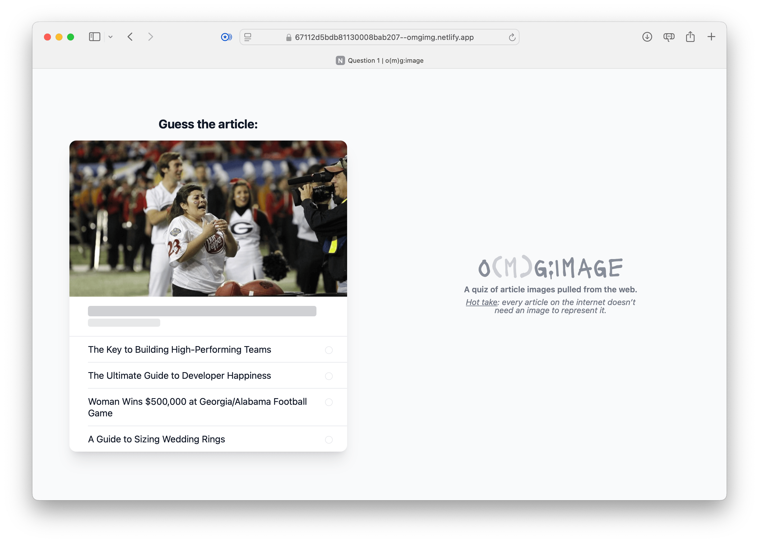
Screenshot of iteration number one for o(m)g:image, showing how the layout changed. For example, the entire question became one big visual chunk, isntead of discrete UI pieces.

From there, I started clicking around and going through each question. This gave me a feel for the experience of answering questions, seeing the result, and moving on to the next question.

I had figured out (in my mind’s eye) how this would work in Figma, but only once I had a working prototyping in a web browser could I really get a feel for how the Figma design held up. This gave me a chance to say to myself, “Oh well that doesn’t work, and I’ll have to change this, and this thing over here...”

That's how I ended up on another iteration where I tweaked element positioning to try and better the experience of: seeing a question, answering it, then viewing the result.
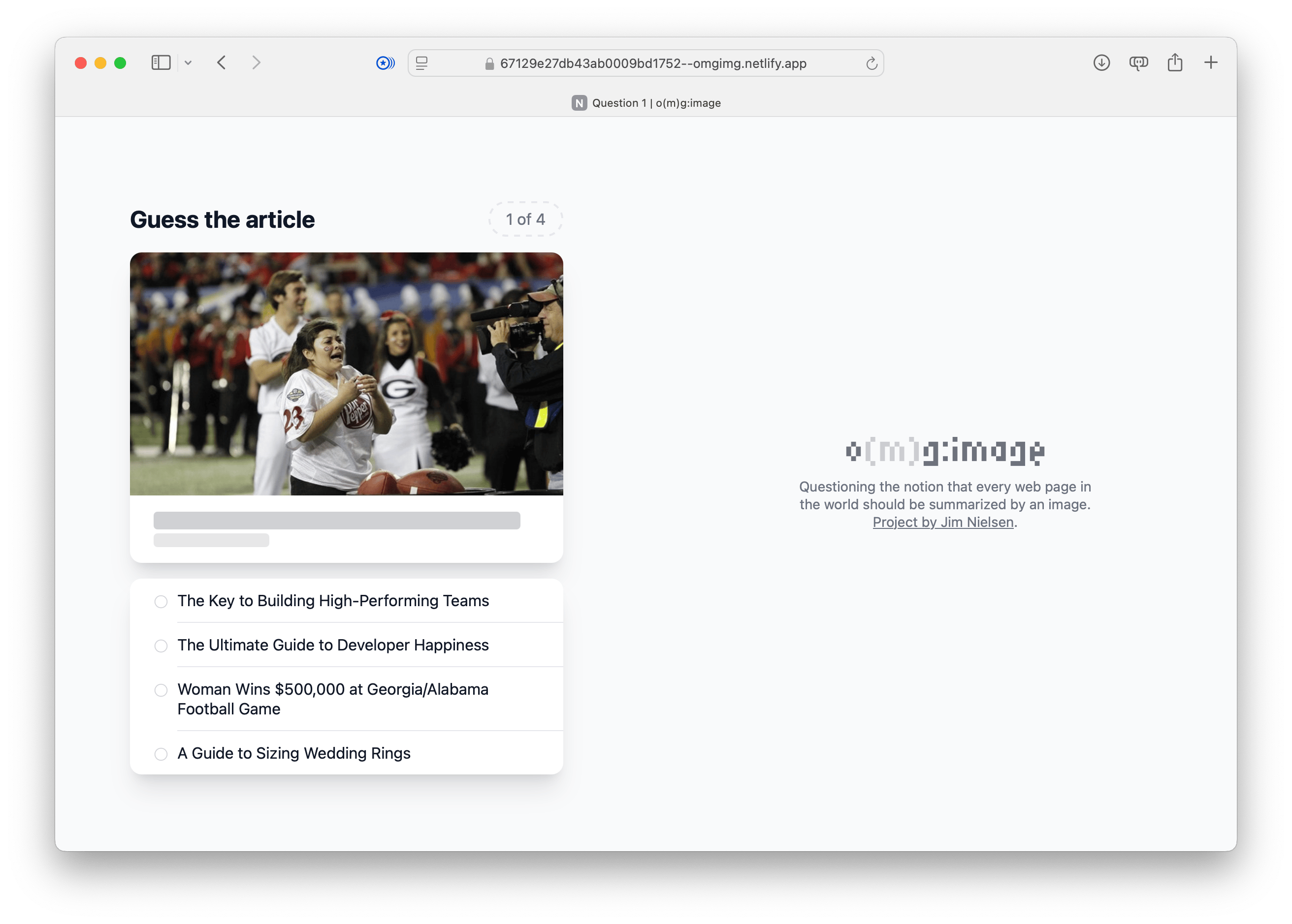
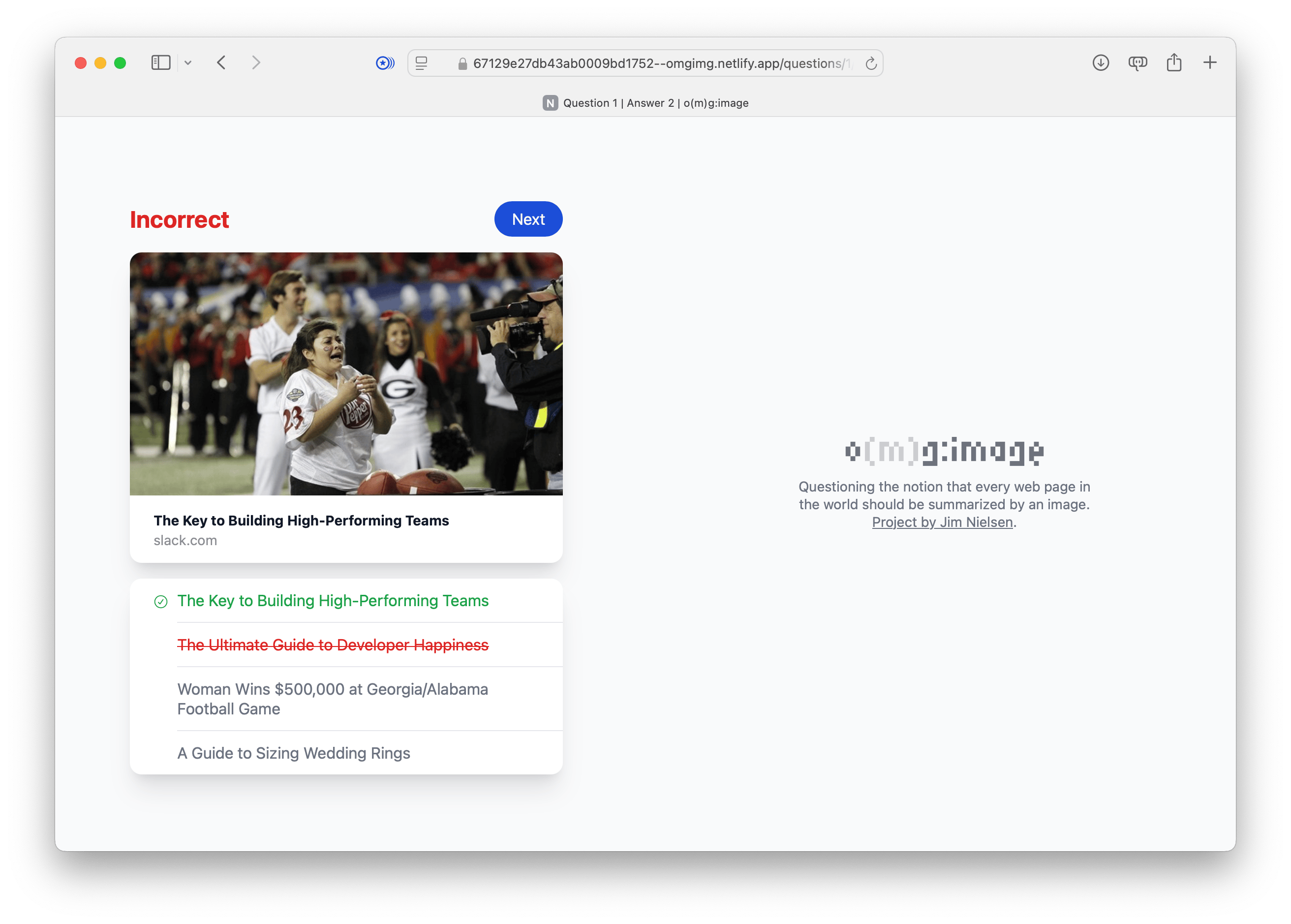
Screenshot of iteration number three for o(m)g:image. More elements have been moved around, including the “Guess the article” title is now left-aligned with the question count to the right. That way, when the page changes, they reveal new information but stay in the same spot.

Screenshot of iteration number three for o(m)g:image for the answer page, where the incorrect answer is crossed out and the title “Guess the article” has been replaced with the text “Incorrect”.

After I got the navigational elements to a place that felt better (and indicating your progress through the quiz), I went back to layout and played with the overall positioning of elements. I also continued to refine and tweak the elements that helped you navigate through the questions of the game (and their corresponding answer pages).
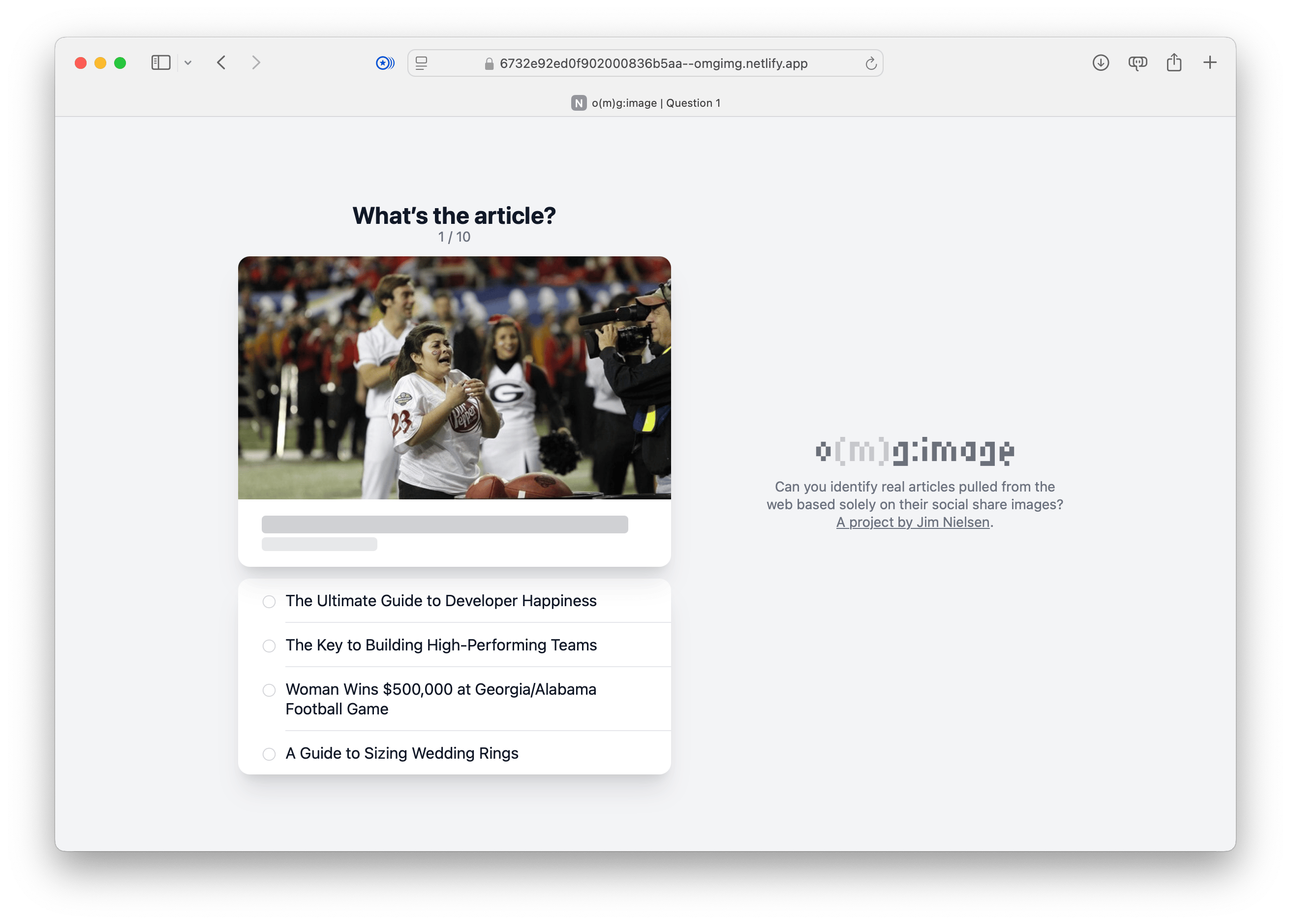
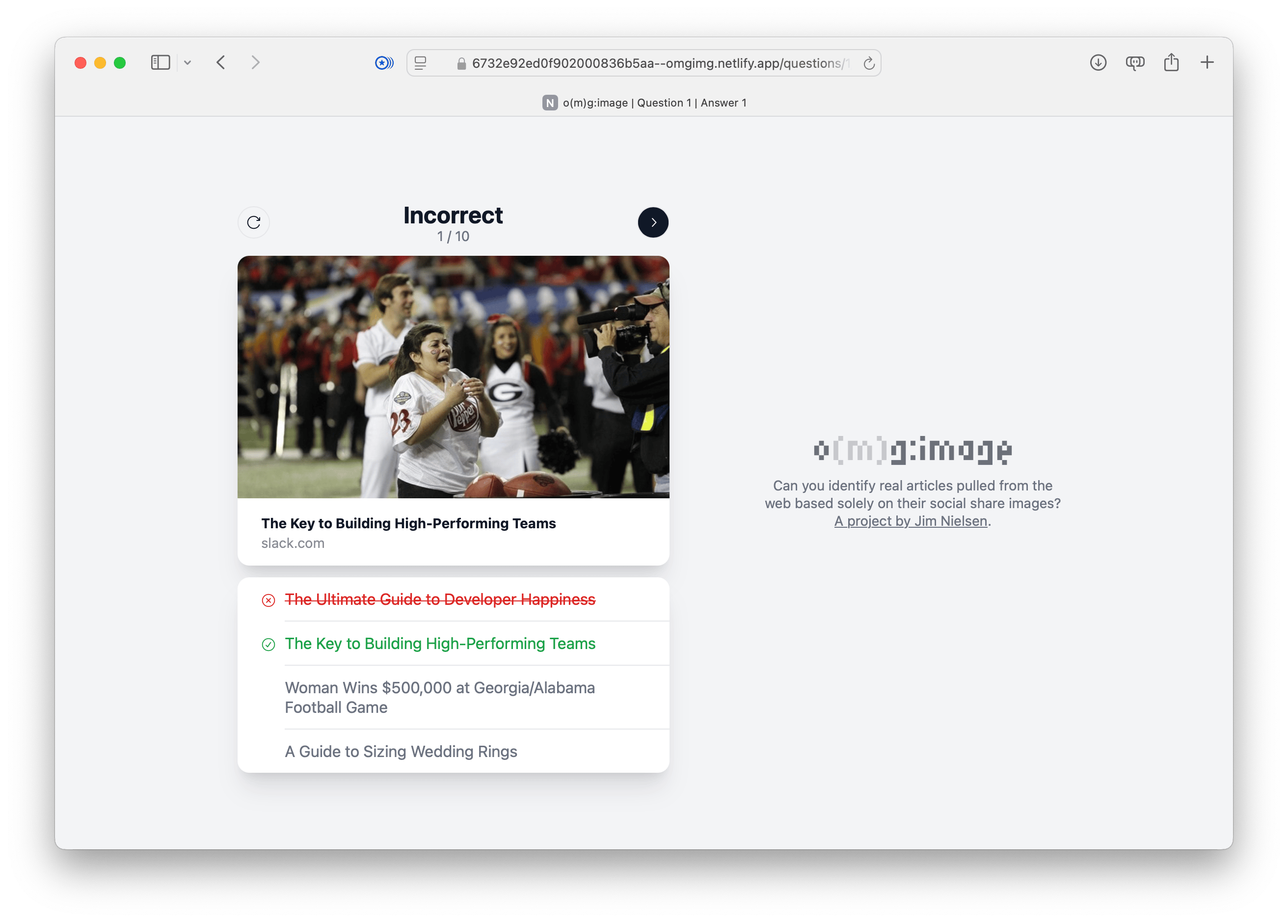
Screenshot of iteration number four for o(m)g:image where the article heading has changed to be laid out top-to-bottom, heading then quesion status.

Screenshot of iteration number four for o(m)g:image answer page where the article heading has changed to be laid out top-to-bottom, heading then quesion status. On the left is a control to restart the question. On the right a control to go to the next one.

At this point I ended up taking a detour on the navigation front.

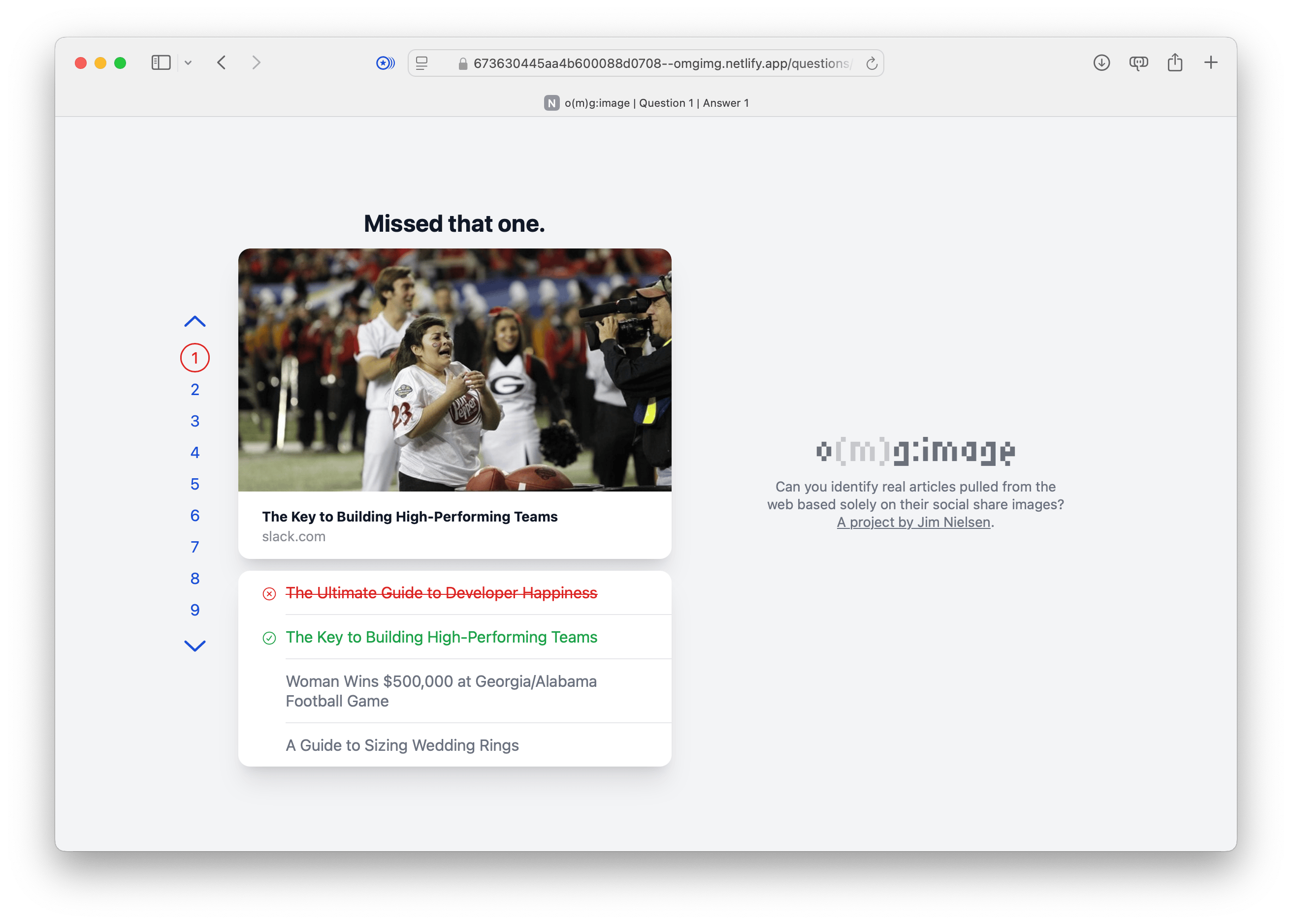
I kept waffling between the idea of minimal representation of the number of questions in the game (e.g. “1/10 questions”) and something more robust that would let you jump to any question at any point. So I built a version to test out that idea.
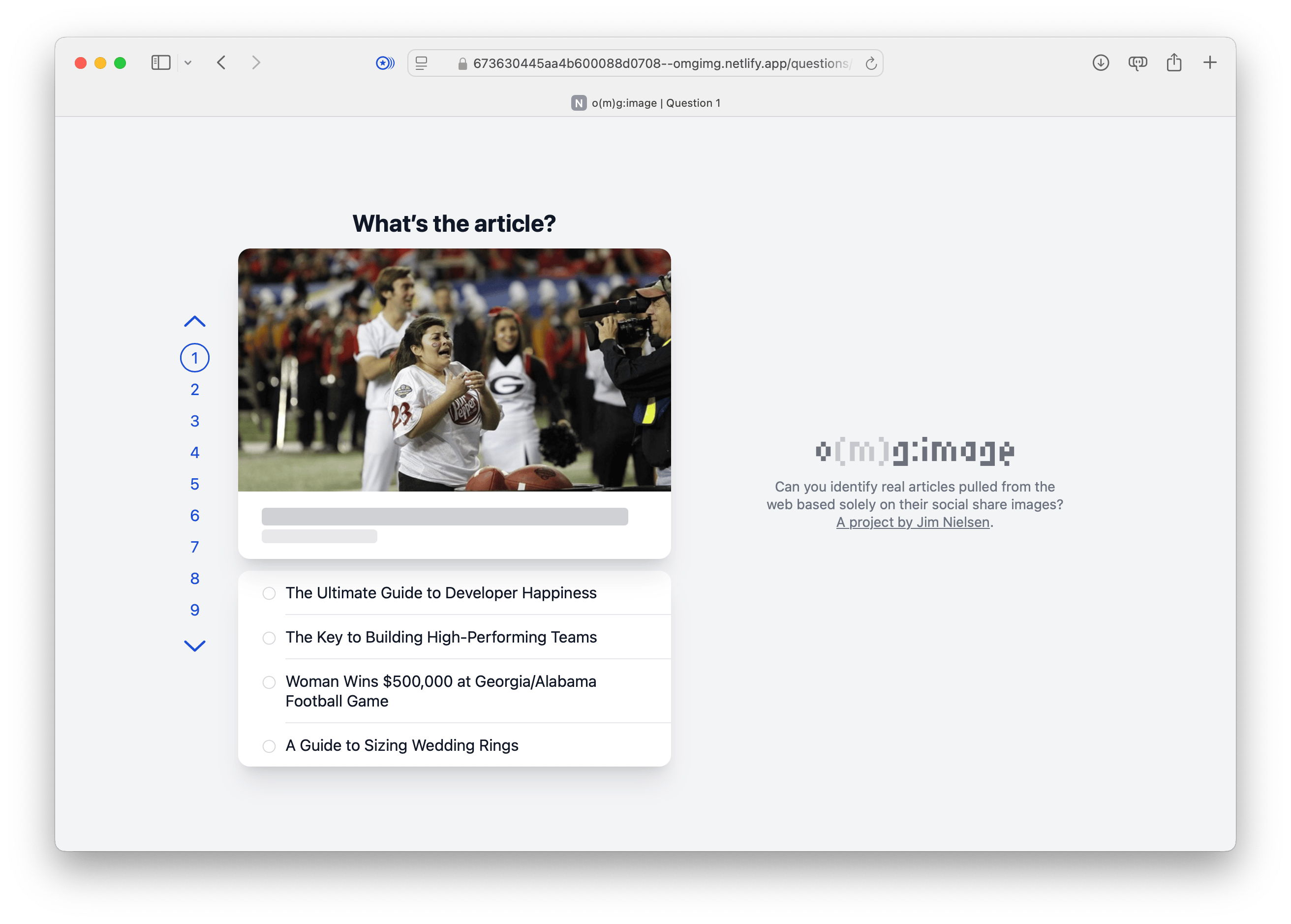
Screenshot of iteration number five for o(m)g:image where there’s a numer for every question in the quiz that you can click on.

creenshot of iteration number five for o(m)g:image answer page where there’s a numer for every question in the quiz that you can click on and the currently active answer page is red because the question was answered incorrectly.

Then I ended up on a side quest of multi-page view transitions, because it was cool to be able to design the navigation in such a way that I could have multiple HTML pages that transitioned visually when navigating between them.

Animated gif showing numbers 1 through 8, the active one with a circle around it and as each one is clicked and becomes active the circle eases over to that position in an animation.

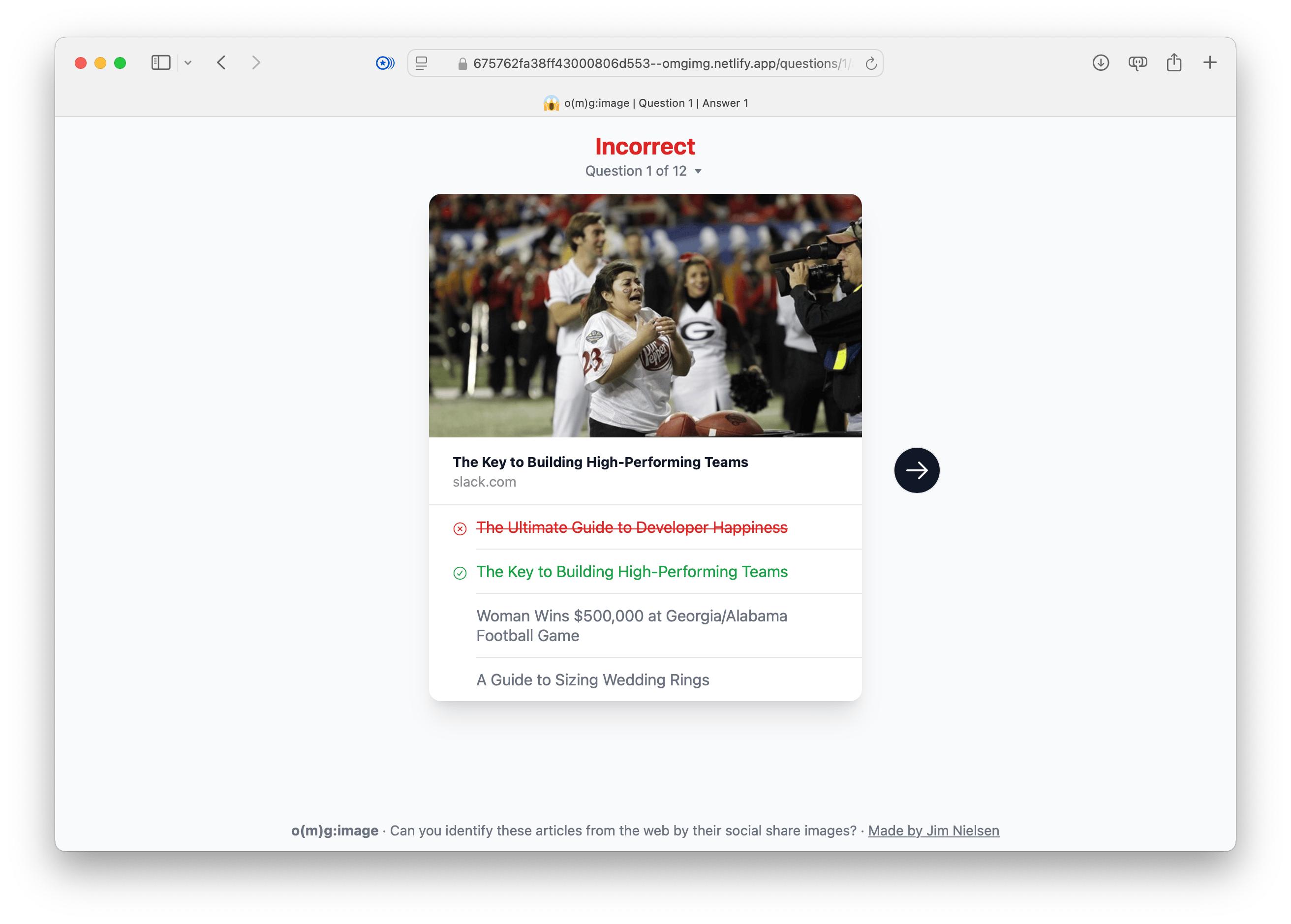
But I ended up deciding I didn’t want to go in that direction, so I went back to a minimal representation of question status/progress. I also changed the layout (yet again). These were all decisions I made after repeated usage of the game, just clicking through things over and over and over until I found an experience that felt seamless and fast.
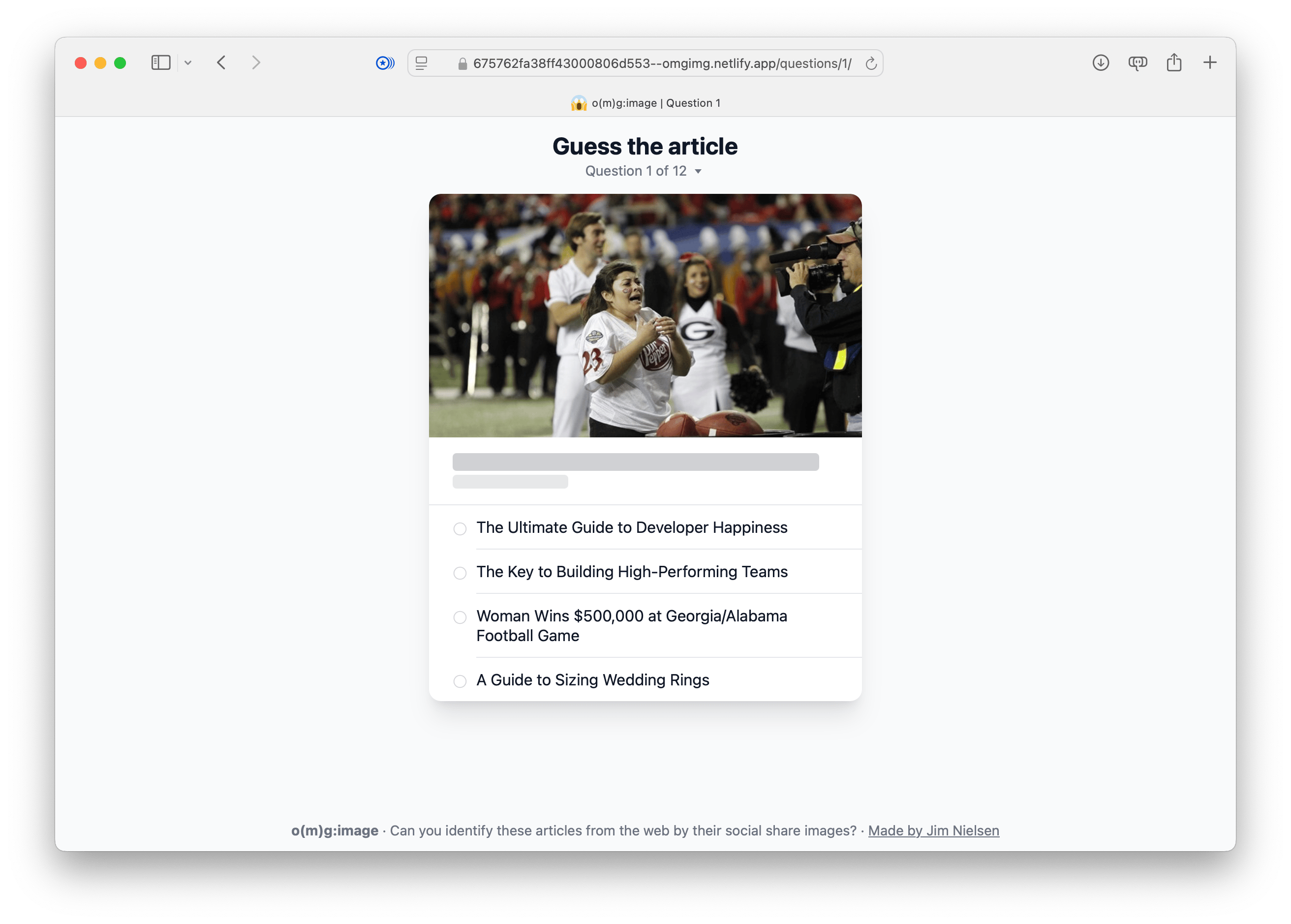
Final version of the question page. Quiz interface titled ‘Guess the article,’ labeled as ‘Question 1 of 12.’ It features an image of a football game scene at the top, with four multiple-choice options below, such as ‘The Ultimate Guide to Developer Happiness’ and ‘Woman Wins $500,000 at Georgia/Alabama Football Game.’ At the bottom, the text ‘o(mg):image - Can you identify these articles from the web by their social share images?’ appears, with a credit link to ‘Made by Jim Nielsen.’

Final version of the answer page. Quiz interface with the title ‘Incorrect’ and the label ‘Question 1 of 12.’ The image of a football game scene is displayed at the top, and below it, the correct answer, ‘The Key to Building High-Performing Teams,’ is highlighted in green, while the incorrect guess, ‘The Ultimate Guide to Developer Happiness,’ is crossed out in red. The other two options remain unselected. A forward arrow button is visible on the right. At the bottom, the text ‘o(mg):image - Can you identify these articles from the web by their social share images?’ appears, with a credit link to ‘Made by Jim Nielsen.’

I also decided that, rather than have all questions laid out in the navigation for every single question, I would have a single page with all the questions represented on it. As an enhancement, people with JavaScript would see their progress on that page including the correctness of their answer for each question.
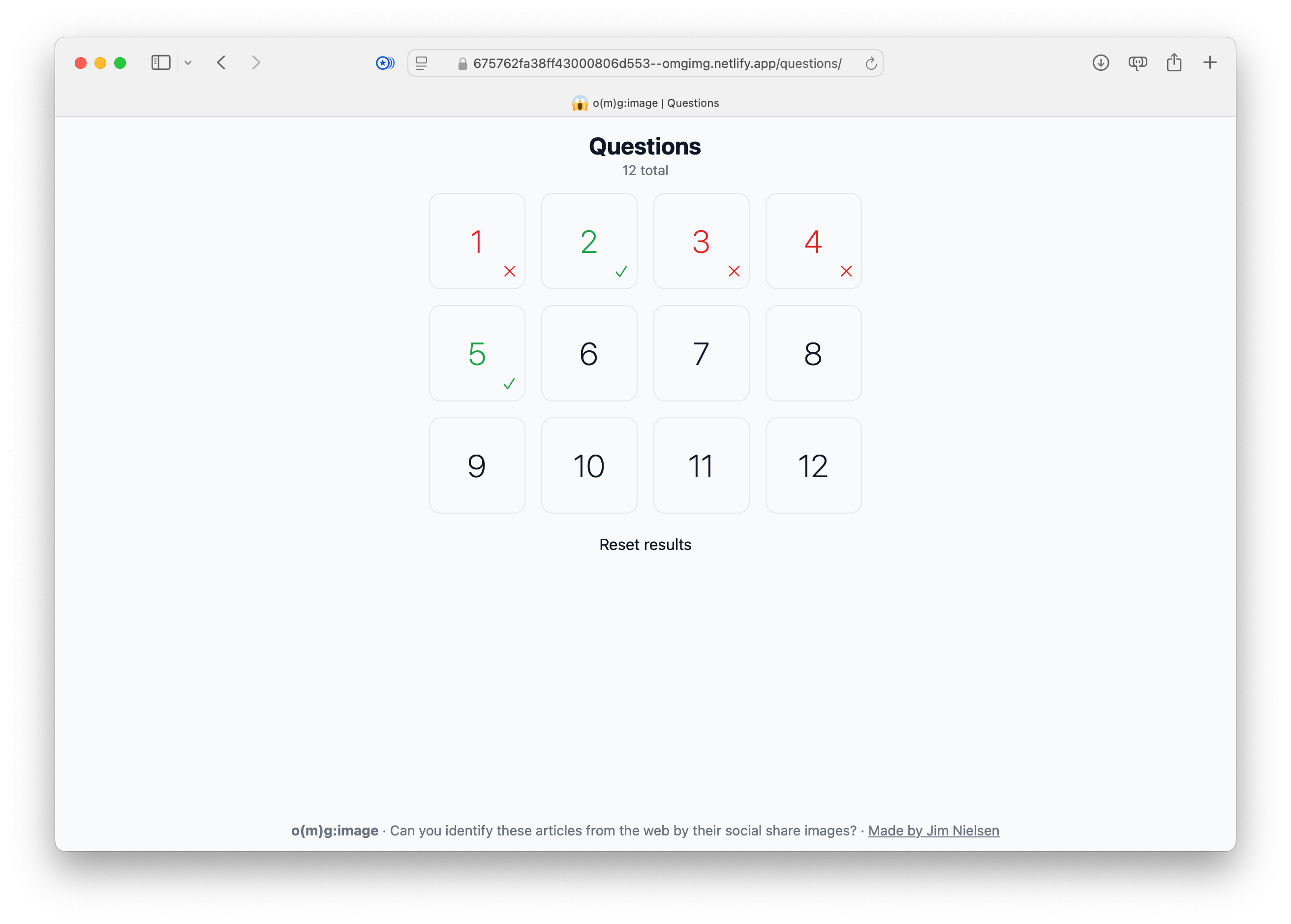
Quiz results page titled ‘Questions’ with a grid showing the status of 12 questions. Correct answers are marked with green checkmarks (e.g., questions 2 and 5), and incorrect answers are marked with red Xs (e.g., questions 1, 3, and 4). The remaining questions are unattempted. A ‘Reset results’ button is centered below the grid. At the bottom, the text ‘o(mg):image - Can you identify these articles from the web by their social share images?’ appears, with a credit link to ‘Made by Jim Nielsen.’

That felt good to me, so I shipped it and that’s the state of the site at the time of this writing.

It’ll probably change in the future because every time I use it I think, “Oh I could tweak this, and move that...”

That’s the curse of building these things yourself.


Reply via:

Email :: Mastodon ::

Bluesky

Tagged in: #omgImg

Related posts linking here: (2024) Making o(m)g:image, Part IV: URLs ::(2024) Making o(m)g:image, Part II: As Little JS As Possible ::(2024) Making o(m)g:image, Part III: The HTML

Scroll to top