Although we can apply any CSS Unit to line-height, a unitless 1.5 value is the most recommended way to handle it. To begin with, an explanatory image on how line-height is applied by the browser:
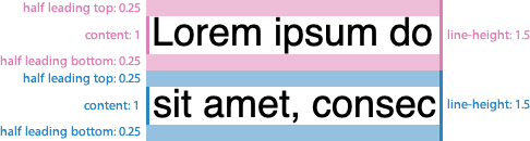
As you can see, every line-height is distributed in different areas:
- A “content area”, that would be ≈1 tall.
- A “leading area”, that would be the remaining space, halved in top & bottom leadings.
Therefore we could express it as:
lineHeight = leading / 2 + content + leading / 2Or:
line-height: calc(0.25 + 1 + 0.25);However, this approach has a maitenance downside: as you can note in following demo, it sets too much line height in larger font sizes. In order to establish an optimal readability, we must manually tweak it on every font-size increment, down to 1.1 on very large font sizes.
See the Pen calc line-height: demo 1 by @supersimplenet on CodePen.
Looking for a formula
To have a clearer way, let’s take a look to our demo figures, on a comparison table (computed line-height values are in pixels for easier understanding):
| line-height: 1.5 | line-height: 1.1 | |
|---|---|---|
| font-size: 10px | 15px | |
| font-size: 50px | 55px |
In order get an optimal line-height we will need to be as close as possible to 1.5 value (15px), on smaller font sizes, but closer to 1.1 (55px) on larger ones.
Wait… 11px is already pretty close to 15px. We’re just a few pixels away.
So, instead of starting on a 1.5 value, why don’t we flip it over? We could start down from 1.1, adding just the few pixels we need, which will make almost no visual difference in larger font sizes, but on smaller ones.
Something like:
line-height: calc(2px + 1.1 + 2px);Revisiting our computed line-height comparison table:
| LH 1.5 | LH (2px + 1.1 + 2px) | LH 1.1 | |
|---|---|---|---|
| font-size: 10px | 15px | 15px | |
| font-size: 50px | 59px | 55px |
That’s better! We nailed it in small font sizes, and get pretty close on larger ones.
Unfortunately, line-height: calc(2px + 1.1 + 2px) is invalid CSS, since unit & unitless values can’t be mixed. Could we use any relative unit that gets computed to about 1.1?
Kind of: the ex unit computes to current font x-height (the height of the lowercase letter “x”), so we just find out the perfect match for our formula.
In fact, any relative unit (em, rem…) can be used, but since we’re calculating line height, it makes sense to use a height unit.
Since every typeface has its own ex value, we still need to fine-tune our px & ex values. Anyway, consider this a good starting point:
line-height: calc(2px + 2ex + 2px);As you can see in following demo, it sets a very nice line height, in a wide range of different typefaces:
See the Pen calc line-height: demo 2 by @supersimplenet on CodePen.
That’s valid CSS. Also, the ex unit has very good browser support. Hooray!
Descendant elements
If you apply the formula on a parent element, and font-size is a changed on a descendant element, line-height would be unafected on the descendant, since it has been calculated based on parent font-size:
.parent {
	font-size: 20px;
	line-height: calc(2px + 2ex + 2px);
	/* computed: 2px + (2 * 20px) + 2px = 44px */
}
.parent .descendant {
font-size: 40px;
/* desired:  2px + (2 * 40px) + 2px = 84px /
/ computed: 2px + (2 * 20px) + 2px = 44px (same as .parent) */
}
This can be solved by applying the formula to all descendants, with the universal selector:
.parent * {
	line-height: calc(2px + 2ex + 2px);
}
On responsive typography
Our formula also helps with reponsive typography. Using relative-to-viewport units (vw, vh, vmin, vmax) leads to a lack of fine control, so we can’t tweak line-height on every font-size change.
This issue was also tackled by CSS locks technique, which uses relatively complex arithmetic to establish a minimum and maximum line-height.