About a month ago, I wrote an article recommending that if you are going to have an always visible control for switching between light and dark mode, it should be a two-state toggle that alternates between system and whatever the current opposite of system is, not a tri-state one (system, light, dark). If you are forced to include such a control (say, someone is pointing a gun at you and shouting “code dammit! now!”), I stand by that recommendation: use two states, as described in the article.
But the article explicitly doesn’t answer the question “should you have one at all?”. I was much more neutral on this at the time of writing. I am now firmly in the “no” camp. More on that below.
The two-state toggle design proposed in my article can actually express all three data model states.
What I didn’t mention was that I had been meaning to write this article for years, but had been putting it off. What finally pushed me to write it 1 was that Bramus argued that some Modern Web Guidance I had written on this was incorrect. He assumed it was an oversight, that I simply hadn’t thought of all the implications. On the contrary, my recommendation had been the result of some very careful consideration, combined with my HCI background. Surely, if I explained my reasoning well, he would see it!
I tried to convince him through discussion (in person, as we were both in Berlin at the time) to no avail. My conclusion was that I must be doing a poor job explaining my reasoning, and that a blog post was in order to explain it properly. Surely, after that he would be convinced!
And thus, one of my most successful blog posts was born.
Reactions
This article really made the rounds. It was shared by hundreds of folks, including people I really respect, such as:
- ShadCN
- Paul Kinlan
- Kevin Powell
- John-David Dalton
- Tab Atkins-Bittner
- Cory LaViska
- Ahmad Shadeed
- Josh Tumath
and many others. A lot more who hearted it.
Some of the quotes really made me blush ☺️. Here is a small selection:
I wasn't sold on this until I got to the implementation. It's so smart I'm probably gonna spend my day redesigning at least one or two of the theme toggles I've built.
— Josh Collinsworth (@collinsworth.dev) August 6, 2026 at 4:30 PM
[image or embed]
This is one of the best articles I've seen about the difference between letting the underlying settings dictate the structure of your UI, and thinking about what actually makes sense to your users. Really, really insightful, and definitely worth ten minutes of your time.
— Dylan Beattie (@dylanbeatt.ie) August 6, 2026 at 4:43 PM
[image or embed]
Once upon a time web developers regularly wrote blog posts about UX design that were this good. Thank you to @lea.verou.me for keeping the art alive.
— Sam Littlefair (@littlefair.ca) August 6, 2026 at 6:19 PM
[image or embed]
OK, I'm persuaded. For a toggle in the header or footer, a toggle between 'system colour scheme' ↔️ 'the opposite' is better than system ↔️ light ↔️ dark.
Lea is a master of user experience.
— Josh Tumath (@joshtumath.uk) August 7, 2026 at 2:19 AM
[image or embed]
This is a great post to read, lots of useful UX and usability thoughts. I like this approach.
— Ahmad Shadeed (@ishadeed.com) August 7, 2026 at 11:09 AM
[image or embed]
Really, really appreciate the deep thinking about the user's _actual_ needs and intentions, irrespective of conventions and commonalities, in this brilliant piece. 👌
— sylvia (@svillegas.com) August 12, 2026 at 9:12 PM
[image or embed]
Tri-state theme controls always make me think™. Minor friction, but unnecessary. We can do better.
— Alexey Ardov (@ardovalexey) August 4, 2026
The intent is simple: "flip the theme". The UI only needs two states: light and dark. “Follow system” can stay under the hood.
The algorithm I use in my projects ➡️ https://t.co/8s15vxVFY2
This is the missing piece of the puzzle for theming controls in the UI. I’m a little bit jealous I didn’t think of it myself :) https://t.co/HDjvCO1UhN
— zerts (@zertsdev) August 7, 2026
Articles were written, for and against it. This is a small sample (I couldn’t find most of them):
- https://css-tricks.com/dark-mode-toggles-two-states-are-enough/
- https://daily.dev/posts/dark-mode-toggles-two-states-are-enough-lea-verou-aojclwsb5
- https://vale.rocks/micros/20260810-0330
- https://unsung.aresluna.org/2026/08/14/
- https://bitstorm.org/weblog/2026-8/dark-light-toggle.html
Unfortunately, I failed to convince Bramus, who two weeks later wrote a blog post of his own 😢
Bramus’ objections
Bramus’s central objection to the two-state toggle is this:
Consider this scenario:
- The user’s OS is set to auto-switch Light/Dark based on the time of day.
- They visit a website during the day, so they see the Light theme.
- Using the site’s two-state control, they try out the Dark theme. They decide they don’t like it, so they revert it back to Light.
- They visit the site again at night.
Because the two-state toggle maps one of its values back to “System” behind the scenes, the site is now
dark, although they explicitly choselightthe last time they interacted with the control. You may now expect an incoming bug report for the control not properly working …
His reasoning is that a tri-state control sidesteps this by letting users pin light or dark explicitly at all times, which he also considers clearer overall, since all three options are always visible.
An easily-misread framing: auto-switching by time of day works fine
In both of his posts, Bramus initially frames the disagreement as “this will not work for users that have their system set to automatically switch to dark mode at night”, which is false: it will work just fine. The control covers all three intents with a single click. Not a single click per session — a single click, ever. The variable is around when that click happens. In fact, I dedicated a whole section to this exact scenario in the original article, which he acknowledges but says he’s “not buying it”.
He does later explain what he sees as broken in more detail, but since most people do not read very carefully, there were a couple people who agreed thinking the two-state toggle I was proposing is somehow broken for auto-switching systems.
His poll asks the wrong population the wrong question
Bramus asked developers which control they build, then used the tally as evidence for which control is usable!
Those are different questions. Developer preference is confounded with convention and implementation convenience. If asking developers what they build gave us data on what UI is most usable, we wouldn’t need user testing, ever 😅
We optimize UIs around user goals, not around developer preferences. In fact, more often than not there is a tension between what is easiest to build and what is optimal for usability, because usability is all about abstracting the underlying model (which is closer to the machine), and exposing a model that is closer to how the user thinks.
“Local feedback” doesn’t solve the gulf of evaluation
Responding to the objection that two of the three options produce the same visual result, Bramus writes that
“the selected option does change so there is local visual feedback.”
Sure, the button highlights, and that’s better than if nothing happened at all. But the button is the means, not the end. The user clicked it to change the page, not the button!
When the control changes and the page doesn’t, the user acted and the world didn’t respond — that’s Norman’s gulf of evaluation. Widget feedback with an unchanged outcome is the failure, not a mitigation of it. It’s also why NN/g’s toggle guidelines insist a toggle has an immediate, visible effect.
Implementation simplicity != cognitive load
Bramus says:
“there is nothing complex about a tri-state control” […] it’s “the Dumbest Approach™ one could possibly take.”
Yes, it is — that was exactly my point when I wrote that tri-state toggles are implementation-driven UI. The actual user goal in the moment is not abstract (“system” is a variable, not a value), it is concrete (light or dark). Using a tri-state control involves a mental translation from the three states to the actual user goal. It’s of course very short, almost imperceptible to users — but avoiding this type of unnecessary mental processing was exactly the point of Don’t Make Me Think — which ironically Bramus cites to support his argument.
“Clarity over brevity” is one of these platitudes that everyone agrees with 2, but people use it to support even entirely contradictory positions. Whenever I see one of these, my tendency is to prod deeper; clarity about what? Clarity about the implementation’s state machine is not clarity about outcome. The tri-state is optimized for people who already hold the system model — which is, again, developers.
The failure scenario is rare, and recovery is cheap
Bramus’ central objection is that with a two-state control, forcing a mode “shouldn’t be dependent on the time of the day.” The scenario he gives requires OS auto-switching, plus toggling and reverting within a session, plus revisiting after the switch, plus remembering the earlier interaction.
Usability problems are prioritized by frequency × impact × persistence, and this scenario scores low on all three. The tri-state, by contrast, taxes every interaction with a state most users never need. Optimizing the common path over a rare, cheaply recoverable edge case is not an antipattern, it’s precisely how usability engineering is supposed to work!
“Once a user has interacted with a control, they have mentally set it to the specific state”
People don’t remember settings on sites they rarely visit. For them, a site that tracks the OS matches expectations; a stale override fighting the OS is the actual surprise (“why is this site light at night?”). And in practice no user devotes nearly as many cycles contemplating why the theme of a website they visited to accomplish a task matches or doesn’t match their OS, at most they just toggle and move on. It’s not even System 2 thinking. If there is a recurring problem, sure, they may think about it more consciously, a few may even report a bug. But something that’s fixed with a single click, in a very obvious way? It might not even surface to the conscious mind.
Bramus himself admits that his scenario is purely theoretical; he has never experienced it himself nor seen anyone else experience it.
Once you’ve spent a lot of time and effort on something, you overestimate how much it matters to everyone else. This is true not just in UI design, but in all aspects of life, from any areas you’re an expert in to even your kids 4. Developers have spent days on this control, users will spend half a second at most. It’s the IKEA effect meeting the false-consensus effect: you overvalue what you built, then assume users do too.
Alternative designs
My favorite part of the debate was that it spawned a number of alternative designs.
Some people were divided. They agreed with the reasoning, but still thought a tri-state toggle added clarity. So naturally, they did what UI designers do best: they designed, and the results are quite clever.
Others took a different, hilarious tack on the problem, and attempted to imagine the worst possible dark mode toggles.
Lawful Good 😇
Vale’s 3-in-2 toggle
The alternative that made the rounds most is Vale’s innovative design:
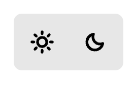
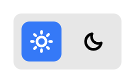
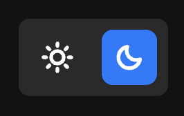
The core premise is quite clever: Three states with the real estate of two icons (33% saving over the typical tri-state control — though still double that of a two-state control), and clarity about whether you’re selecting system or pinning a mode that happens to coincide with your current system setting.
However:
- As Vale themselves admit, some users did not realize they could revert the option they had selected, simply because that’s not a common interaction pattern. Vale does say this was a minority of users, and that it was “immediately understood by the great majority of people [they] tested it with”, however I have doubts on whether this would hold true in the wild, when you haven’t already primed users to pay extra attention to the dark mode toggle.
- Vale claims that “It only takes up the space of a two-state toggle”, but that’s not true. A two-state dark mode toggle only needs the real estate of one icon, not two. It’s possible to implement one that shows both icons simultaneously, but that’s rare.
- In its default state, nothing communicates “system”. It is two icons with no indication of which is currently active. We understand that it’s a dark mode toggle, because it’s presented in isolation, in the context of an article about dark mode toggles. But used on an actual website, I wouldn’t be surprised if users had no idea how to use it and only figured it out by trial and error. Subtly highlighting what System currently resolves to could help here, but then we’re back distinguishing whether “light” means “System (light)” or “Light, always”.
But most importantly, this is adding significant implementation and UI complexity for something that the vast majority of users don’t devote nearly as much thought to as we think they do. In my opinion, this is admirable effort that is ultimately solving a non-problem.
Toni’s undoable two-state toggle
This is also quite interesting:
i feel this is a good trade off if you want to give users the most control, even though i see your point that this is possibly too niche of an edge case to justify.
did i do the UX version of premature optimization, or does this just suck too?
— toni / link (@sarcevic.dev) August 9, 2026 at 2:49 AM
[image or embed]
It’s a two-state toggle that pins light/dark when interacted with, but provides a clear button. This is similar to Bramus’ idea but with more polish.
As I said on bsky, I don’t think this particular design works because:
- Spacing makes it look like these are separate controls, not one clearing the other’s selection
- The clear button has nothing associating it with the color scheme toggle (not proximity, nor its icon).
But none of these are core to the idea, and could be fixed with a little more UI design massaging. If someone really wanted to have three states visible at all times, a reworked version of this would probably be the best way (and can be designed to occupy similar screen real estate as a two-state toggle).
Should anyone spend the time to do this rework? Like I wrote in the previous section, my opinion is that these efforts are pouring a great amount of brilliant creative energy into solving a non-problem, so I would not recommend it.
Chaotic Evil 😈
The Big Dark Mode Toggle Debate™ raged on for weeks, and I think my favorite part of it was the side thread of people taking the piss and coming up with the worst possible dark mode toggle designs imaginable 😅, possibly as a tribute or reprise of The Worst volume control UI.
I reject your two-state toggle and submit my own 4-state toggle. Pray that I do not increase it to 5.
— Michael Ficarra (@michael.ficarra.me) August 6, 2026 at 5:02 PM
[image or embed]
— Michael Ficarra (@michael.ficarra.me) August 6, 2026 at 5:13 PM
— Michael Ficarra (@michael.ficarra.me) August 6, 2026 at 5:18 PM
Of course, I had to participate:
Oh but why stop there? 🤣
— Lea Verou, PhD (@lea.verou.me) August 6, 2026 at 5:25 PM
[image or embed]
I actually strive for perfect clarity with my color theme pickers.
— Chris Coyier (@chriscoyier.net) August 23, 2026 at 5:51 PM
Did anyone already mention "Dark mode with spotLight"? No!? That's the only valid way.
Demo: codepen.io/t_afif/pen/Y… via @codepen.io
Debating about toggles? Well, I don't understand …
— CSS by T. Afif (@css-only.dev) August 24, 2026 at 1:36 PM
[image or embed]
Anything below 4 is unacceptable. right @svenning.io
— Andreas Møller (@andreasmoller.dk) August 22, 2026 at 12:05 PM
[image or embed]
This may be my favorite:
The current debate between 2 vs 3 state theme switchers is ridiculous. Everyone knows that the right answer is 100
#css #a11y
— Andreas Møller (@andreasmoller.dk) August 22, 2026 at 11:59 AM
[image or embed]
Two-state, tri-state, four-state...why should we concern ourselves with this anyway? I say users should not get this for free at all; therefore, I introduced a new mode in this article called capitalism mode ✅
#css
— Sunkanmi Fafowora (@sunkanmifafowora.bsky.social) August 26, 2026 at 1:33 AM
[image or embed]
Could the best dark mode toggle be …none?
However, my biggest insight from all of this is that while I stand by my original recommendation that in most cases, if you are going to have a dark mode toggle that is visible at all times, it should only have two states (system and opposite), I now think that for the vast majority of websites, you should not have such a toggle at all.
Follow system as the default, and if need be have a separate settings panel (even if it’s not actually implemented as a separate page but just an overlay) and put it there. It simply doesn’t warrant permanent screen real estate for the vast majority of users.
The eye-opening moment was when I sent my post to a colleague who is also an HCI PhD, to get their feedback on whether my reasoning was sound, or whether I had any blind spots. For background, this was someone who was much less immersed in the technical weeds of the Web — their work centers more around humans than around deep technical details.
I expected either agreement or constructive criticism, but what I got was much more eye-opening: It turned out that they had no idea what control the article was talking about! Folks, …they had never seen a dark mode toggle!5
And then it dawned on me: all these persistent dark mode toggles I had seen, literally all of them have been on developer-facing sites!
I could not think of a single well-known consumer-facing site with a persistent dark mode toggle. All consumer-facing websites that supported this functionality displayed it in a separate settings panel (which is a different use case). Even those which people spend hours a day using, like Gmail, Facebook, BlueSky, etc. None of them see this as a use case that deserves precious header real estate.
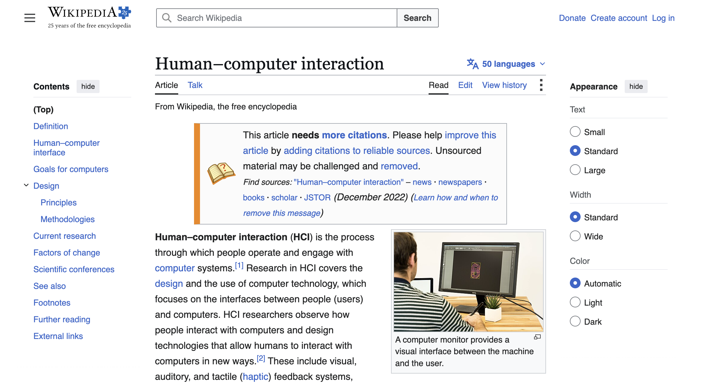
Wikipedia does show this sidebar by default on large enough viewports, but this is not an exception — just an auto-expanded settings panel.
Now, this alone is not evidence that dark mode toggles are a bad idea. A pattern can be widespread and still suffer from poor usability. And every UX innovation started off not being popular, so the reverse doesn’t hold either: a pattern can be unpopular and still be good. But in this case, I think they’re right. It suddenly all made sense to me: this doesn’t matter nearly as much to the average user as it does to us developers.
To be clear: “always light/dark, even against the OS” is a legitimate intent! But it is also a relatively rare one, and rare intents belong behind progressive disclosure — a settings surface — not in the one control every visitor sees.
In a textbook case of false-consensus bias, we have been so focused on our debugging needs that we convinced ourselves this is top of mind for the average user.
When is a persistent dark mode toggle a good idea?
A corollary from the reasoning above is that a dark mode toggle is a good idea when the website is developer-facing or developer-adjacent (e.g. a site for designers).
Experimental validation
Usability is a property of user outcomes, and no users were observed in any of this. Even my own article was derived from first principles and my experience observing users, but no actual observations of users interacting with dark mode toggles were made.
Per the previous section, I’m not convinced this is a problem worth solving. That said, if we do want to solve it, the best answer is obviously to get data from real user interactions.
However, there is a caveat here: qualitative user testing6 is less useful for infrequent microinteractions like this one.
Think about it: how would you design a meaningful qualitative experiment? At best, each participant would only interact with the toggle once. Most wouldn’t click it at all, unless the experiment was designed to show a website where the OS default theme is awful, which generalizes poorly.
Another easy bias in a controlled experiment is that it’s easy to bias the results by drawing attention to things that users would otherwise pay much less attention to. E.g. Vale wrote that the 3-in-2 switch was “intuitive and immediately understood by the great majority of people [they’ve] tested it with”. I strongly suspect these users were aware that something around dark mode toggles was being tested, and were paying a lot more attention to the control than they organically would.
I think the best way to get data for something like this is to record how users actually interact with the control, at scale, then analyze the data quantitatively. The experiment could involve different toggle designs as separate conditions.
Then, we could look at the data to answer questions like:
- How frequently do people interact with the control meaningfully (i.e. ending up with a different selection)? (to see if it’s worth permanent screen real estate)
- On a tri-state control, how frequently do users actually select the option that matches system but isn’t system? (to see if you actually need three states)
- For mouse users, how much time passes between hovering the control and making a final selection for each condition and how many clicks does it involve? (as a proxy for cognitive load)
- etc
By select above, I’m not referring to clicking, but the actual, final selection, to avoid noise from people playing with the control just to see what it does.
The big picture: Question the problem first
It is easy to get deep into a rabbit hole of trying our hardest to solve a problem that shouldn’t exist in the first place.
Especially for those of us with an engineering background, problem-solving comes naturally and it’s very hard to resist a challenging problem.
I’ve seen this happen repeatedly in many types of technical debates. It’s very common in standards groups as well: someone proposes a feature and the group starts debating the details before deciding whether the feature should exist at all.
Before any significant problem-solving task, it’s always good practice to step back and ask ourselves “is this a real problem worth solving?”.
You’d be surprised how often the answer is no.
during a CSS WG meeting where I was presenting several topics no less! ↩︎
It’s right up there with “simplicity”. I have seen developers happily shovel complexity downstream to users using “simplicity” as the justification. ↩︎
I’m not talking about you Bob! ↩︎
Most parents hugely overestimate how many people are interested in kidnapping their kids. In reality they struggle to even find someone to look after them for an evening, let alone take them forever 😅 ↩︎
or — perhaps more likely — never paid attention to one ↩︎
The kind where you get a few users and observe them using the UI to accomplish a task — i.e. what most people refer to as just “user testing” ↩︎