Poorly designed support flows frustrate users, but smart, intentional redesigns can turn a help center into an intuitive, self-service space that feels like a natural extension of the product. This improves the customer experience while reducing live support needs and helping internal teams spot common problems and solutions.
Help centers are no longer afterthoughts; they’re now core to digital product experiences and key drivers of user satisfaction, retention, and brand trust. Users expect support to be seamless, consistent, and personalized across every channel. If you visit any major company’s support page, you’ll notice familiar patterns that make them visually pleasing and easy to use. But these polished experiences took time and iteration to get right.
Let’s go through five real-world case studies that show how digital products transformed messy, outdated support systems over the years. We’ll see how these redesigns establish best practices for today’s sleek, modern support pages that serve both users and the business. At the end, I’ll summarize these insights and map them to action items you can take and an audit checklist to follow while designing your own help center UX.
Dropbox: Refactoring and redesign support UX
Dropbox’s support UX used to be inconsistent and confusing. Help flows didn’t match the product style, forms were overly complex, and users were unaware of what support was available to them (e.g., whether live chat existed on their plan).
Dropbox tackled the problem by running a heuristic evaluation and auditing best-in-class SaaS support flows, leading to several key improvements:
- Simplified navigation with card-based issue categorization
- Seamlessly integrated help articles alongside support options
- Adopted conversational, human-centered language
- Gated escalation to live support until self-service attempts were made
- Personalized support visibility, so features like live chat only appeared if they were part of the user’s plan
These changes resulted in cleaner, more intuitive support navigation, faster issue categorization, and a tone and flow that felt fully aligned with the core Dropbox UI.
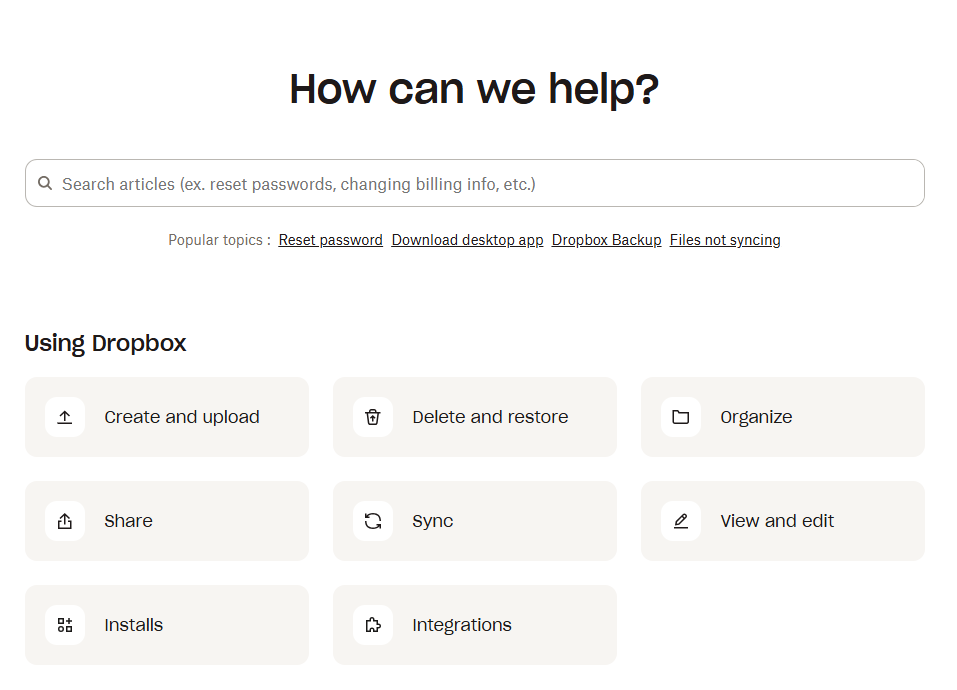
The MVP prototype quickly proved the value of the redesign, with users engaging meaningfully with the new support cards. The interface didn’t just look better; users could easily find and act on the help they needed without friction, reducing the need for live support while still delivering an experience that matched user expectations for a modern, digital-first help center:
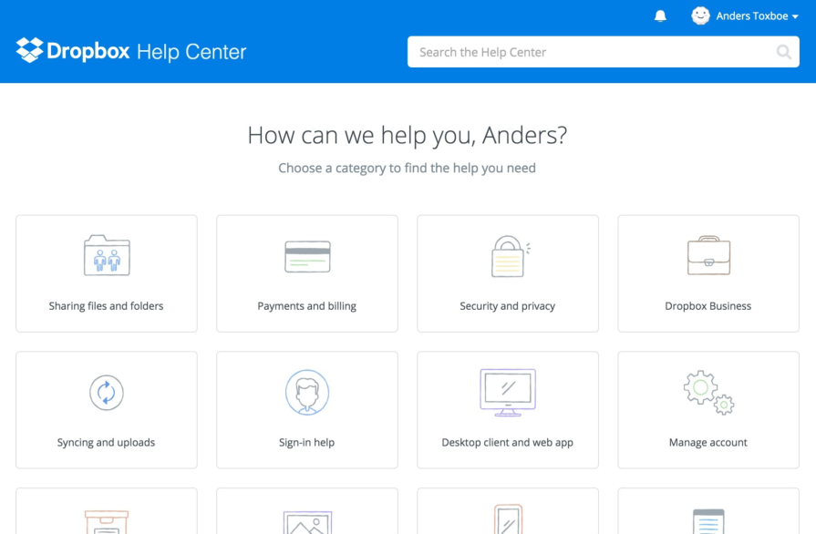
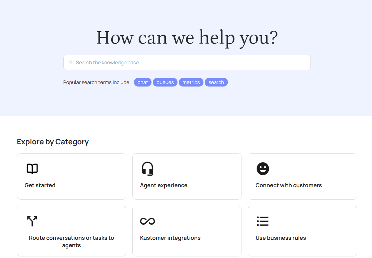
After this major UI rehaul, Dropbox has maintained the major elements of this polished, modern design through subsequent minor adjustments. Here’s how today’s Dropbox help center looks, with the search bar now under the welcoming “How can we help?” statement and more minimalist icons to reduce visual clutter:
What you can learn from Dropbox’s example
- Conduct a heuristic evaluation of your support flows against best-in-class SaaS examples to identify potential friction points
- Use card-based categorization to simplify navigation and help users self-identify their issue faster
- Write in conversational, human-centered language to create a friendlier experience with increased clarity
- Personalize support visibility so users only see the support options available in their plan, avoiding confusion and frustration
- Gate escalation to live support until self-service attempts are made, balancing cost efficiency with good UX
Litmus: Boosting retention through a centralized help center experience
Litmus, an email marketing platform, had its support resources spread across separate tools: Intercom for messaging and WordPress for the help center. Despite a solid product, support workflows were fragmented.
Litmus tackled its fragmented support experience by bringing all customer communication channels under one roof:
- Messaging, chat, and help center articles were consolidated into a single, unified interface, giving both users and agents a central hub for every interaction
- Agents, and the system itself, could now see a complete record of each customer’s history, eliminating the friction and delays caused by bouncing between multiple tools
The overhaul transformed Litmus’s help center into a smooth, cohesive experience where users could get answers quickly without the constant back-and-forth between platforms. By making self-service tools more visible and effortless to use, the new system encouraged customers to resolve issues on their own while still having easy access to human help when needed.
The impact was clear: customers who interacted with support in their first three months were 26 percent more likely to stick around, showing that a streamlined support journey can directly boost retention and overall customer loyalty.
What you can learn from Litmus’ example
- Consolidate all support channels and history into one hub to eliminate fragmented workflows
- Prioritize visibility of self-service tools to reduce unnecessary support tickets while still enabling human help
- Ensure agent context awareness by surfacing the entire history of user interactions in one view
- Track and tie support engagement to retention metrics – small UX refinements can have a measurable revenue impact
- Use centralization to make a good product feel exceptional through support experience, which can boost customer loyalty
Reply.Ai/Kustomer: Help center widget redesign
Back before Reply.Ai was acquired by Kustomer, their web-based help center was inefficient and frustrating, burdening users and customer service teams with redundant searches and low self-service efficacy. Their UX team approached the help center design overhaul with a research-first mindset:
- They started with heuristic analysis, user interviews, and usability testing backed by Google Analytics KPIs
- Based on their findings, they redesigned the widget with intuitive navigation, streamlined FAQs, and a clearer information hierarchy, ensuring every change addressed real user pain points
- Testing and refinement across both desktop and mobile led to a cleaner, less complex layout and a smoother task flow for self-service.
Multiple validation rounds showed a clear lift in user satisfaction, as the redesigned help center aligned more closely with real user needs. The result was an elegant, functional tool that reduced frustration, eased the support burden, and turned the help center into a genuinely helpful resource rather than a point of friction.
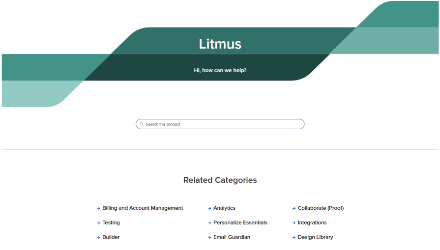
Reply.Ai carried these best practices through the larger rebranding effort after the acquisition by Kustomer. Here’s how their help center looks today:
What you can learn from Reply.Ai/Kustomer’s example
- Begin with UX research (heuristics, interviews, analytics) before redesigning — avoid making assumptions, which may cost you more time and effort along the way
- Redesign with information hierarchy in mind, making navigation intuitive and answers easier to find
- Validate changes with usability testing across devices to ensure consistency in both desktop and mobile flows
- Track KPIs tied to support success (e.g., reduced repeated searches, increased self-service resolution)
- Position your help center as a resource, not a barrier, by addressing pain points uncovered in testing
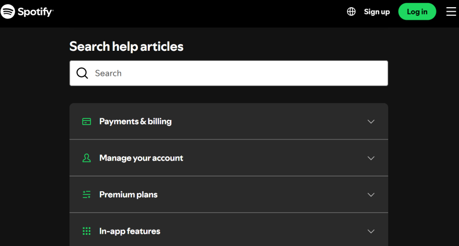
Spotify: Establishing an omnichannel support experience across chat, email, and social media
Spotify’s old help center was designed so that users could contact Spotify via multiple channels (chat, email, Twitter). Though this may initially seem helpful, allowing users to choose how to interact with a support agent, the reality was that the support experience became fragmented and frustrating for users and support agents alike.
To counter this, Spotify:
- Created a unified help center interface that kept context intact across every support channel through CRM and ticketing integration. This finally made it possible to integrate monitoring and pattern identification for escalation support
- Trained agents to follow up on previous interactions, no matter the medium, ensuring that customers never had to repeat themselves. This continuity was meant to transform support from a series of disjointed conversations into a cohesive, personalized experience
With a unified support system, Spotify could more effectively analyze qualitative data, identify pain points in customer complaints, and find the right way to solve them. This UX improvement took their help center to the next level and enabled agents to provide faster, more context-aware support, fostering stronger emotional connections through personalized human responses.
What you can learn from Spotify’s example
- Integrate all support channels (chat, email, social) into a unified help center with CRM/ticketing.
- Train agents to carry context forward so users never repeat themselves across channels.
- Use support data to monitor patterns and identify recurring issues for proactive fixes.
- Measure CSAT and resolution rate improvements to validate the impact of omnichannel support.
- Recognize that emotional connection in support (personalized responses, continuity) can strengthen brand trust.
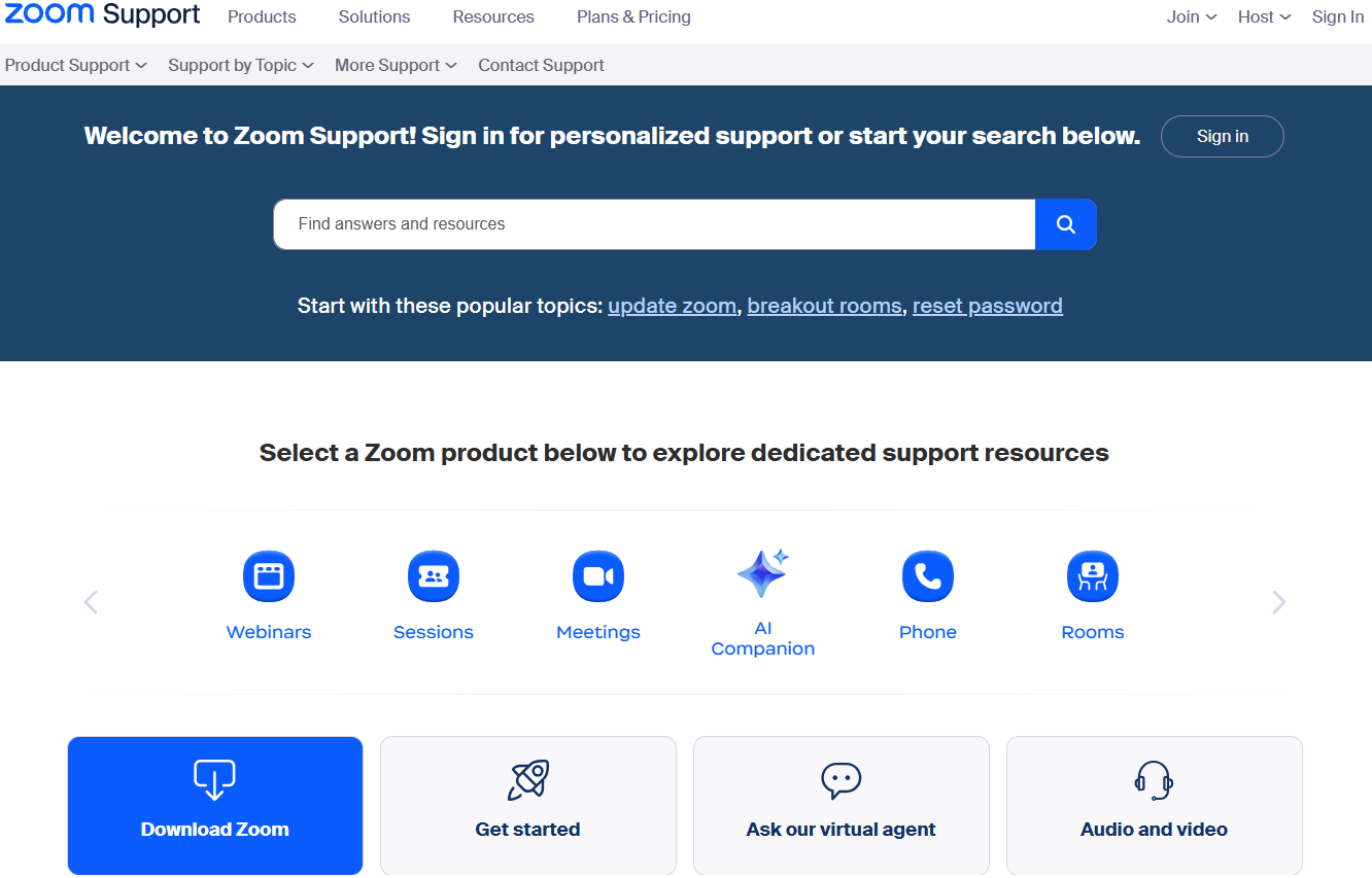
Zoom: Balancing modern features with established best practices
Zoom’s user base grew rapidly worldwide, which meant its support center had to handle a massive increase in questions across web, mobile, and even voice. At first, Zoom relied heavily on human support through live chat and tickets, but this approach created bottlenecks for both users and agents. Simple questions clogged the system, while customers with complex or urgent issues were left waiting.
To counter this, Zoom:
- Centralized support into a unified help center, powered by a single knowledge base that feeds answers consistently across AI chat, search, and phone/voice channels
- Introduced the Zoom Virtual Agent (ZVA), an AI chatbot that uses intent detection and smart semantic search to resolve common questions instantly
- Designed clear escalation paths to human agents when confidence was low, ensuring sensitive or complex cases still received personalized support
- Instrumented the system with Self-Service Rate (SSR) and CSAT tracking, so the team could continuously improve flows based on measurable outcomes
With this modernized help center, Zoom enabled users to resolve the majority of issues on their own with the AI agent, while also giving their human agents more time to focus on high-value cases. Zoom reports that its AI assistant and self-service-oriented help center resolve up to 97 percent of inquiries via self-service, boosting CSAT by 28 percent.
What you can learn from Zoom’s example
- Use AI chatbots and semantic search as the front door to self-service, but always provide a clear path to humans when confidence is low
- Keep a single knowledge base powering all channels (chat, search, voice) to ensure consistency and avoid duplicate answers
- Track metrics like SSR, CSAT, and resolution rates to guide ongoing UX improvements
- Recognize that automation works best when paired with thoughtful human escalation, which builds user trust
Patterns, insights, and best practices for help center UX
The four case studies we discussed above reveal clear patterns in what makes modern help centers effective. To sum it up, let’s map these patterns and insights to some best practices and action items you can take:
| Pattern/insight | Best practices/action items |
|---|---|
| 1. Information architecture & navigation — Clear categorization reduces friction |
|
| 2. Search & findability — Self-service works only if the search feature is effective |
|
| 3. Content quality & tone — Human-centered content lowers escalations |
|
| 4. Escalation & live support rules — Reserve live support for complex/urgent cases |
|
| 5. Omnichannel & integration — Unified systems reduce user frustration |
|
| 6. Measurement & iteration — Success comes from testing + data |
|
| 7. AI-powered self-service (if possible) — Augment human support with intelligent assistance |
|
Audit checklist: SaaS help desk
Pair the map above with the following audit checklist to ensure that your help center UX aligns with these patterns and best practices:
1. Information architecture & navigation
Can users identify their issue in ≤2 clicks?
Are categories labeled in plain language?
Is navigation consistent with product UI?
2. Search & findability
Do top results answer without scrolling?
Are search analytics tracked?
Does search support auto-suggest?
(If applicable) Does search leverage semantic/AI-powered matching for intent-based results?
3. Content quality & tone
Are help center articles scannable?
Do they include images/videos that walk users through each step?
Is the tone friendly/reassuring?
(If applicable) Are articles optimized for both human reading and AI retrieval (structured headings, metadata, FAQ-style)?
4. Escalation & live support rules
Are escalation rules clear?
Is context carried forward?
Is live support visibly available when needed?
(If applicable) Are AI-to-human handoff rules defined so that escalation happens smoothly without users repeating themselves?
5. Omnichannel & integration
Do agents see full customer history?
Is one knowledge base powering all channels?
Can users switch channels without losing context?
(If applicable) Is the AI assistant/virtual agent integrated across all channels (not just web)?
6. Measurement & iteration
Are self-service vs. escalation rates measured?
Is there a process for content gap analysis?
Are quarterly usability reviews in place?
(If applicable) Are AI performance metrics tracked (Self-Service Resolution %, escalation accuracy, CSAT impact)?
Together, these resources can serve as a help center UX audit framework. Teams can score themselves in each area to spot quick wins and prioritize redesign efforts.
Limitations and edge cases
While the patterns and best practices above offer strong starting points, there are important exceptions to keep in mind:
- Live chat gating isn’t universal — In sensitive areas like billing disputes, account lockouts, or privacy concerns, forcing self-service first may frustrate users and erode trust
- Over-simplification risks alienating advanced users — Technical or professional audiences may need depth and precision rather than overly “friendly” or lightweight copy
- Not all users search the same way — Some may prefer browsing, while others struggle to articulate their problem (search-only approaches can exclude them)
- Omnichannel expectations may outpace reality — Some platforms (e.g., social DMs) can’t fully integrate seamless handoffs
- Metrics don’t tell the whole story — A drop in support volume might look positive, but it could hide unresolved frustration or silent churn in key segments
How I applied these best practices to reduce live support needs, improve SEO, and boost revenue
At one point in my career, I learned about the Dropbox case study and decided to use some key lessons from it to increase profit in one of my projects. Building on the lessons from Dropbox’s redesign, I led an initiative to optimize live chat triggers on our platform:
- Instead of showing chat to every visitor, we identified specific user behaviors and page contexts that indicated a higher likelihood of meaningful engagement
- By tailoring triggers to these scenarios and introducing delayed activation, we avoided overwhelming our support team while still offering help at the right moment
- We also filtered out low-value markets that historically generated minimal revenue, focusing support where it truly mattered
Over time, these adjustments reduced live support load by roughly 50 percent, improved SEO by minimizing intrusive pop-ups, and even increased overall revenue, as interactions were both more targeted and higher in quality.
This hands-on experience reinforced the principle that careful UX design and thoughtful automation can simultaneously enhance the user experience, reduce friction, and deliver measurable business impact.
Conclusion
The evolution of help center UX is no longer about building a “support page” — it’s about creating an experience that feels as intentional, polished, and user-centric as the product itself. Well-executed redesigns can do far more than solve user problems; they can strengthen brand trust, drive retention, reduce operational costs, and even increase revenue.
As we can see from these case studies, the brands that treat help centers as a living, evolving part of their UX strategy will not only resolve more issues but will turn every support interaction into an opportunity.
The post 5 support page redesigns that transformed help desk UX appeared first on LogRocket Blog.