A confirmation dialog is that little pop-up you see when you’re about to take an action and need to double-check if you’re sure. It asks for your decision before moving forward. Such a double-check warning message UI is helpful when the action could have a big impact, like deleting a file or confirming a purchase.
In software design, confirmation dialogs are often used to double-check user actions and help prevent mistakes. They’re also handy when the software needs the user’s permission for something it can’t do on its own — like installing an update or making a change to the system.
In this article, I’ll walk you through the role of confirmation dialogs and share some best practices for creating ones that are easy to use and effective. Plus, we’ll take a look at how two popular software products handle their confirmation dialogs.
When to use confirmation dialogs?
We can directly execute most UI interaction-based actions and perform most background system operations automatically without explicitly requesting user confirmation, but we should use confirmation dialogs in the following special scenarios to prevent user errors and respect user rights:
Actions with irreversible consequences
Software interfaces display some UI components that lead to irreversible consequences. Users can click on these special UI components and execute irreversible actions by mistake or without fully understanding the consequences. By displaying a confirmation dialog, we can double-check user interactions and prevent users from accidentally entering irreversible actions.
Here are some example scenarios where you should ask for user confirmation to prevent UI interaction errors:
- Deleting data records or files permanently from physical storage
- Deleting an account or leaving a service via a UX exit flow
- Closing the app with unsaved data or settings
- Closing a model dialog with unsaved entries in form elements
- Placing a blockchain transaction
- Sending an important email or SMS
See how the Ubuntu operating system warns users when they try to delete a file permanently from the physical storage:

Operations that significantly impact user data, settings, or context
Confirmation dialogs are also helpful in warning users about the results and side effects that need the user’s attention. These actions are typically reversible, but their results and side effects can cause frustrations and stressful thoughts if users select a particular action by mistake or do not fully understand the outcomes.
Some users even click on specific UI elements to see what they do without being serious about their interaction with software products. So, asking user confirmation for actions that significantly impact user data, settings, or context also prevents user errors and effects of mindless UI interactions.
Here are some example scenarios:
- Making a specific data record public from the private state
- Activating an important automated action, i.e., scheduling a periodic task that updates user data
- Enabling/disabling an app setting or feature that impacts other functionalities, i.e., activating an energy-saving feature
- Logging out from an app
Situations requiring user acknowledgment before proceeding
Apart from UI interaction-driven operations, a software product invokes background operations based on various execution schedules. Most internal system operations, like database optimizations and base functional operations, can be executed without explicitly requesting user interaction, but we should ask for user acknowledgment before proceeding with operations that connect with basic digital user rights. Moreover, software products often ask for user acknowledgment for operations that the software system can’t alone decide to execute without asking user permission or choice.
Here are some example scenarios where you should display a confirmation dialog before proceeding with an automated action:
- Installing updates for a software product
- Removing duplicated data entries or images found in an app
- Using a faster route instead of the current user-selected route in a navigational app
- Turning on optimization or energy-saving features based on a specific condition, i.e., activating a lightweight, minimal theme for a slow device
- Restarting the device after performing a core configuration change or system update
See how the Ubuntu operating system displays a confirmation dialog before installing software updates automatically:

Best UI practices for double-check warning messages
A confirmation dialog temporality halts a specific task execution and requests the user to continue or cancel, so we should design its message, and action buttons effectively to let the user quickly make the right decision.
Adhere to the following best practices to create effective, but user-friendly confirmation dialogs in your software UIs:
Use clear and concise language for the message
Designers often use confirmation dialogs for data deletions or other critical actions. If the user deliberately selects a specific action, the user expects to know the consequences and side effects quickly. Even if the user takes an action by mistake, the user seeks the selected action name quickly. So, we should aim to describe the requested action and consequences effectively using clear and concise language.
Using unclear and long confirmation messages creates unwanted confusion and wastes the user’s energy and time, causing frustration. Use clear and concise confirmation messages with a friendly tone even if the consequences are irreversible and dangerous:

Provide distinct options with clear labels
A confirmation message typically offers two options: confirming the selected action execution or canceling it. Some design scenarios can introduce a third option as well. We should carefully implement distinct options for confirmation dialogs using clear labels to support users in making the right decision.
Past UI designers always used the traditional confirm button as the primary option, but modern UI design recommends using the intended action name as the primary option. Clearly labeling the primary action button using not more than two words and using the generic cancel word as the cancellation option helps users make the right decision faster:

Avoid unnecessary confirmation dialogs
We use confirmation dialogs assuming that users can make UI interaction mistakes, but users practically don’t always make errors while using software products — experienced users perform accurate UI interactions to complete their tasks productively. So, we shouldn’t add unnecessary confirmation dialogs that increase UI interaction events count — asking for user confirmation requires one additional mouse click or keystroke and also increases user cognitive load.
Avoid using a confirmation dialog if the requested action is not likely to be triggered by a user error, i.e., a confirmation dialog is not required if the logout action is placed within an expandable menu.
Avoid using confirmation dialogs for primary actions that users usually use with caution or for frequent primary actions:

Using visually prominent design ideas
When a confirmation dialog arrives on the screen, the current interaction context should go to it to support accurate user decision-making, so we should design high-quality confirmation dialogs using a visually prominent design based on the following design ideas:
- Highlight the confirmation dialog and set it as the primary interaction context by displaying it on a semi-transparent backdrop layer or with other similar effect
- Use a clear dialog box background color that sharply visualizes the message and available options
- Use a suitable background color for the primary option based on the action severity, i.e., a red color variant for permanent data deletions
- Use the default button style for the cancel option and reduce its importance to highlight the primary option, but don’t use a grey color variant that generally indicates disabled actions
- Using appropriate icons before the confirmation message helps users understand the consequences before reading the message, so consider using icons if other parts of the app design effectively use icons
- A confirmation message is so important, but don’t capitalize words or the entire message since capitalized text can tempt users and is unfriendly
- Adhere to design guidelines offered by the operating system or framework if available, i.e., macOS recommends placing the confirm option button after the cancel option, but Windows recommends the opposite
Visually prominent confirmation dialog design is great, but make sure not to create more intrusive designs:

Allow users to dismiss the dialog easily
Even if we highlight the confirm action in confirmation dialogs and let the user continue executing the requested action, users often need to use the cancel option. Users typically select the cancel option if they initiate a critical action by UI interaction mistake or change their intention after realizing the consequences.
Confirmation dialogs usually offer the cancel option as an action button, but implementing the following methods to dismiss helps users cancel confirmation dialogs faster by eliminating user frustration points:
- Clicking the outside region of the dialog
- Pressing the escape key on desktop and laptop computers
- Pressing the back button of Android devices
- Clicking a dedicated close button placed on the top right corner of the dialog
Alternatives to confirmation dialogs
Designers mostly use confirmation dialogs as a solution to prevent user errors, but double-checking user actions is not the only solution for UI interaction error prevention. In some scenarios, confirmation dialogs are mandatory, but you can choose the following alternative solutions for some design scenarios as well:
Undo functionality for reversible actions
If a specific action can be reversed easily under your current product design specifications, a confirmation dialog typically adds an unwanted user interaction step. For example, if you move a data record to a recoverable storage section, aka trash bin, after deletion, users can easily recover it even if they delete it by mistake.
Displaying a toast message with the undo option is a good alternative to traditional confirmation dialogs for preventing user errors.
For example, see how the Google Keep note-taking app implements an undo option instead of using a confirmation dialog for note delete action:

Using inline warnings or tooltips for less critical actions
Some UI interaction-based actions are reversible and have less critical consequences, but we may have to mention the consequences to prevent user errors. A general software product may contain many less critical actions, so using confirmation dialogs for each action can introduce excessive dialogs to the system, causing user frustration.
Alternatively, inline warning messages (inline alert boxes) and tooltips can state the consequences of a less critical action without affecting the user’s current working context.
Here are some example scenarios where designers can consider using inline warning messages to prevent user errors:
- When the user tries to use a duplicate item name in an inventory management app, the product details form can display an inline warning instead of showing a confirmation dialog before saving the new item
- Describing a feature that possibly drains the battery within a warning box before the toggle switch without asking user confirmation before activating the specific feature
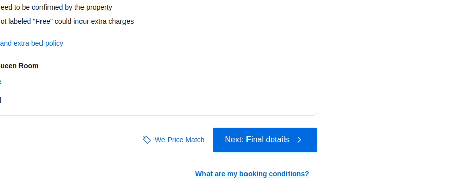
The Booking.com website uses a stylish tooltip to display the summary of reservation details before navigating to the final details section without showing a confirmation dialog:
Using error-prevention design techniques to minimize confirmation dialogs
Confirmation dialogs double-check user interactions by pausing selected action executions, so designers use them with UI elements or keyboard shortcuts that are prone to user interaction errors. For example, if a software interface always displays the logout button on the primary app surface, designers typically use a confirmation dialog to prevent accidental logout action triggers.
In some situations, we can adjust the design to minimize confirmation dialogs. For example, we can remove the confirmation dialog for the above logout action scenario by reducing the probability of clicking the logout action by mistake, i.e., placing the logout action within the primary app menu.
Here are some error-prevention design techniques that help you minimize confirmation dialogs:
- Placing critical action buttons after all frequent, general, and less-critical interaction areas
- Placing critical action buttons away from the primary app surface, i.e., using menus, tabs, pages, expandable sections, etc
- Aggregating critical action buttons into one section with a suitable color theme and title that indicates the severity of consequences
Examples of good double-check warning message UIs
Let’s study the confirmation dialog designs of two popular software products and evaluate their effectiveness.
Case study 1: Deleting files from Google Drive’s trash bin
Google Drive, a popular cloud storage solution, has a well-designed, user-centered UI design that adheres to minimal, modern design concepts. Drive doesn’t display a confirmation dialog while deleting files, since deleted files are recoverable from the trash bin. So, it uses a tooltip with the undo action after file deletion.
Removing files from the trash bin is irreversible, so Drive implements a confirmation dialog.
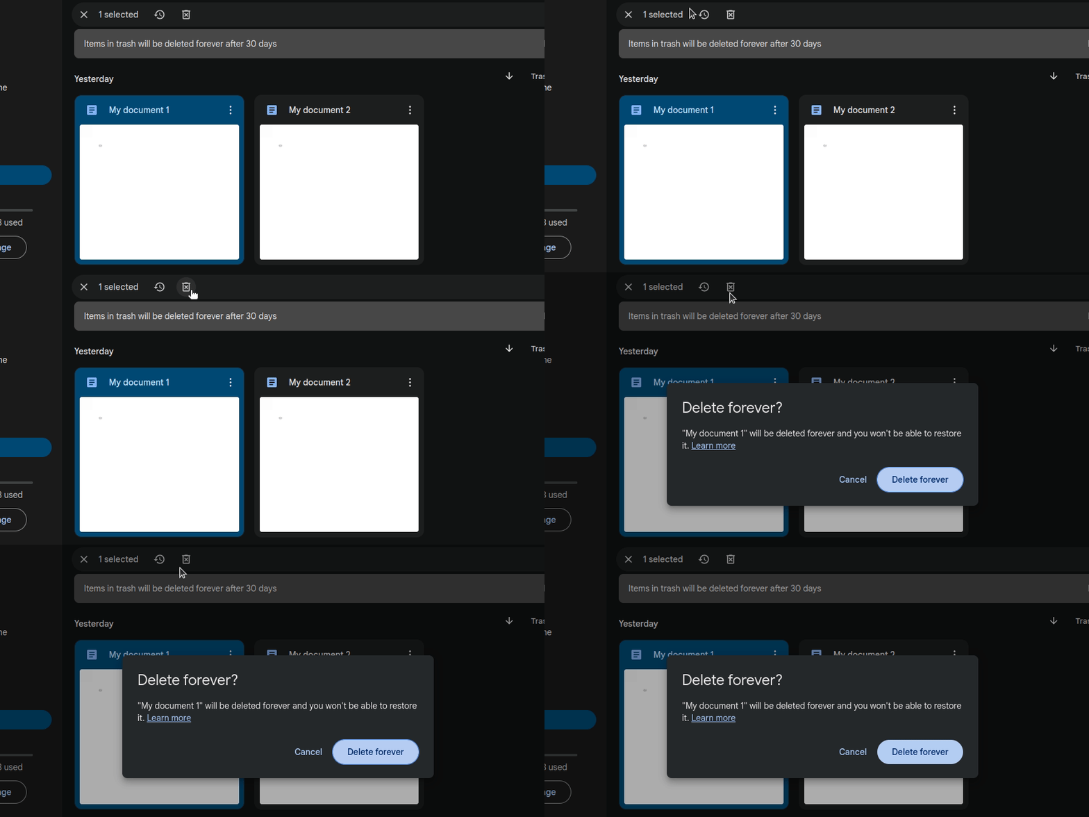
Deleting a single file (or multiple selected files) from the trash bin displays the following confirmation dialog:
Notice the following design facts:
- Uses a simple casual question for the title
- States the action and consequences clearly only using just one sentence and displays a link to learn more about the deletion process
- Clicking the “Learn more” link doesn’t open a new tab or close the dialog — the help modal dialog describes deleting files without interfering with the opened confirmation dialog
- Displays distinct options and uses a blue-color variant for the primary option
- Displays a semi-transparent backdrop layer and lets users dismiss it by clicking outside
- Implements keyboard support: escape key to dismiss and return key to continue
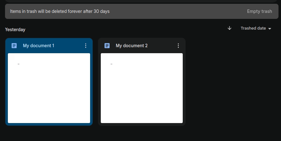
Emptying the trash displays the following confirmation dialog:
Notice the following design facts:
- Uses a red color variant for the primary option since continuing with the primary action deletes all trash bin files permanently
- Even if emptying trash displays a confirmation dialog, Drive places the “Empty trash” within an alert box using a less-appealing text button to prevent user errors
Google Drive implements simple, friendly, and effective confirmation dialogs using suitable visual styles and a casual language tone.
Case study 2: Confirmation dialogs in the Android settings app
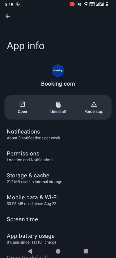
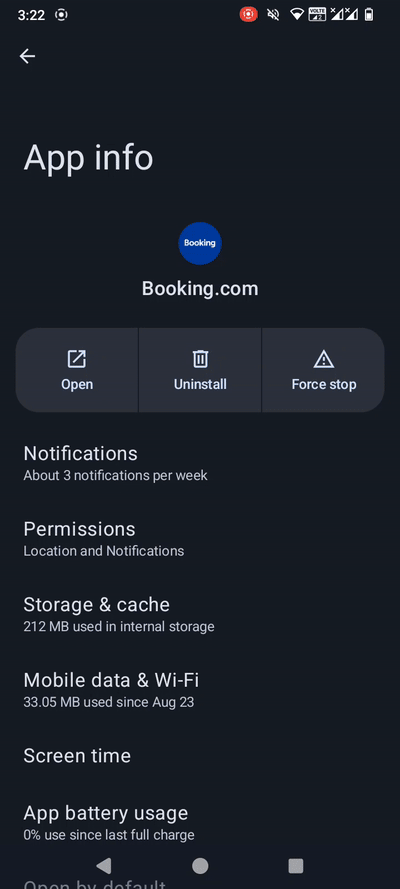
Android, the most popular mobile operating system, offers a fully-featured settings app for handling core operating system configurations. The settings app offers a separate section to manage installed apps. It lets users uninstall and force stop a specific app using two primary action buttons, and implements a secondary section to clear app storage and cache:

Uninstalling an app is a critical action that removes stored app and related files, so the settings app shows a confirmation dialog as follows:
Notice the following design facts:
- Uses the selected app name as the title
- States only the action without consequences in the confirmation message since uninstalling an app is a well-known, self-explanatory operation
- Displays a semi-transparent backdrop and lets users dismiss it by touching outside
- Uses “OK” as the primary action instead of using the uninstall wording in the label to match the question-type confirmation message
- Implements the back button support: users can touch/press the back button to dismiss the dialog
The app force-stop action also displays a confirmation dialog with a similar design:
Notice the following design facts:
- Uses a question-type action name as the title
- Describes consequences shortly using one word: “misbehave”
The above confirmation dialogs use “OK” as the primary option label, but the settings app states the selected action for deletion events. For example, see how removing app data displays a confirmation dialog with the “Delete” button label:
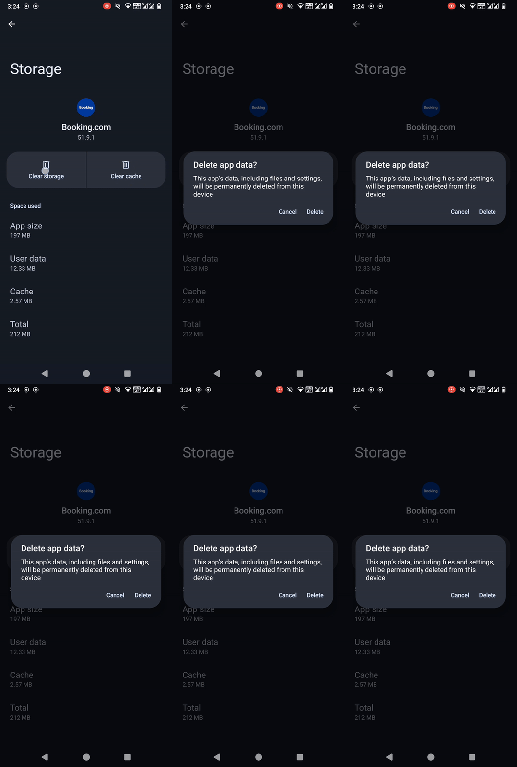
The settings app clears the app cache immediately without displaying a confirmation dialog since it won’t affect the app functionality like the clear storage action.
The Android settings app implements confirmation dialogs using the shortest possible title and message, maintaining understandability and friendliness. They typically use the traditional “OK” label to simplify action button labels using question-type titles and messages. However, the settings app uses the action name as the primary option label (i.e., delete) for data deletion actions.
Conclusion
In this article, we studied the role of confirmation dialogs and understood how to design effective, friendly, and high-quality dialogs to request user confirmation for actions. Confirmation dialogs help designers prevent users from accidentally triggering critical actions via UI interaction mistakes, so using them effectively can make your software product safer for users. Some products even ask for password confirmation to make software products more secure and safer.
Confirmation dialogs typically temporarily halt requested user actions, so using them for less critical actions undoubtedly affects product usability. To balance safety and usability in software UIs, optimally use well-designed confirmation dialogs only for required actions and alternatively use undo features, inline warnings, tooltips, and error-prevention design techniques for less critical actions.
The post Double-check user actions: All about warning message UI appeared first on LogRocket Blog.