A button is arguably the most likely component to find itself in your codebase so I’m going to show you how I approach building one. The hope is it demystifies the humble button and encourages folks who reach for a <div> and a JavaScript handler to use semantic elements.
What we’re building
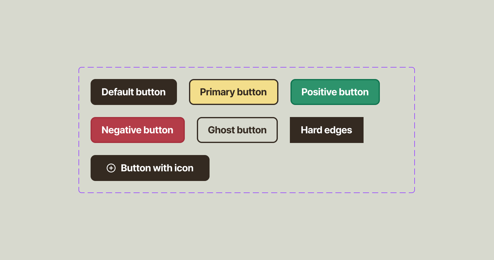
We’ve got a pretty standard button with three variants, a “ghost” version (outline only) and a version with hard edges. The icon version doesn’t count as a variant because we’re building the button to support icons as standard.
Just with that collection, there’s quite a lot of variety in colour treatment especially, so a lot of our focus is how to keep that manageable in the long term.
HTML first, always
Let’s first take a look at the HTML.
<!-- Actual button -->
<button class="button">A button</button>
<-- Link button -->
<a href="/" class="button">A button</a>
Hopefully I’ve answered the inevitable “why not style the HTML <button> element?” question with both <button> and <a> elements being represented. There’s also an argument to not use buttons for links — mainly because <button> elements can be activated with the space key and links can’t. Button links are an extremely common user interface pattern so today, I’m in the business of presuming you’re gonna use them so I can at least show you how to do it well from a CSS perspective.
In terms of deciding when to use a <button> or an <a>, here’s my rule of thumb:
- Does it trigger a page change?
<a> - Does it trigger something interactive?
<button>
For the icon version, the HTML markup looks like this:
<a href="#" class="button">
  <svg aria-hidden="true" width="16" height="16" viewBox="0 0 16 16" fill="none" xmlns="<http://www.w3.org/2000/svg>">
    <!-- SVG innards redacted because life is too short -->
  </svg>
  Button with icon
</a>
The main thing to alert you to here is the aria-hidden="true" attribute. In almost every case, an icon within a button is decorative, so it’s better to hide it from screen readers. Hiding it from screen readers allows them to focus on announcing whether it is a button or a link and what the label is too, which results in a better overall experience.
The width and height attributes will be ignored when we apply icon sizes with CSS, but they’re useful for if the CSS doesn’t load. Without them, the SVG will fill the width of its container, which with no CSS available, will be the whole viewport.
Base component CSS
The aim of the game with this component is to make it maintainable and a good way to do that is to make it configurable. What I mean by that is instead of setting properties like background and color in each variant, we should instead power those properties with variables — also known as custom properties.
Let’s make a start on our component CSS and I’ll explain as we go.
.button {
/* Configuration */
--button-padding: 0.7em 1.2em;
--button-gap: 0.5em;
--button-bg: #342a21;
--button-color: #ffffff;
--button-hover-bg: #4b4b4a;
--button-hover-color: #ffffff;
--button-border-width: 3px;
--button-border-style: solid;
--button-border-color: var(--button-bg);
--button-radius: 0.5em;
/* Layout and spacing */
display: inline-flex;
align-items: center;
gap: var(--button-gap);
padding: var(--button-padding);
/* Colours */
background: var(--button-bg);
color: var(--button-color);
/* Stroke and radius */
border-width: var(--button-border-width);
border-style: var(--button-border-style);
border-color: var(--button-border-color);
border-radius: var(--button-radius);
/* Typography */
text-decoration: none;
font-weight: var(--button-font-weight, 700);
font-size: var(--button-font-size, 1em);
letter-spacing: 0.05ch;
font-family: sans-serif;
line-height: 1.1;
/* Interactive */
cursor: pointer;
}
There’s always a wall of CSS when you’re making buttons, so to make things easier to digest, I’ve broken the CSS properties and values into nice logical groups. Let’s break them down.
Configuration
--button-padding: 0.7em 1.2em;
--button-gap: 0.5em;
--button-bg: #342a21;
--button-color: #ffffff;
--button-hover-bg: #4b4b4a;
--button-hover-color: #ffffff;
--button-border-width: 3px;
--button-border-style: solid;
--button-border-color: var(--button-bg);
--button-radius: 0.5em;
Quite a lot of these are self explained colours. I just want to highlight that I recommend setting a hover colour (--button-hover-color) explicitly because you absolutely want to make sure your text has sufficient contrast with the background, regardless of variant.
You’ll spot later in the article that for some properties, I’m looking for a custom property and setting a fallback value like this:
padding: var(--button-padding, 0.7em 1.2em);
You might be wondering what the decision process is in deciding whether to add a custom property in the big ol’ block of them at the start of a component or to do the above. There’s no absolute rule as I see it. I tend to add to the big ol’ block if there’s a 100% chance that the variable is going to change per variant because surfacing them up there makes it easier to see what is configurable for my colleagues.
Layout and spacing
display: inline-flex;
align-items: center;
gap: var(--button-gap);
padding: var(--button-padding);
Next up, I like to group layout and spacing together. For a button, I recommend setting display to inline-flex or inline-block. If you are 100% sure there will be no icons, then opt for inline-block. Both of these options give you characteristics of a block-level element but importantly, will still flow inline with text.
If you were to use block or flex as the value for display, the button would automatically fill the horizontal (inline) width, which is not ideal. You could control the width with the following if you absolutely want to do that:
.button {
  max-width: max-content;
}
I don’t personally see a reason to do that, so I opt for the inline- prefixed options because I know compositional layouts will control the rest for me.
Stroke and radius
border-width: var(--button-border-width);
border-style: var(--button-border-style);
border-color: var(--button-border-color);
border-radius: var(--button-radius);
You indeed read right — I skipped colours. They’re super straightforward representations of the configuration options we set earlier. The same can be said for borders and radius, but there’s a couple of bits I wanted to cover with those.
Firstly, I break border into individual properties so each part can be configurable. Unfortunately if you did this: border: var(--button-border-width) var(--button-border-style) var(--button-border-color), it wouldn’t work. Frustrating, yes, but we are where we are.
Second, I recommend always setting a border value because if you use a <button> element, it’ll have the user agent stylesheet version. I think this alone is why a lot of JavaScript orientated folks like to use <div> elements (don’t do that). I can’t think of another reason why someone wold commit such a crime 😅
Anyway, another reason to define a border, even for an element that has a solid background is that if like our context, you’ve got a border-only button (known as “ghost” buttons) and a solid button sat next to each other, they will be the same height. That won’t be the case without borders and it’ll look weird.
Typography
text-decoration: none;
font-weight: var(--button-font-weight, 700);
font-size: var(--button-font-size, 1em);
letter-spacing: 0.05ch;
font-family: sans-serif;
line-height: 1.1;
There’s a couple of examples of looking for a custom property and falling back to a default value here. It’s unlikely that font-weight and font-size are going to be configured in a variant, but it’s useful to present that option for in-context configuration in another component, where .button is a child:
.my-component {
  --button-font-size: 2em;
}
FYI
This is also why I like to prefix custom property names with the component name, even though they’re technically scoped to .button. It makes things easier to understand!
One thing I do want to point out is line-height. If you don’t set this, <a> buttons and <button> buttons will be different heights because they usually have different line heights from user agent styles. I chose 1.1 because text won’t overlap with our chosen font if it wraps on to multiple lines.
A thing you might think I’m being overly specific about is the font-family. Even though our global styles for the body define the font we want to use (sans-serif), it’s still a good idea to define it in our .button styles. This is for if the button finds itself in a parent that defines a different font.
Interactive
cursor: pointer;
I imagine I’ll be yelled at for this, but I set cursor: pointer because I like a consistent user experience. There probably will forever be a debate that <button> elements should not use a pointer cursor, but I firmly side on yes, use pointer. Meet user expectations!
This is how it’s looking so far. A big cluster of the same button.
See the Pen Buttons - Core only by Andy Bell (@piccalilli) on CodePen.
Sizing the icon
Time for a pro tip: use relative units like em units and lh units to size icons. It means as the text size increases or decreases, your icon will size relative to that change.
For our button, I’ve opted for the cap unit, which to simplify, is the height of the chosen font’s capital letters. Because buttons are often capitalised or even uppercase, that makes more sense than an ex unit (height of the lowercase “x” character), especially.
.button svg {
  height: var(--button-icon-size, 1.2cap);
  width: auto;
}
By setting width as auto, we can maintain that nice square aspect ratio too or if it isn’t square, maintain relative proportions.
See the Pen Buttons - icon styles by Andy Bell (@piccalilli) on CodePen.
Interactive styles
Let’s target our hover, focus and active states, starting with hover:
.button:hover {
  background: var(--button-hover-bg);
  color: var(--button-hover-color);
}
Right now, all we need to apply the already existing custom properties from earlier. Job done.
.button:focus {
  outline-width: var(--button-outline-width, var(--button-border-width));
  outline-style: var(--button-outline-style, var(--button-border-style));
  outline-color: var(--button-outline-color, var(--button-border-color));
  outline-offset: var(
    --button-outline-offset,
    calc(var(--button-border-width) * 2)
  );
}
You must provide a focus style for interactive elements. There’s no excuse to remove outline, especially as browsers will honour your border radius now too. What I’m doing here is looking for specific outline custom properties then falling back to the border style. For the offset, I’m again looking for a specific custom property and falling back to a multiple of the border width, which gives us a nice consistent gap between border and outline.
One thing I’ll note is that you need to test your focus styles in various contexts and set --button-outline-color if there’s not enough contrast.
.button:active {
  transform: scale(99%);
}
When I say active, I mean the :active pseudo-class, rather than an .active/.is-active state. This is what I like to call the “pressed state”. It’ll only trigger when a user presses the button or clicks (without releasing).
Because of this, I like to make buttons a bit squidgy with a little 1% reduction in the element’s scale. It’s a nice touch which makes buttons feel like they’re actually being pressed.
See the Pen Buttons - interactive states by Andy Bell (@piccalilli) on CodePen.
Variants
Right, everything gets easy from this point. Because our button is really configurable, our variants (primary/positive/negative) are a case of declaring some custom properties.
.button[data-button-variant="primary"] {
  --button-bg: #f3de8a;
  --button-color: #342a21;
  --button-border-color: currentColor;
  --button-hover-bg: #f1d979;
  --button-hover-color: #342a21;
}
.button[data-button-variant="positive"] {
--button-bg: #2d936c;
--button-border-color: #107350;
--button-hover-bg: #359d75;
}
.button[data-button-variant="negative"] {
--button-bg: #b33c48;
--button-border-color: #a62f3d;
--button-hover-bg: #c24a56;
}
If you’re wondering why I’m using data attributes, head over to the CUBE CSS Exception documentation. In short, I prefer to use data attributes to achieve a more finite state change than risk that my element has multiple, conflicting classes.
Creating variants in the long term will also be a case of declaring some colours. It also means if the core component needs changes made to it, you don’t have to update every variant.
See the Pen Buttons - variants by Andy Bell (@piccalilli) on CodePen.
Ghost buttons
I don’t know why we call border-only buttons ghost buttons. If someone wants to wade through the internet to find out, go for it, but we’re here today to write some CSS.
.button[data-ghost-button] {
  --button-bg: transparent;
  --button-border-color: currentColor;
  --button-color: currentColor;
}
Again, just like with variants, all we need to do is define some custom properties. For ghost buttons, it’s a good idea to use the currentColor keyword because the button will inherit its parent’s colour then. If we specified them as the dark colour, they would disappear on dark backgrounds!
See the Pen Buttons - with ghost styles by Andy Bell (@piccalilli) on CodePen.
Hard edges
Finally, let’s make a quick version of the button with no rounded corners:
.button[data-button-radius="hard"] {
  --button-radius: 0;
}
You guessed it: custom properties and job done!
Wrapping up
With all that done, here’s our collection of button component instances with their variants.
See the Pen Buttons by Andy Bell (@piccalilli) on CodePen.
I’m hoping you took something away from this today. If you did, let us know! Most importantly, if you use <div> for buttons, I hope this guide shows you how simple it is to style actual button elements too.