I’ve been excited by the potential of text-box-trim, text-edge and text-box for a while. They’re in draft status at the moment, but when more browser support is available, this capability will open up some exciting possibilities for improving typesetting in the browser, as well as giving us more control of alignment and internal spacing in our components, such as a button.
Daniel Schwarz wrote a great deep dive into the current proposal for these two CSS properties, but in this article I’d like to give you an even more solid understanding of the problem this new CSS capability is solving.
Aligning text on the web has historically involved a level of compromise. Much of this is down to how fonts render in the browser, and inconsistencies in how different fonts take up space within their text box.
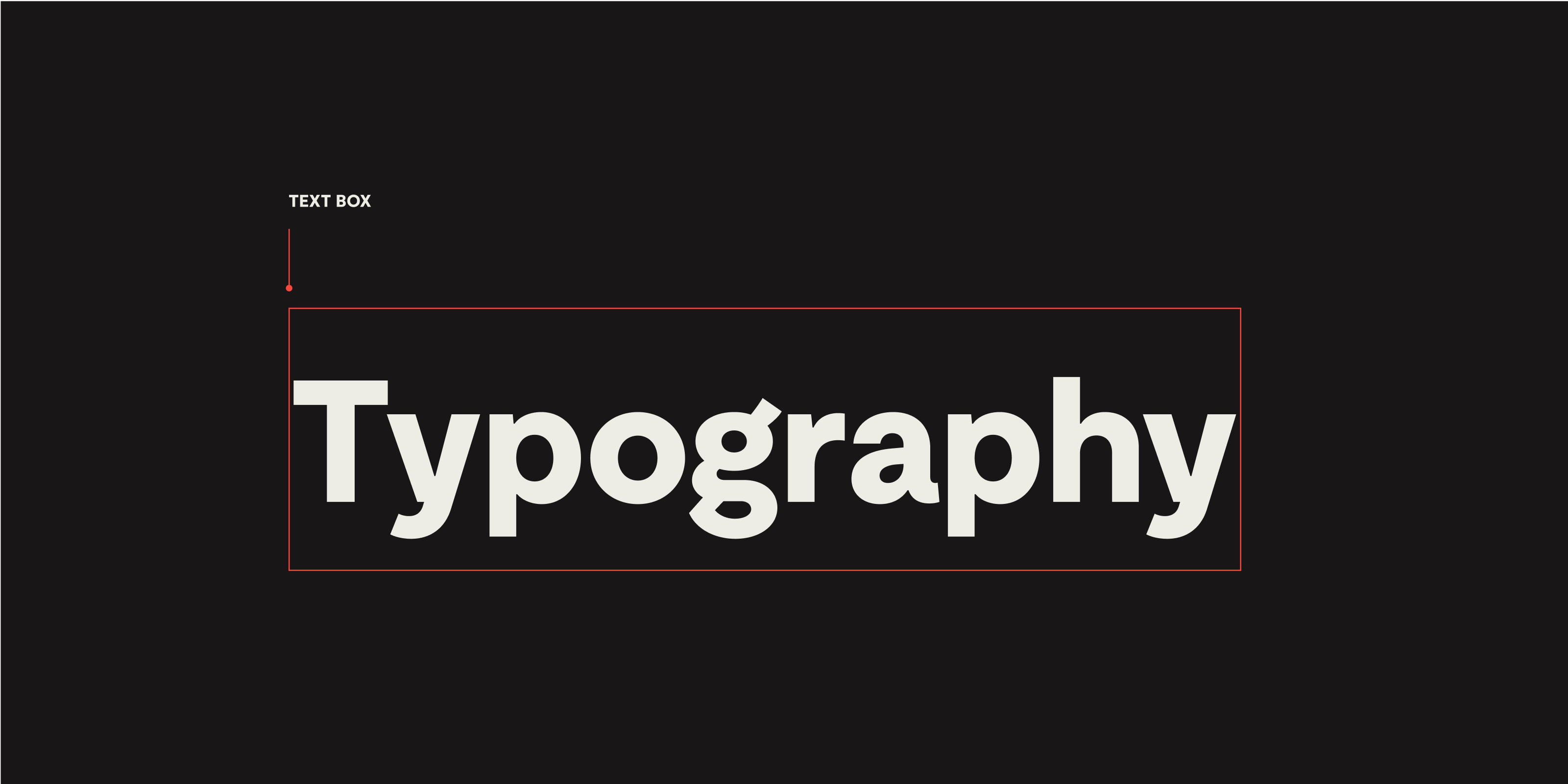
This diagram shows the text box for Moderat Extrabold, the headline font we use for Piccalilli. The box is cropped pretty tight horizontally, but vertically there’s a lot of space above and below, which can make typesetting tricky, especially when combining fonts which may have different amounts of space above and below (which we’ll come to later).
What makes up all that extra space? There are a lot of factors involved, and the spacing can differ greatly from font to font. Let’s break it down.
A primer in font metrics
It’s good to have some context for the metrics that influence the spacing within a font. Here’s a visual breakdown of the vertical metrics within Moderat Extrabold.
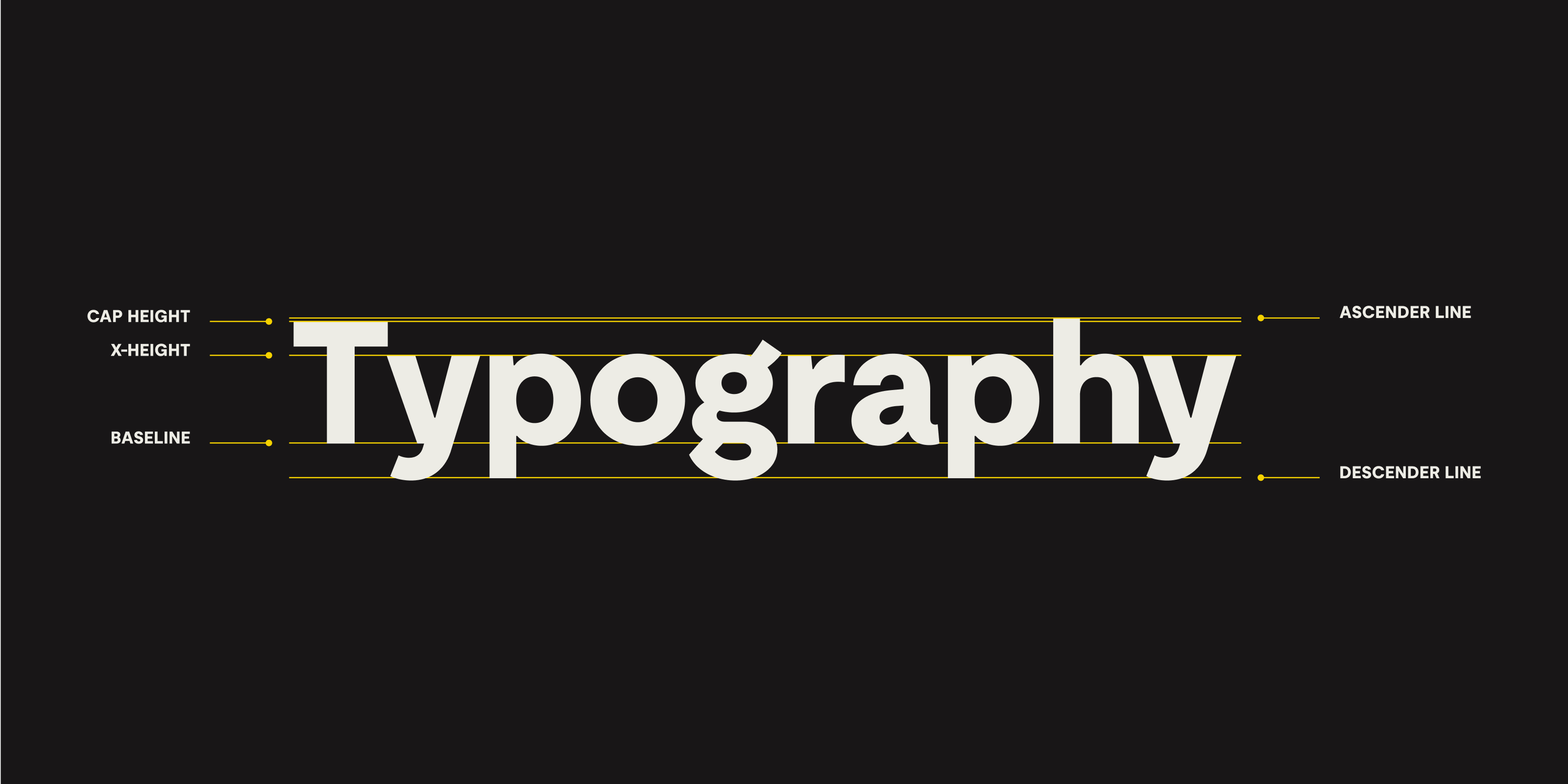
The ascender and descender lines mark the boundaries of the font’s geometry. In general, ascenders and descenders will extend to these lines. Letters with curved or angled forms generally overshoot these lines ever so slightly, to achieve visual balance alongside their straight-edged counterparts.
As you can see below, in some fonts, certain ascenders will sit below the ascender line. Check out the lowercase “t” here in Moderat below, for example.
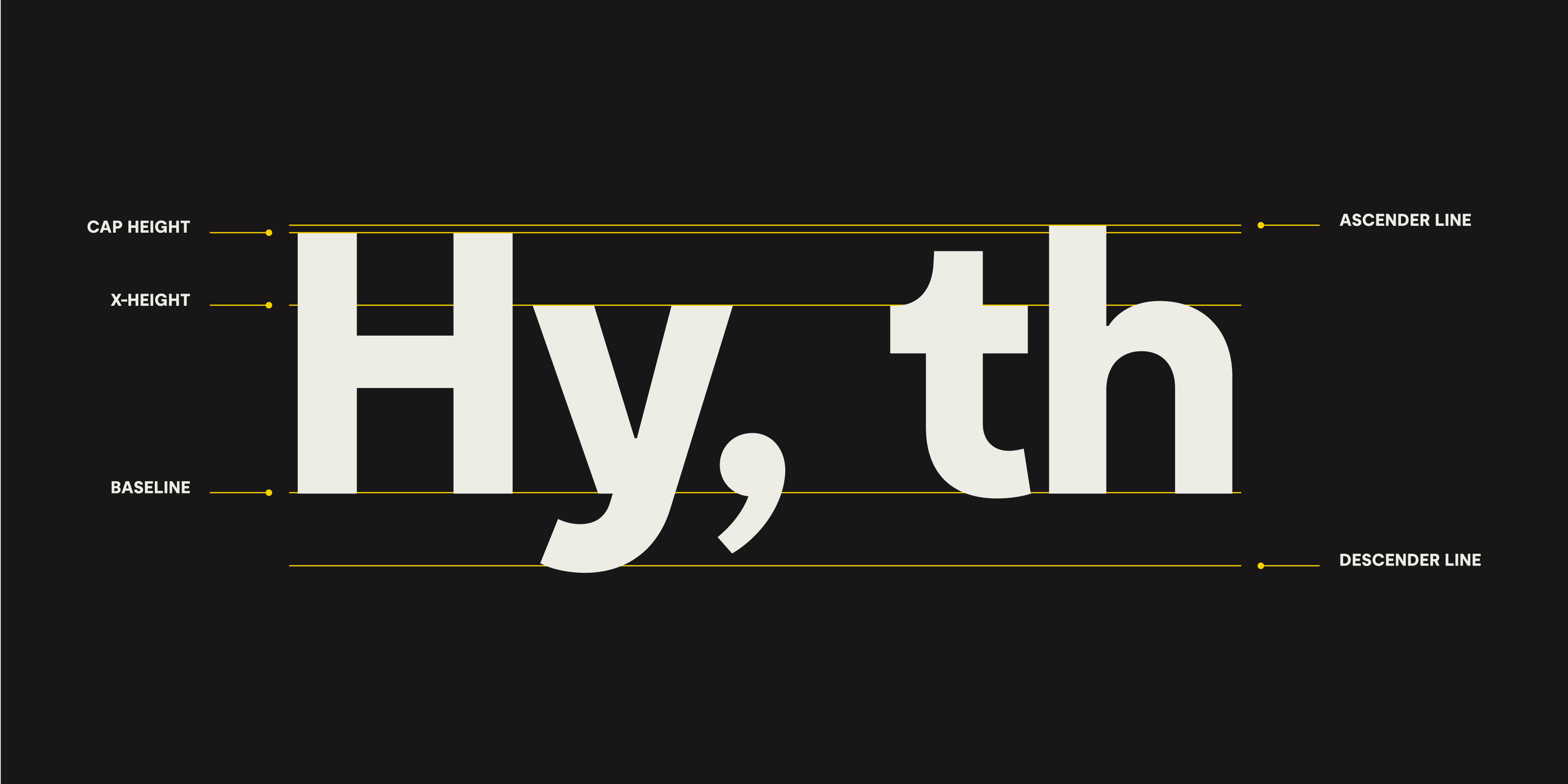
The cap height, as the name implies, marks the height of a font’s capital letterforms. It often sits below the ascender line, but in some fonts the cap height and ascender line can be at the same height.
The take away here is that the spacing dynamics within the characters of your text will differ depending on the font you’re using.
Font sizing
In digital type, font metrics are all relative to font size. Let’s imagine we give a paragraph element a font-size of 1em in our CSS. What aspect of this font is 1em tall? The short answer is we don’t know because the font size does not give us any reliable information on the size of the characters within a font or the metrics within it.
To help understand why, it’s helpful to know that when a type designer is creating a font, they’ll design each character within a box known as an em square, which acts as a grid container for the glyph. This is not the same unit we’re applying in CSS, as the browser calculates em values differently than traditional type design. If our paragraph with font-size: 1em renders at 16px, what’s happening internally within the font is that its em square container is being scaled to 16px tall. Inspect the element in the browser, and with a line-height of 1, the element’s bounding box will be 16px tall. But within that box, the positioning and sizing of the actual letterforms are totally up to the font designer, which is why they can vary so much from font to font.
FYI
The `16px` value is an approximation and based on a presumption that your operating system font size has not been changed from its default value.Although the font size set by us designers tells the software at which size to render the em square, the type design within that em square can theoretically sit wherever the type designer wants it to. The horizontal and vertical positions of the marks that make up any given letterform are very much an arbitrary decision, so, like many things in type and typography, there are no hard-and-fast rules.
This variability is a key consideration when swapping a font, or using multiple fonts in a project. Check out Elliot Jay Stocks’ write-up for Google for more on this.
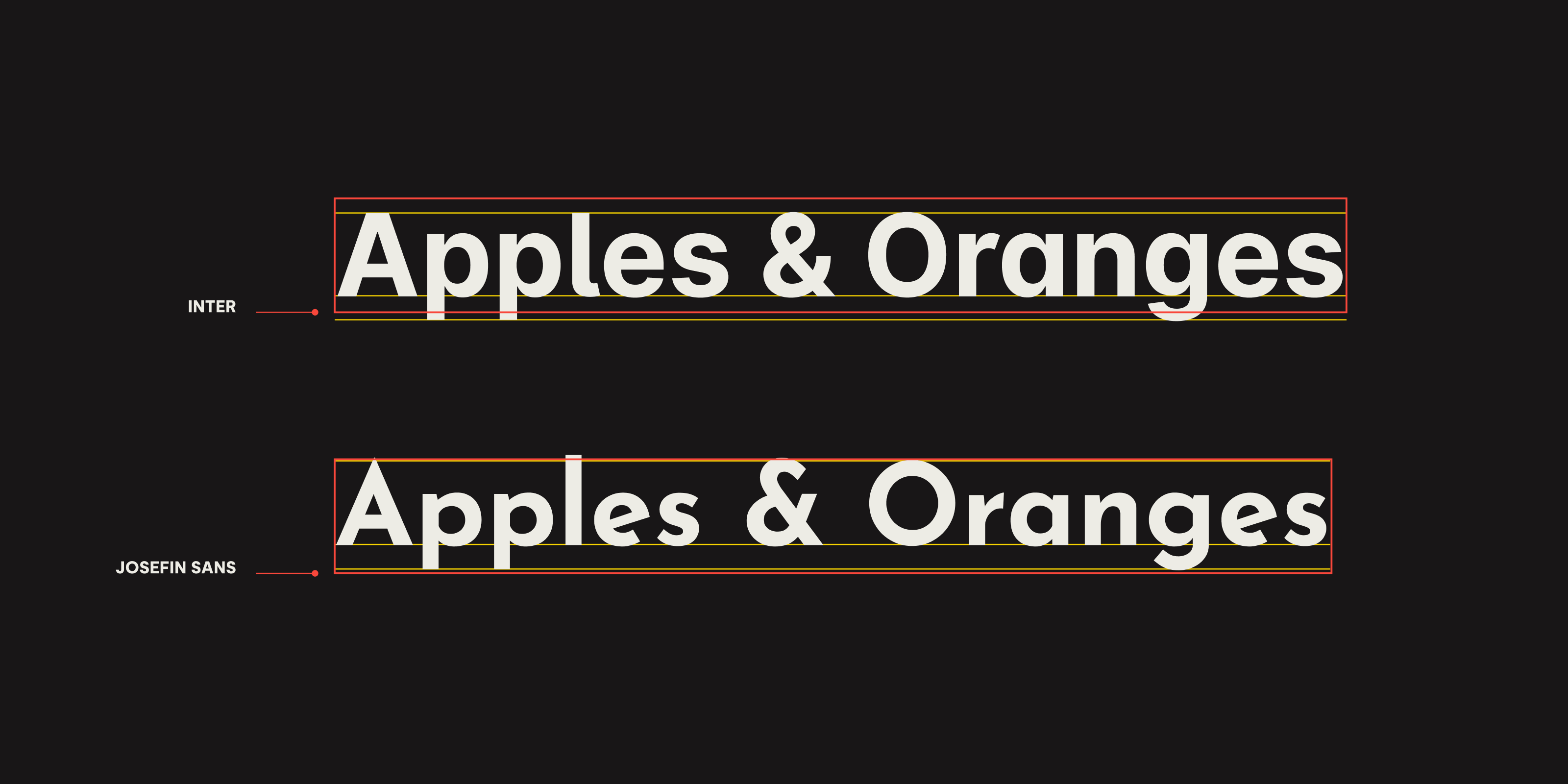
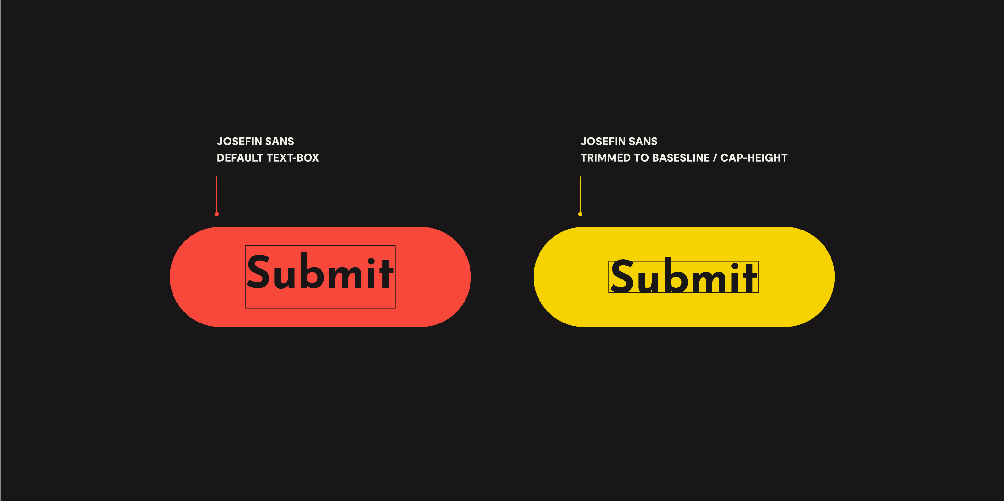
Above is a comparison of Inter with Josefin Sans set at the same font size and a line-height of 1.0. The text box is marked in red, and the cap height, baseline and descender line in yellow. As you can see, whilst both text boxes are the same height, Josefin Sans’ baseline sits higher than Inter’s, and the spacing above and below the two fonts is markedly different. Notice that both fonts include ascenders and descenders that extend out of their text box too.
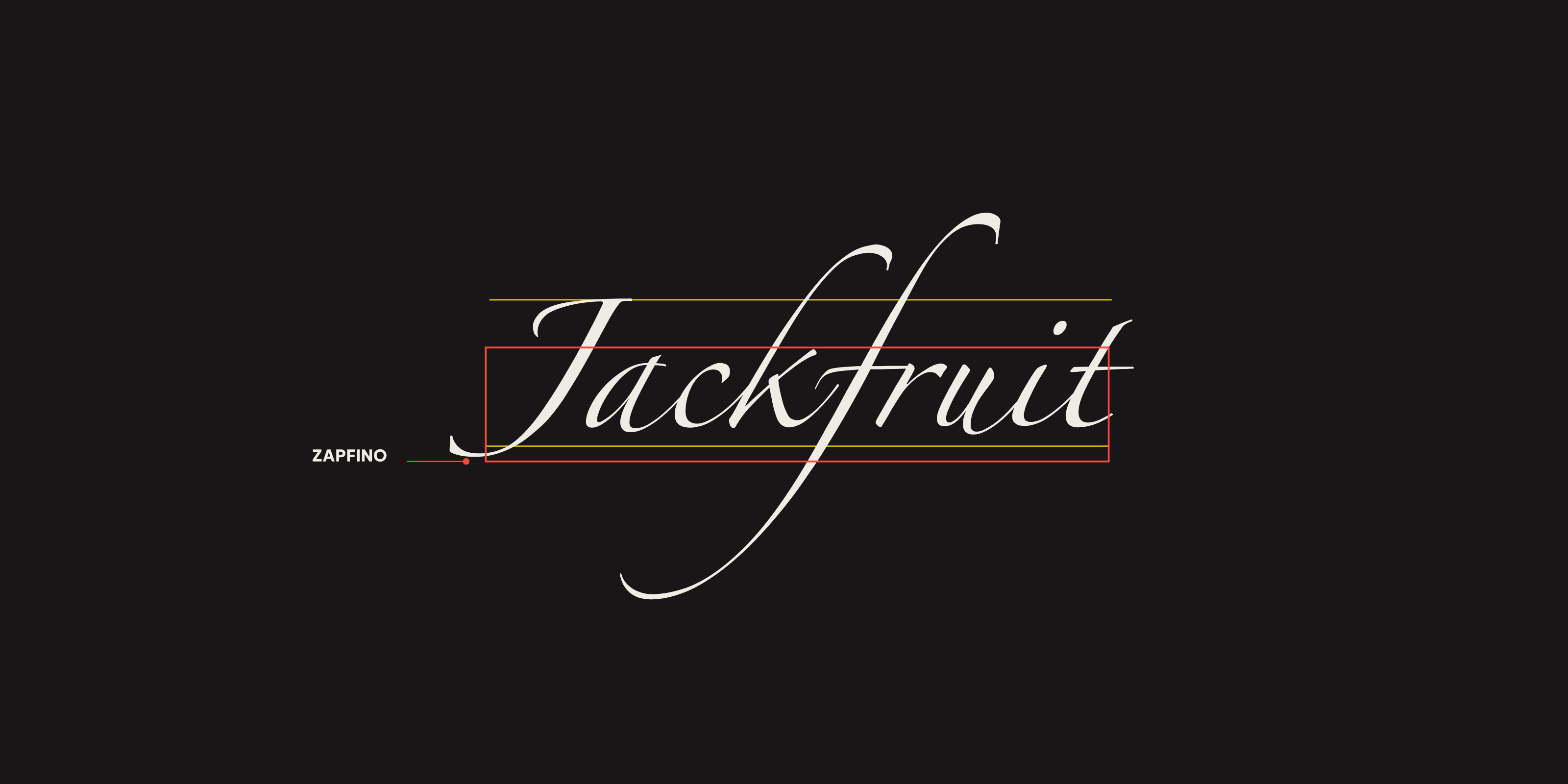
To show an example that takes this to extremes, here’s Zapfino. Check out those swashes which are miles out of the text box. What’s also interesting here is that the cap height sits a way outside of the text box too. Thinking back to the flexibility type designers can employ in designing their fonts within the em square, this example really demonstrates that sizing and spacing within a font can be a bit of a wild west at the extremes.
Leading
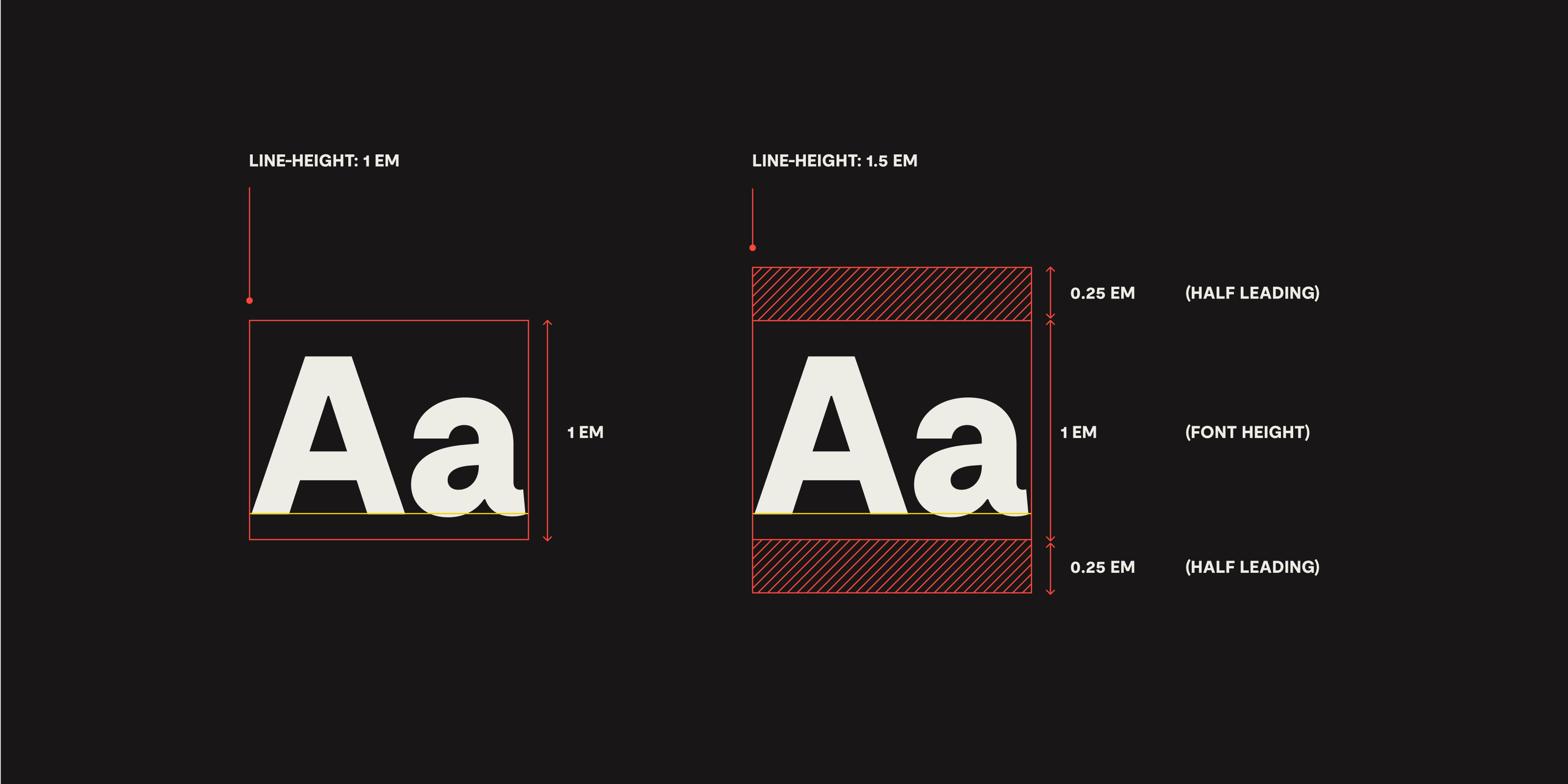
The final piece of the puzzle in understanding how text boxes are calculated in CSS is line-height, or “leading” in typographic terms. In traditional metal type, the spacing between lines of text was set via lead strips. These spacer strips were added between lines. The CSS approach to leading works a little differently, in that spacing is added both above and below each line of text. You can think of this as a kind of “half leading”.
With line-height set to 1.0, an element’s text box height will equal its font-size (multiplied by the number of lines of text if it wraps). In the case of our paragraph example, the text box will be 16px tall. Change the line-height to 1.5, and the text box grows to 24px tall, with 4px of leading added above and below. And if you set a fixed line height rather than a relative one, the browser just sets the text box to match the line-height and distributes any space evenly above and below.
Let's see how text-box-trim will help us
When you break it down, the extra space within an element’s text box is quite simple to understand. Just take the font size and add half the leading above and below. But as we’ve learned, it’s the extra space within the font itself, and the variability of the character sizing and positioning within different fonts that makes this much more tricky to work with in practice.
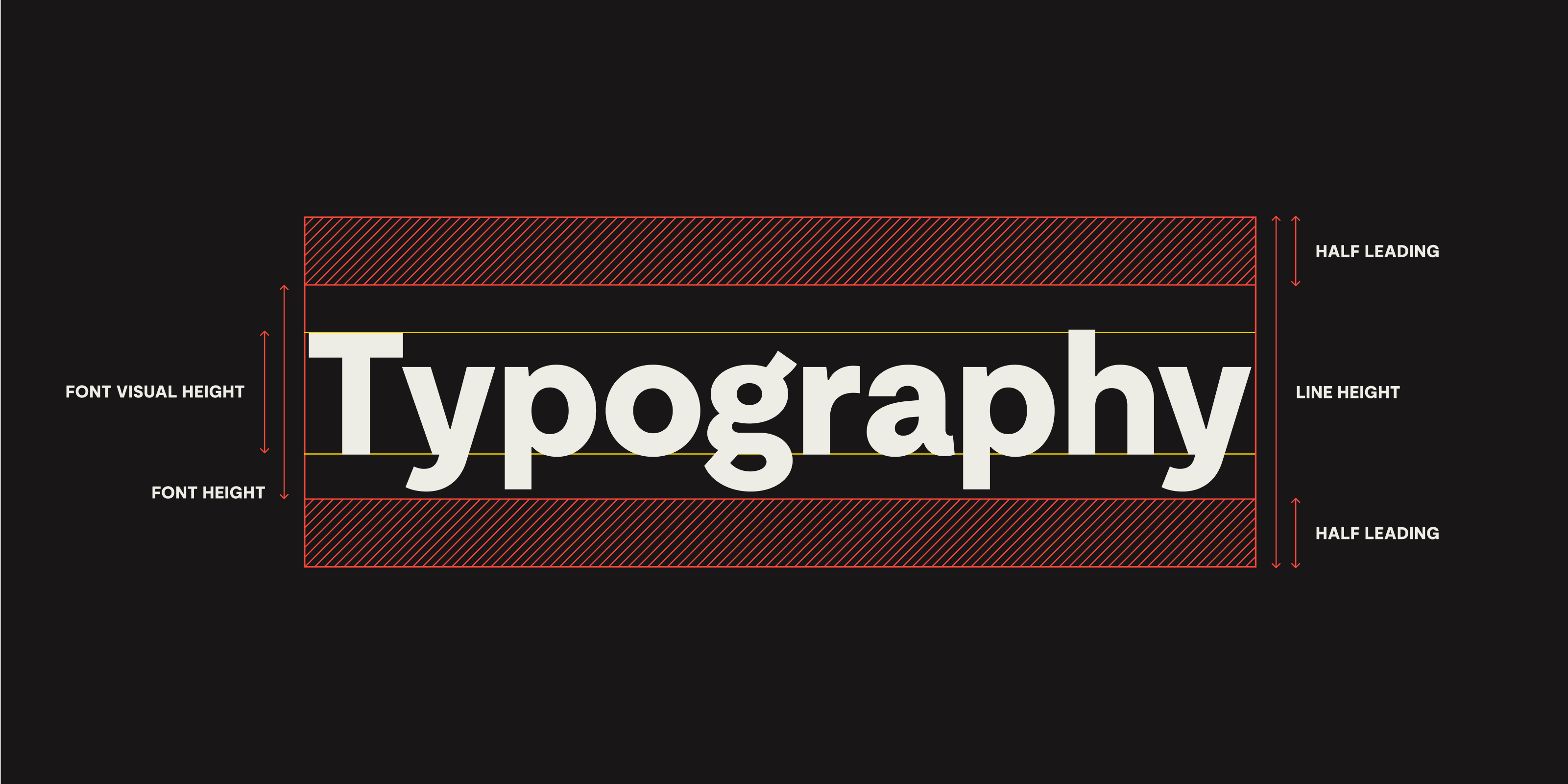
With text-box-trim we gain control over which boundary line text boxes are cropped to, and finally we can trim away this extra space to work with a font’s actual visual height.
One of the ways we’re planning to use this feature to improve typesetting at Set Studio is within our favoured fluid spacing system. We use a spacing scale that’s based on multiples of a base unit, which we combine with utilities like flow to keep a sense of rhythm between all the elements on a page. But in practice, the extra space within text boxes has meant we’ve had to let go of the idea of creating true vertical rhythm for text elements within our spacing system.
We’re pragmatic and happy to live with this for the sake of creating designs that work with the medium of the browser. But when a little bit more support comes for text-box properties and we can trim away that unwanted extra space, we’ll be all over it, as a progressive enhancement.
.prose :is(h2, h3, h4, p, ul, ol, li, blockquote, figure) {
  text-box: cap alphabetic;
}
FYI
We’re using the shorthand property here.
Here we’re trimming text elements within .prose content to the cap height and baseline. Our prose now nicely follows our fluid spacing rhythm!
Applying a trim like this could — depending on the font as we’ve discussed — cut a fairly severe amount of spacing from between your text elements, so it’s very likely you’ll want to increase the spacing when this is applied. Hence our slight trepidation about using text-box in production yet.
It’s worth bearing in mind that design tools like Figma treat text spacing in a very similar way to the browser, with leading above and below, so spacing decisions during design will have been made with this extra spacing in place.
To account for this, we can bump the flow space up a step within our spacing system. Because our CSS is affecting wider elements via the change to --flow-space, we’re going to fence the code in a @supports query now because we only want this to apply if text-box-trim is available to us.
@supports (text-box: cap alphabetic) {
	.prose :is(h2, h3, h4, p, ul, ol, li, blockquote, figure) {
	  --flow-space: var(--space-l);
text-box: cap alphabetic
}
}
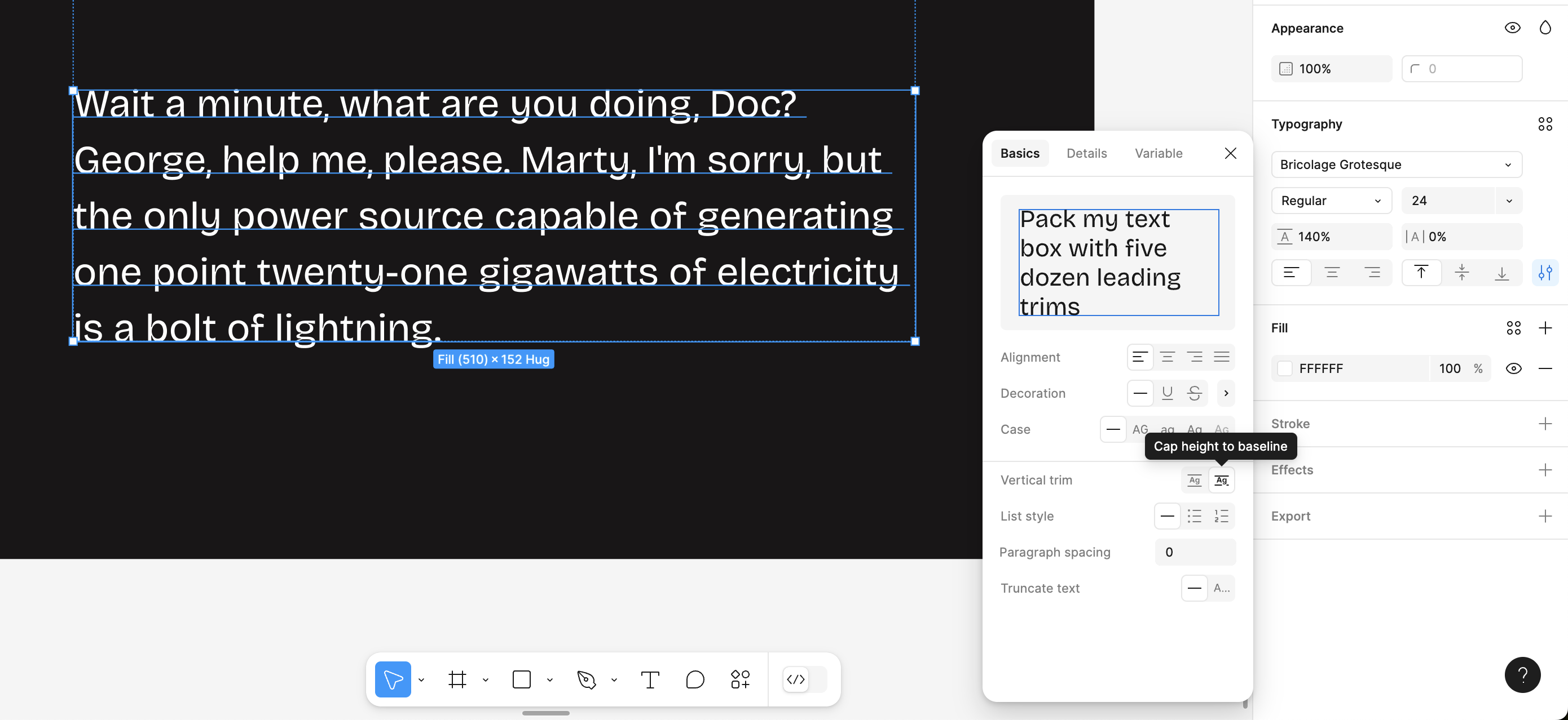
Figma has a setting that lets you toggle ‘vertical trim’ for text elements, under the additional typography settings. If you’re planning to use text-box in your code, it’s a good idea to design with this setting on. And test designs in the browser with and without trimming the text box to make sure both the reading experience is solid in each case. Readability is more important than perfect vertical rhythm.
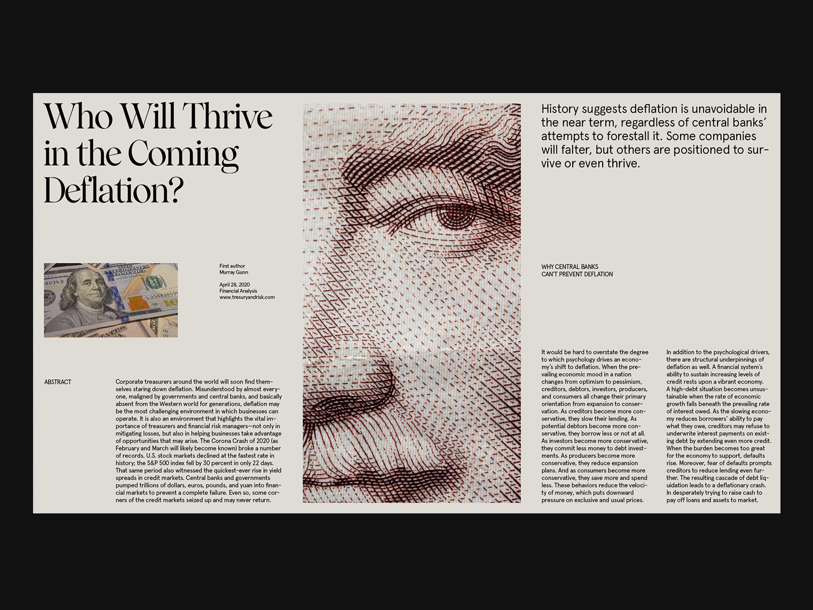
Another good example of where these new CSS properties will help us improve our designs, is making precise vertical alignment of text and imagery like this design from Marko Cvijetic on Dribbble much more easily achievable.
One of the most common use cases for a lot of us is visually centering text within elements like buttons or notifications. This is especially handy for fonts that have awkward spacing like Josefin Sans.
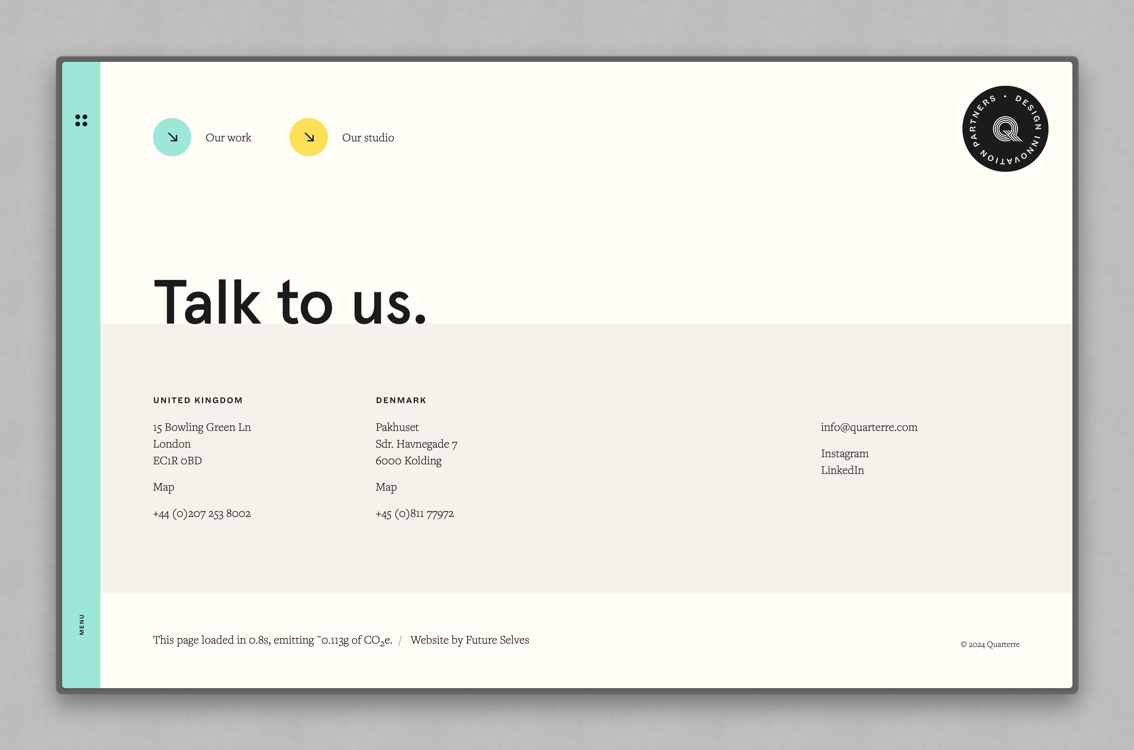
There are plenty of creative uses for text-box-trim too. In this design I placed headings with their baseline flush against sections below using negative margin, like this:
.footer-heading {
	margin-bottom: calc((var(--space-3xs) + 0.072em)* -1);
}
It’ll be nice to be able to achieve effects like this without resorting to magic numbers, thanks to text-box-trim.
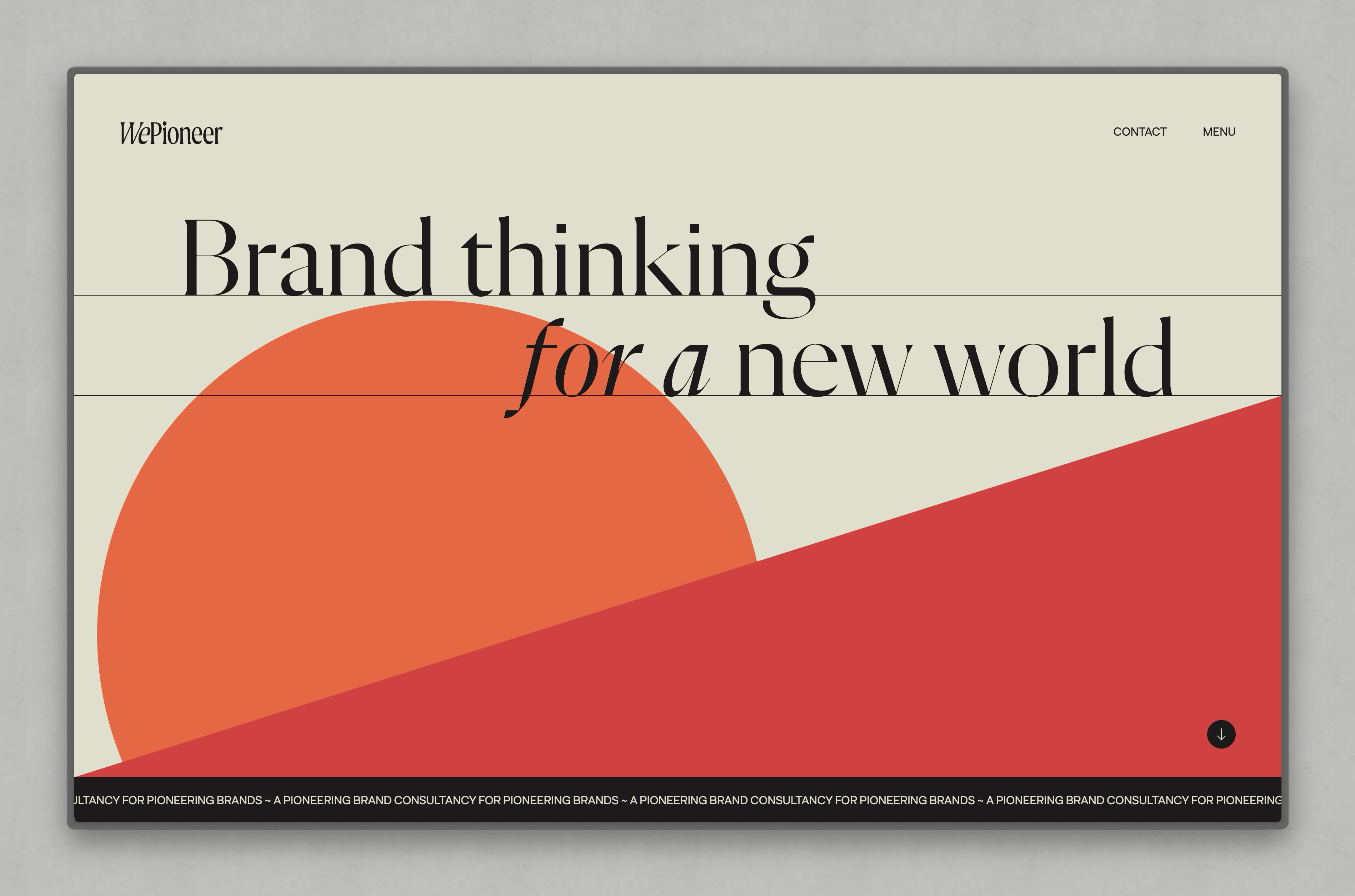
I used a similar approach to add baseline borders to headings in another project, but couldn’t achieve perfect baseline alignment in Firefox. With text-box-trim this effect could be layered in as a progressive enhancement, with the lines only added where the browser supports it.
I’m excited to see what people make with these new CSS properties once they ship!
Latest support
See the latest browser support for text-box-trim, text-box-edge and text-box here. As with all newer CSS specifications, the syntax might change as it evolves, so I recommend keeping an eye on the discussions.