Pardon my dust 2 – redesigning christianheilmann.com
Read the original on christianheilmann.com ↗OK, the shift from WordPress and Godaddy is happening. I managed to convert most of the old blog to static pages and you can see the result already at the old domain Wait-till-i.com
It’s a highly responsive and fully static site now, build with lots of dirty PHP conversion scripts and Jekyll. I did use GitHub pages at first, but the build took 10 minutes each time, and that’s not the idea of Github. You can see what the design looks like and how it behaves in the following screencast, click to see it on YouTube:
Here’s what’s done so far:
- Fully written by hand without any AI
- Hiding and showing of sections using `details` and `summary`
- Grid layout for responsiveness
- dark/light version (light still in the making)
- Images and links should all be there, but many are dead

- Highlight of current section and dimming of the others using `has()`
The most amazing thing so far is that the only thing I use JavaScript for is the search, which also means that it is almost instant.
Here are the main new-ish things I used to avoid having to use any script:
Accordion with animated details and summary using `allow-keywords` and `name`
If you give several `detail` elements the same name, they become an accordion as the others get automatically closed when you expand one.
One
Lorem ipsum dolor sit amet…


Two
Lorem ipsum dolor sit amet…


Three
Lorem ipsum dolor sit amet…
And now we also have a way to “animate to auto” and other keywords using interpolate-size. Which means you can make the accordion open smoothly using the following:
:root {
interpolate-size: allow-keywords;
}
	details::details-content {
height: 0;
overflow: clip;
transition: height 0.4s ease,
content-visibility 0.4s allow-discrete;
}

	details[open]::details-content {
height: auto;
}
You can play with this on the accordion demo page:
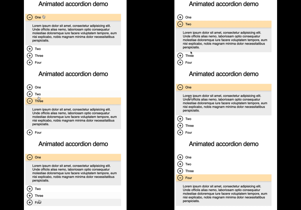
Currently (November 2026) this works only in Chromium browsers, but it is progressively enhanced, as other browsers snap to the expanded stage.
I found this explained by Theodore Lefevre on LinkedIn.
## Card layout using `grid` and hero highlight using `not(:hover)`
The layout of the different sections on the homepage uses CSS grid and is pretty straight forward:
.deck {
pointer-events: none;
}
	.deck:hover .card:not(:hover),
.deck:focus-within .card:not(:focus-within){
scale: 0.8;
opacity: 0.3;
}
	.card {
pointer-events: auto;
transition: scale 300ms, opacity 300ms;
}
	.card:hover, .card:focus-within {
background: skyblue;
border-color: cornflowerblue;
}
	.deck {
display: grid;
grid-template-columns: repeat(auto-fit, minmax(10em, 1fr));
gap: 3rem;
}
Highlighting the current section is done using `hover` and `focus-within` (to support keyboard users). Making the other cards less prominent uses `not(:hover)`, which in the past would have needed a class on the parent elenent or having to loop through the other cards.
.deck {
pointer-events: none;
}
	.deck:hover .card:not(:hover),
.deck:focus-within .card:not(:focus-within){
scale: 0.8;
opacity: 0.3;
}
	.card {
pointer-events: auto;
transition: scale 300ms, opacity 300ms;
}
	.card:hover, .card:focus-within {
background: skyblue;
border-color: cornflowerblue;
}
	.deck {
display: grid;
grid-template-columns: repeat(auto-fit, minmax(10em, 1fr));
gap: 3rem;
}
You can play with this [on the cards demo page](https://wait-till-i.com/demos/cards/) (make sure to resize the outer element):
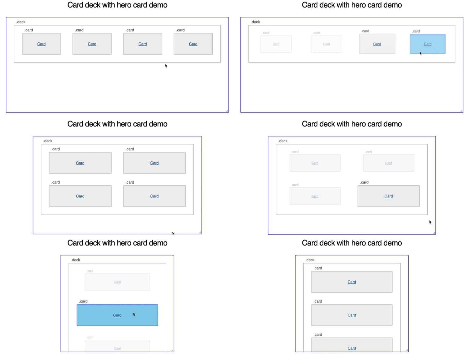
I found this [on CSS Tricks by Krzysztof Gonciarz](https://css-tricks.com/a-pure-css-gallery-focus-effect-with-not/).
What’s next?
The other thing that’s costing me a lot of time is cleaning up the markup of older posts. I’m writing a very messy PHP script to do that and I am almost done removing all the defunct embed codes from old Flash versions of YouTube and many other dead services.
I also moved to Jekyll to do all of this offline as building the page on GitHub Pages took 8 minutes at a time, which got me scarily close to the 10 minute timeout limit…
See you in part 3!