Astro Tutorial: Make a Static Site with Interactive Components
Read the original on debugbear.com ↗In this Astro tutorial, we'll build an interactive coffee blog using Astro's core concepts, including file-based routing, build-time and live content collections, and the islands architecture.
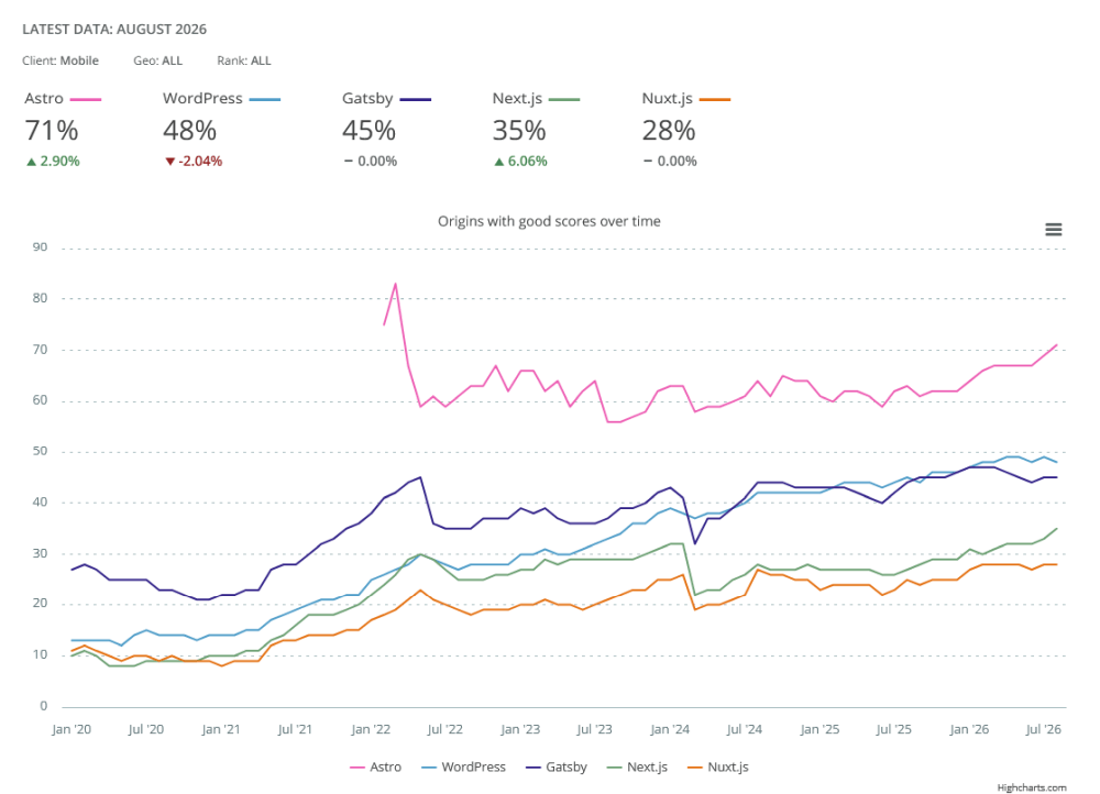
Astro is a performance-friendly meta-framework for content-heavy websites. It ships zero JavaScript by default, but you can add it wherever you need interactivity, which is one reason Astro sites tend to have significantly better Core Web Vitals than sites built with Next.js, Nuxt.js, WordPress, and other popular frameworks.
For example, according to the HTTP Archive, 71% of the tested Astro sites have a Good score on mobile at the time of writing (on desktop, it's 84%):
Check out the PDF version of this tutorial.
What We Will Build
Our demo site will feature:
- A homepage with:
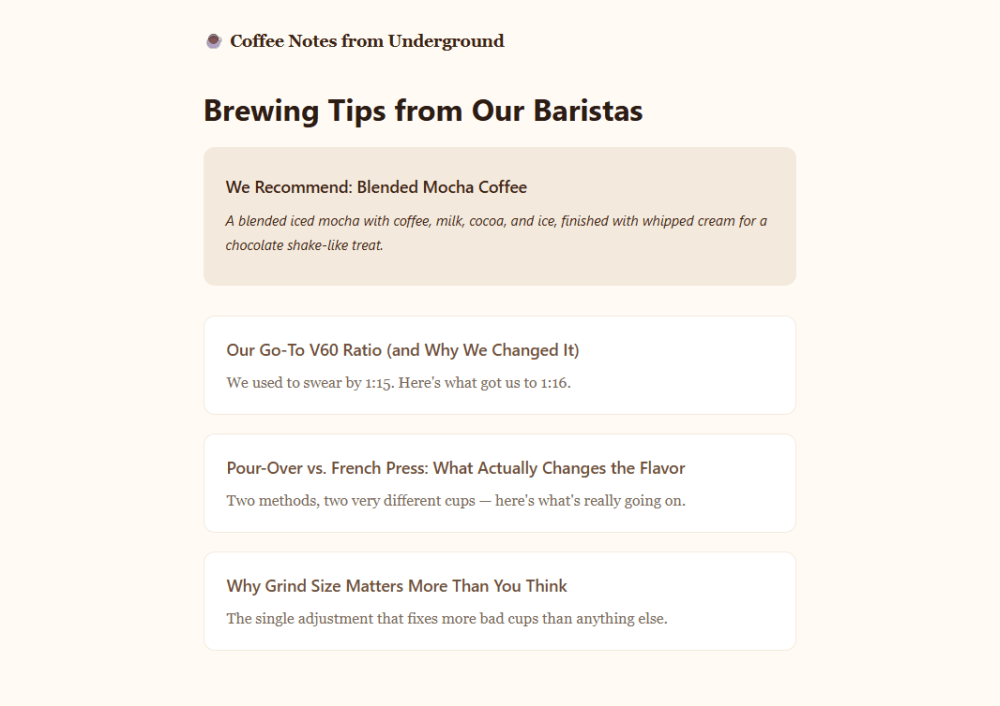
- a random coffee recommendation, powered by a live content collection that fetches data from an external API
- the latest blog posts, powered by a build-time content collection
- Three blog posts, each with:
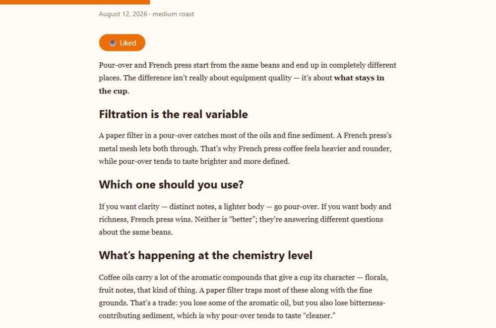
- a Like button, built as a Preact island
- a reading progress bar, built as a Web Component
We'll deploy the site to Cloudflare Workers.
The goal of this setup is to demonstrate that Astro supports several frontend frameworks (e.g., Preact, Svelte, Solid, Vue, React, etc.) alongside Web Components.
Technically, this means you could install several UI framework integrations side by side, with each one hydrating as a separate Astro island. On the other hand, Astro doesn't add Web Components as islands, since they just use built-in browser APIs. This lets us compare adding interactivity to an Astro site with and without using the islands architecture.
To keep the coffee blog fast, we'll use Preact instead of React because it provides a React-like API in about 3KB gzipped, compared to React's 40KB+. If you already know React, most of what you know transfers directly to Preact (e.g., components, JSX, hooks), aside from a few small differences.
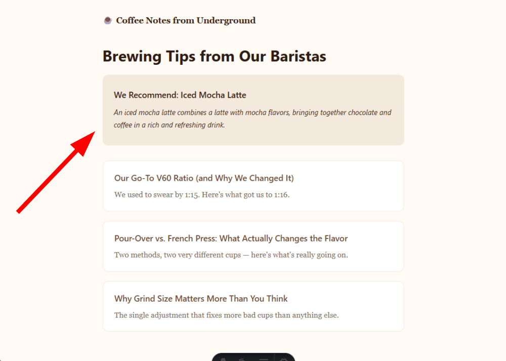
Here's a screenshot of the homepage with the three blog posts and the random coffee recommendation at the top:
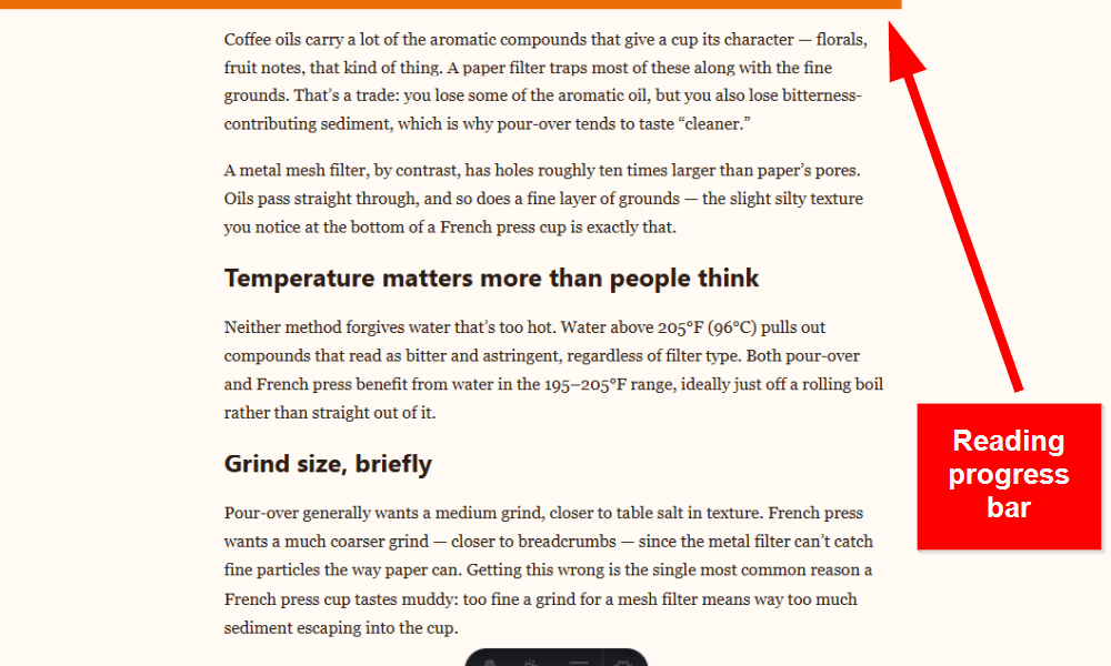
A single blog post shows the Like button and the reading progress bar at the top:
The finished project structure looks like this:
coffee-blog/├── public/ ← static assets, served as-is│ └── favicon.svg├── src/│ ├── components/│ │ ├── CoffeeRecommendation.astro ← uses a live content collection│ │ ├── LikeButton.css ← unscoped CSS for the Preact island│ │ ├── LikeButton.jsx ← Preact island│ │ └── ReadingProgressBar.astro ← renders a Web Component│ ├── content/│ │ └── blog/ ← uses a build-time content collection│ │ ├── grind-size-matters.md│ │ ├── our-v60-ratio.md│ │ └── pour-over-vs-french-press.md│ ├── layouts/ ← shared page layouts│ │ └── Layout.astro│ ├── live/ ← live loader logic│ │ └── coffee-loader.ts│ ├── pages/│ │ ├── blog/│ │ │ └── [slug].astro ← blog post page (file-based routing)│ │ └── index.astro ← homepage│ ├── styles/ ← shared design tokens│ │ └── global.css│ ├── content.config.ts ← build-time content collection config│ └── live.config.ts ← live content collection config├── astro.config.mjs ← adapter + integrations├── package.json ← dependencies├── tsconfig.json ← TypeScript config└── wrangler.jsonc ← Cloudflare Worker configPrerequisites
If you've written any HTML, CSS, and JavaScript before, you already have most of the knowledge you'll need to build an Astro site.
A few files in this tutorial use basic TypeScript to catch errors at build time. Don't worry if you haven't used it before, since TypeScript is just JavaScript with type annotations added on top. While Astro works with plain JavaScript too, it supports TypeScript out of the box, so there's nothing extra to install.
Beyond that, you'll also need:
- Node.js 22.12+
- A JavaScript package manager, such as npm, pnpm, or Yarn
- A code editor, such as VSCodium
- A GitHub or GitLab account to host the source code
- A Cloudflare account
1. Scaffold the Project
To get started with Astro development, run the following command in your terminal:
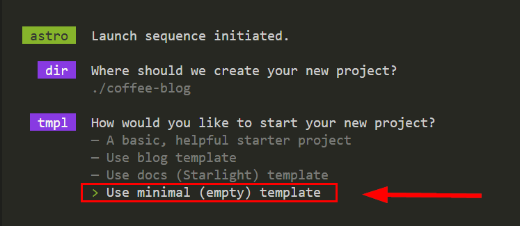
npm create astro@latestWhen prompted, pick the Use minimal (empty) template option, then go with the default options for the rest of the questions:
Once the installer finishes, you can start the dev server by running npm run dev and opening the site at localhost:4321 in your browser. Right now, it's just a bare-bones placeholder page; we'll be adding the other folders and files as we go.
For starters, let's replace Astro's default favicon files with an SVG containing the hot beverage emoji:
<!-- /public/favicon.svg --><svg xmlns="http://www.w3.org/2000/svg" viewBox="0 0 100 100"> <text y=".9em" font-size="75">☕</text></svg>Place the favicon.svg file into the public folder, which is the home for non-code, static assets that Astro serves as-is without processing them, such as fonts, icons, or the robots.txt file.
If you still see the default Astro favicon in the browser tab, clear the cache, as some browsers are prone to aggressive favicon caching.
While using an emoji glyph as a favicon is fine for a hobby project, a production site should use an actual SVG path instead.
2. Set Up the Base Layout and Global Styles
First, we define the layout every page will share and the global styles for the site. Create the following folders and empty files in the src folder:
/layouts/Layout.astro/pages/index.astro/styles/global.css
An .astro file is Astro's own component format. It looks similar to JSX (JavaScript XML), but the Astro syntax is a superset of HTML with support for components and JavaScript expressions. It has two main parts:
- The component script, also known as the frontmatter, where you write server-side JavaScript or TypeScript (you place this at the top of the file between two
---code fences). - The template, where you define the HTML that Astro renders. You can use the
{}notation to embed values or expressions from the component script into the markup.
Layout.astro is a shared wrapper every page will use. It defines the basic HTML structure of the site:
---// /src/layouts/Layout.astroimport '../styles/global.css';// Defines the props this layout expectsinterface Props { title: string;}const { title } = Astro.props;---<!doctype html><html lang="en"> <head> <meta charset="UTF-8" /> <meta name="viewport" content="width=device-width" /> <link rel="icon" type="image/svg+xml" href="/favicon.svg" /> <title>{title}</title> </head> <body> <header> <a href="/">☕ Coffee Notes from Underground</a> </header> <main> <!-- Renders the page content passed into this layout --> <slot /> </main> </body></html><style> header { padding: 2rem 0 1rem; } header a { text-decoration: none; font-weight: bold; font-size: 1.1rem; color: var(--coffee-dark); }</style>The <slot /> element is Astro's own template syntax that defines where each page's content is rendered.
The file also includes styles for the header. We keep them here to colocate the styles with the markup they affect, rather than putting them in the global CSS file. Astro also scopes <style> blocks in .astro files to the component by default, so these styles apply only to this component and don't leak into others. Since the layout is the only file on the site that renders the header, keeping its styles here makes them easier to find and maintain.
To the /src/pages/index.astro file, we just add an <h1> heading for now to have something visible on the homepage:
---// /src/pages/index.astroimport Layout from '../layouts/Layout.astro';---<Layout title="Coffee Notes from Underground"> <h1>Brewing Tips from Our Baristas</h1></Layout>We also add some basic CSS to global.css that includes design tokens and global styles that are shared across the entire site:
/* /src/styles/global.css */:root { --coffee-dark: #3b2412; --coffee-medium: #6f4e37; --coffee-light: #b08968; --cream: #f3e9dd; --paper: #fffaf3; --text: #2b1d13; --text-muted: #7a6a5a; --accent: #ec6e07; --text-on-accent: #ffffff;}* { box-sizing: border-box;}body { font-family: 'Georgia', 'Iowan Old Style', serif; background: var(--paper); color: var(--text); max-width: 680px; margin: 0 auto; padding: 0 1.5rem 4rem; line-height: 1.7;}h1,h2,h3 { font-family: system-ui, sans-serif; line-height: 1.2;}a { color: var(--coffee-medium);}code { background: var(--cream); padding: 0.1em 0.4em; border-radius: 4px; font-size: 0.9em;}If you now open the site in your browser, this is what you should see:
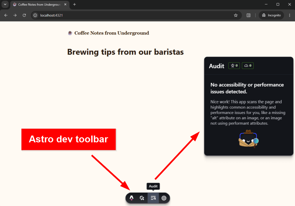
The screenshot above also shows Astro's dev toolbar with the Audit menu open. The dev toolbar is enabled by default while running the site in development mode.
3. Add the Blog Posts with a Build-Time Content Collection
To add the three blog posts, create the following empty files in the src folder (or use different slugs and content for the posts if you prefer):
/content.config.ts/content/blog/grind-size-matters.md/content/blog/our-v60-ratio.md/content/blog/pour-over-vs-french-press.md
The content.config.ts file defines where to find the posts and what data each post's frontmatter must contain:
/* /src/content.config.ts */import { defineCollection } from 'astro:content';import { z } from 'astro/zod';import { glob } from 'astro/loaders';// Defines the blog collection and its schemaconst blog = defineCollection({ // Loads every Markdown file in src/content/blog/ as an entry loader: glob({ pattern: '**/*.md', base: './src/content/blog' }), schema: z.object({ title: z.string(), pubDate: z.date(), tags: z.array(z.string()), // Catches a typo like "medum" instead of allowing invalid data roast: z.enum(['light', 'medium', 'dark']).optional(), excerpt: z.string(), }),});export const collections = { blog };The glob() loader tells Astro to treat every Markdown file in the /src/content/blog/ folder that matches the **/*.md pattern as an entry in the blog collection.
The collection schema describes the structure and rules that the data must follow. We define it in defineCollection() once, and then every post is validated against it automatically.
Schemas are optional for defineCollection(), but strongly recommended. Without one, Astro won't validate your collection entries or generate types for their frontmatter data. However, if you provide a schema, it must be built with Zod, because defineCollection() expects a Zod schema.
The blog posts themselves are Markdown files with a frontmatter block at the top (for the full content of the three posts, see the GitHub repository):
<!-- /src/content/blog/grind-size-matters.md -->---title: "Why Grind Size Matters More Than You Think"pubDate: 2026-08-10tags: ["brewing", "technique"]roast: lightexcerpt: "The single adjustment that fixes more bad cups than anything else."---If a cup tastes sour, it's usually under-extracted — grind finer...Right now, the homepage still looks the same because it doesn't load any content from the blog collection yet. To give each post its own page, we need to add routing.
4. Route the Blog Posts
To create a page for each post in the blog content collection, we'll set up a dynamic route. Add the following empty file to the src folder:
/pages/blog/[slug].astro
The square brackets around [slug] mark a dynamic route segment (one file that generates multiple pages at build time).
By default, Astro uses file-based routing, which maps URLs to the corresponding files in the /src/pages/ folder in the following way:
- Regular files automatically become pages (e.g.,
/src/pages/index.astrobecomes/). - Dynamic route files, such as
[slug].astro, tell Astro what shape the URL will take through their filename and placement. For example, placing[slug].astroin the/pages/blog/folder defines a route for the blog posts, which will produce URLs such as/blog/our-v60-ratio/or/blog/grind-size-matters/. However,[slug].astrois a template rather than a page, so Astro still needs to know throughgetStaticPaths()which actual pages to build from it.
The /src/pages/blog/[slug].astro file uses getStaticPaths() to generate a page for every entry in the blog collection:
---// /src/pages/blog/[slug].astroimport Layout from '../../layouts/Layout.astro';import { getCollection, render } from 'astro:content';// Generates one route for each blog postexport async function getStaticPaths() { // Gets all blog posts so we can generate a route for each one const posts = await getCollection('blog'); return posts.map((post) => ({ params: { slug: post.id }, props: { post }, }));}const { post } = Astro.props;const { Content } = await render(post);---<Layout title={post.data.title}> <a href="/">← Back</a> <h1>{post.data.title}</h1> <p class="meta"> {post.data.pubDate.toLocaleDateString('en-US', { dateStyle: 'long' })} {post.data.roast && ` · ${post.data.roast} roast`} </p> <Content /></Layout><style> .meta { color: var(--text-muted); font-family: system-ui, sans-serif; font-size: 0.9rem; margin-bottom: 2rem; }</style>Notice post.data.title, post.data.pubDate, and post.data.roast above. We haven't written an interface for post. This is because Astro uses the Zod schema from content.config.ts to automatically determine the type of post.data. For example, pubDate is already a real Date object (not, say, a string), which is why .toLocaleDateString() works on it.
With routing in place, you can now visit the individual blog posts. For example, visiting http://localhost:4321/blog/our-v60-ratio/ should show:
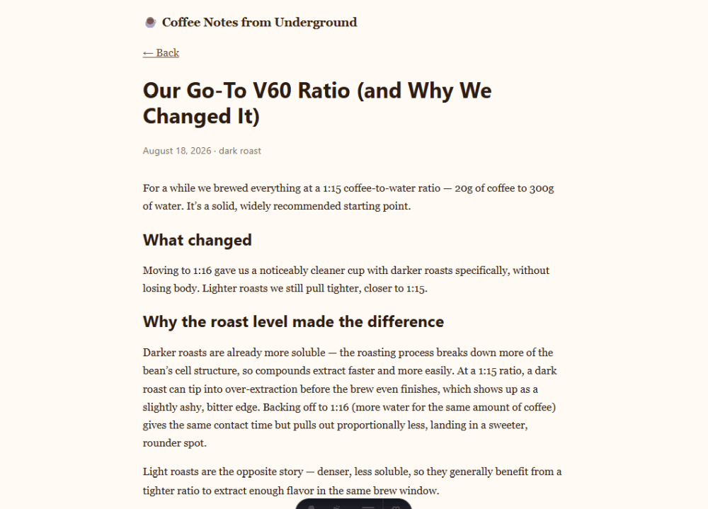
The black bar at the bottom of the screenshot above is Astro's collapsed dev toolbar, which you can expand by hovering over it.
Now that routing is set up, we can populate the /pages/index.astro file:
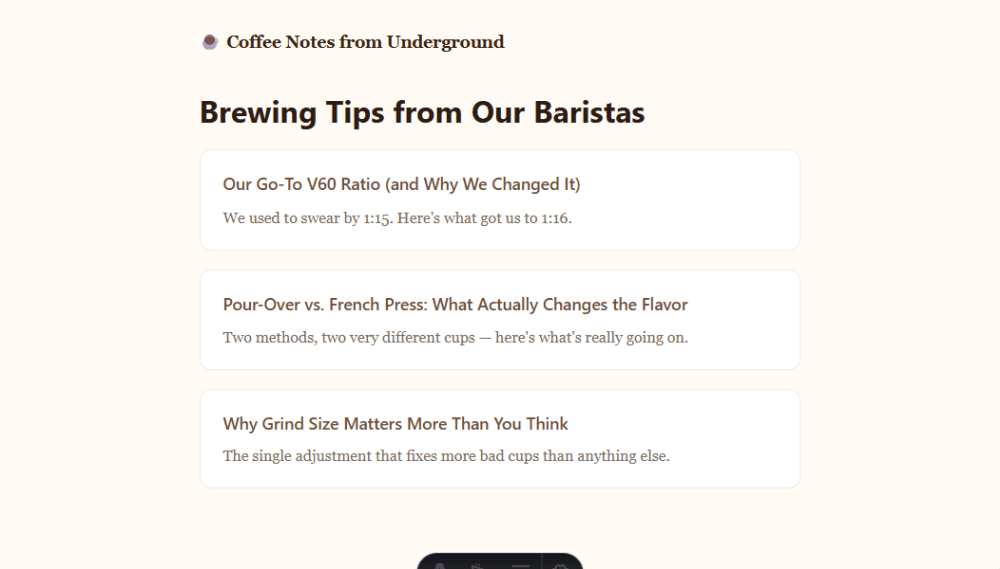
---// /src/pages/index.astroimport Layout from '../layouts/Layout.astro';import { getCollection } from 'astro:content';// Sorts posts by publish date, newest firstconst posts = (await getCollection('blog')).sort( (a, b) => b.data.pubDate.valueOf() - a.data.pubDate.valueOf());---<Layout title="Coffee Notes from Underground"> <h1>Brewing Tips from Our Baristas</h1> <ul class="posts"> { posts.map((post) => ( <li> <a href={`/blog/${post.id}/`}>{post.data.title}</a> <p>{post.data.excerpt}</p> </li> )) } </ul></Layout><style> .posts { list-style: none; padding: 0; display: grid; gap: 1.25rem; } .posts li { border: 1px solid var(--cream); border-radius: 12px; padding: 1.25rem 1.5rem; background: white; } .posts a { font-family: system-ui, sans-serif; font-weight: 600; font-size: 1.1rem; text-decoration: none; } .posts p { margin: 0.4rem 0 0; color: var(--text-muted); font-size: 1rem; }</style>The three blog posts should now appear on the homepage, ordered by date:
5. Add a Random Coffee Recommendation with a Live Content Collection
Our live content collection will show a random recommendation fetched from Sample APIs' Coffee API at request time. Create the following empty files in the src folder:
/live/coffee-loader.ts/live.config.ts/components/CoffeeRecommendation.astro
In the coffee-loader.ts file, we define a simple live loader that fetches data from the API, filters the API results, randomly selects a recommendation, and falls back to a default recommendation if the request fails or returns no usable entries:
/* /src/live/coffee-loader.ts */import type { LiveLoader } from 'astro/loaders';interface Coffee { id: number; title: string; description: string;}const fallbackCoffee: Coffee = { id: 0, title: 'Black Coffee', description: 'Black coffee is as simple as it gets with ground coffee beans steeped in hot water, served warm.',};export const coffeeLoader: LiveLoader<Coffee, { id: string }> = { name: 'coffee', // This loader only supports the single 'recommendation' entry. // loadCollection() is still required by the LiveLoader interface. loadCollection: async () => ({ entries: [], }), loadEntry: async ({ filter }) => { if (filter?.id !== 'recommendation') return undefined; try { const response = await fetch( 'https://api.sampleapis.com/coffee/hot' ); if (!response.ok) { throw new Error(`Coffee API returned ${response.status}`); } const coffees: Coffee[] = await response.json(); // Excludes test records that were added with higher IDs const recommendations = coffees.filter( (item) => item.id >= 1 && item.id <= 20 ); if (recommendations.length === 0) { throw new Error('Coffee API returned no recommendations'); } const coffee = recommendations[ Math.floor(Math.random() * recommendations.length) ]; return { id: 'recommendation', data: coffee, }; } catch (error) { console.error('Coffee API request failed:', error); return { id: 'recommendation', data: fallbackCoffee, }; } },};The live.config.ts file registers the coffeeLoader object as the live collection's loader and defines the shape of its entries with a Zod schema:
/* /src/live.config.ts */import { defineLiveCollection } from 'astro:content';import { z } from 'astro/zod';import { coffeeLoader } from './live/coffee-loader';const coffee = defineLiveCollection({ loader: coffeeLoader, schema: z.object({ title: z.string(), description: z.string(), }),});export const collections = { coffee };In the CoffeeRecommendation.astro file, we query the live collection with getLiveEntry(), log any errors, show an unavailability notice if no entry is returned, and render the result on the homepage:
---// /src/components/CoffeeRecommendation.astroimport { getLiveEntry } from 'astro:content';const { entry, error } = await getLiveEntry('coffee', 'recommendation');if (error) { console.error('Could not load coffee recommendation:', error);}---<section class="coffee-recommend"> {entry ? ( <> <h2 class="coffee-recommend-title"> We Recommend: {entry.data.title} </h2> <p class="coffee-recommend-desc">{entry.data.description}</p> </> ) : ( <p class="coffee-recommend-desc"> Today's recommendation is temporarily unavailable. </p> )}</section><style> .coffee-recommend { display: block; padding: 1rem 1.5rem; border-radius: 12px; background: var(--cream); color: var(--coffee-dark); font-family: system-ui, sans-serif; font-size: 0.9rem; margin: 0 0 2rem; } .coffee-recommend-title { font-size: 1.1rem; font-weight: 600; } .coffee-recommend-desc { font-size: 0.9375rem; font-style: italic; margin-top: 0.25rem; }</style>The "temporarily unavailable" message above is shown when getLiveEntry() returns no entry. API failures are handled separately by coffee-loader.ts, which catches them and returns fallbackCoffee as a normal entry, so visitors still see a recommendation.
Finally, we need to change the homepage so it displays the coffee recommendation.
We first (1) add export const prerender = false to opt the homepage into on-demand rendering, allowing it to fetch the live collection data at request time. Then, we (2) import and (3) add the CoffeeRecommendation component:
---// /src/pages/index.astro// (1) Sets on-demand rendering because it reads from a live collectionexport const prerender = false;import Layout from '../layouts/Layout.astro';// (2) Imports the CoffeeRecommendation componentimport CoffeeRecommendation from '../components/CoffeeRecommendation.astro';import { getCollection } from 'astro:content';/* ... */---<Layout title="Coffee Notes from Underground"> <h1>Brewing Tips from Our Baristas</h1> <!-- (3) Adds the CoffeeRecommendation component --> <CoffeeRecommendation /> <!-- (the rest of the file stays the same) -->While the code above works on the dev server, you'll need a server adapter to use on-demand rendering in production (we'll see how to add the Cloudflare adapter in Step 7).
Instead of using on-demand rendering for the entire homepage, you can also keep the homepage prerendered and use a server island to defer just the coffee recommendation to a separate server request. To do so, remove the export const prerender = false; line and add the server:defer directive to the component:
<CoffeeRecommendation server:defer />Note that server islands also require an adapter because the deferred component must be rendered on the server at runtime, when the page is requested.
Now, the coffee recommendation has been added to the homepage. To test it, refresh the page a few times and watch for the recommendation to change:
6. Add Interactivity with and without Astro Islands
We'll add interactivity to our coffee blog in two different ways:
- a Like button as a framework component (Preact)
- a reading progress bar as a Web Component
Create the following empty files in the src folder:
/src/components/LikeButton.jsx/src/components/LikeButton.css/src/components/ReadingProgressBar.astro
Astro uses an islands architecture for framework components, where interactive components can become client islands that Astro hydrates in the browser.
However, you can also build interactive components as Web Components using standard browser APIs on any Astro site, without shipping a framework runtime to the browser.
Before looking at the code, here's a brief comparison of island-based and browser-native interactivity in Astro development:
| Island-based interactivity | Browser-native interactivity | |
|---|---|---|
| Astro island? | Yes | No |
| Example | LikeButton.jsx | ReadingProgressBar.astro |
| UI technology | Preact, Svelte, Vue, React, etc. | Web Components / browser APIs |
| Astro hydration | Yes | No |
| JavaScript | Framework runtime + component code | Component code only |
| Styling | Unscoped CSS | <style> in .astro file (Astro-scoped) |
| How it becomes interactive | client:* directive | <script> registers the custom element |
i. Add a Like Button as a Preact Island
To add the Preact Like button, run the following command to install the Preact integration for Astro:
npx astro add preactThe installer will make changes to your astro.config.mjs and tsconfig.json files. When asked, accept the changes.
The LikeButton.jsx file defines a Preact component with local state that updates the button's text and styling when clicked:
/* /src/components/LikeButton.jsx */import { useState } from 'preact/hooks';import './LikeButton.css';export default function LikeButton() { // The button starts in the "not liked" state const [liked, setLiked] = useState(false); return ( <button class={`like-button ${liked ? 'is-liked' : ''}`} aria-pressed={liked} onClick={() => setLiked((liked) => !liked)} > {liked ? '☕ Liked' : '🤎 Like this post'} </button> );}Before adding the CSS, let's update the /src/pages/blog/[slug].astro file to see what the Like button looks like without styling:
---// /src/pages/blog/[slug].astro/* ... */// (1) Imports the LikeButton componentimport LikeButton from '../../components/LikeButton.jsx';/* ... */---<Layout title={post.data.title}> <!-- ... --> <!-- (2) Adds the Like button to the page --> <LikeButton client:idle /> <Content /></Layout>The client:idle directive tells Astro to hydrate the Preact component in the browser when the page has finished its initial work and the browser is idle. You can use different client:* directives to control when hydration happens. For example, client:load hydrates the component as soon as the page loads, while client:visible waits until the component enters the viewport.
The island architecture also applies when you use the same framework multiple times. For example, if your site had multiple Preact components, each one would be its own separate island, with its own hydration timing (e.g., one could use client:idle while another uses client:visible). Astro, however, shares common framework code between those islands while keeping their component code separate.
Now open a blog post in the browser and test the button. If it works as intended, add the styling to the /src/components/LikeButton.css file:
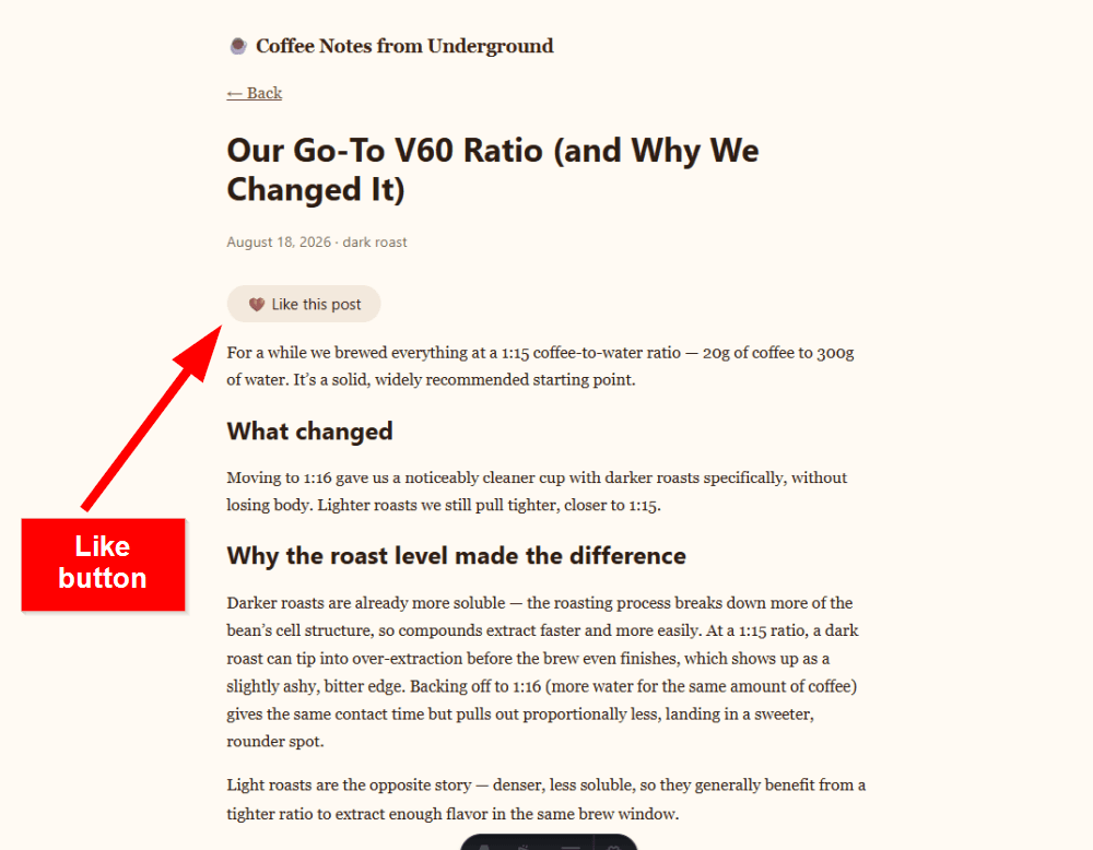
/* /src/components/LikeButton.css */.like-button { border: none; border-radius: 999px; padding: 0.5rem 1.2rem; font-family: system-ui, sans-serif; font-size: 0.95rem; cursor: pointer; background: var(--cream); color: var(--text); transition: background 0.15s ease, color 0.15s ease;}.like-button.is-liked { background: var(--accent); color: var(--text-on-accent);}/* Applies hover styles only on devices that support hovering to avoid touch-device UX issues */@media (hover: hover) { .like-button:not(.is-liked):hover { background: var(--accent); color: var(--text-on-accent); } .like-button.is-liked:hover { background: var(--coffee-dark); }}The Like button is now done; this is what you should see in the browser:
ii. Add a Reading Progress Bar as a Web Component
We create the reading progress bar as a Web Component. Because the component uses only browser APIs for its client-side behavior, we don't need:
- a framework runtime
- a
client:*directive - Astro frontmatter, since there is no server-side component code
The ReadingProgressBar.astro file consists of a custom <reading-progress-bar> element and a <script> that defines its behavior:
<!-- /src/components/ReadingProgressBar.astro --><reading-progress-bar> <div class="bar"></div></reading-progress-bar><script> class ReadingProgressBar extends HTMLElement { // Stores the visible bar and the pending animation-frame ID bar: HTMLElement | null = null; rafId: number | undefined; scrollableHeight = 0; // Calculates how far the document can be scrolled vertically updateScrollableHeight = () => { this.scrollableHeight = document.documentElement.scrollHeight - window.innerHeight; }; // Converts scroll position to a 0–1 value and clamps the result updateProgress = () => { const scrollTop = window.scrollY; const progress = this.scrollableHeight > 0 ? Math.min(Math.max(scrollTop / this.scrollableHeight, 0), 1) : 0; if (this.bar) { // Sets the bar's width as a percentage of scroll progress this.bar.style.width = `${progress * 100}%`; } // Allows the next scroll or resize event to schedule another update this.rafId = undefined; }; // Schedules a progress update for the next animation frame onScroll = () => { if (this.rafId === undefined) { this.rafId = requestAnimationFrame(this.updateProgress); } }; // Schedules a scrollable-height recalculation and progress update // for the next animation frame onResize = () => { if (this.rafId === undefined) { this.rafId = requestAnimationFrame(() => { this.updateScrollableHeight(); this.updateProgress(); }); } }; connectedCallback() { // Finds the visible bar that represents reading progress this.bar = this.querySelector<HTMLElement>('.bar'); // Waits until the next animation frame before measuring the document requestAnimationFrame(() => { this.updateScrollableHeight(); this.updateProgress(); }); window.addEventListener('scroll', this.onScroll); window.addEventListener('resize', this.onResize); } disconnectedCallback() { // Removes listeners and cancels any pending update window.removeEventListener('scroll', this.onScroll); window.removeEventListener('resize', this.onResize); if (this.rafId !== undefined) cancelAnimationFrame(this.rafId); this.rafId = undefined; } } customElements.define('reading-progress-bar', ReadingProgressBar);</script><style> reading-progress-bar { position: fixed; top: 0; left: 0; display: block; width: 100%; height: 10px; z-index: 50; } .bar { height: 100%; width: 0%; background: var(--accent); }</style>The <reading-progress-bar> component uses the light DOM rather than Shadow DOM. This is because Astro already scopes the component's <style> block, providing the CSS isolation needed here without requiring Shadow DOM.
The connectedCallback() and disconnectedCallback() methods above are lifecycle callbacks for Web Components:
connectedCallback()finds the bar element, measures the page's scrollable height, sets the initial progress, and adds thescrollandresizeevent listeners.disconnectedCallback()removes both listeners and cancels any pending update when the element is removed, so the component cleans up after itself.
Both the scroll and resize listeners schedule their updates with requestAnimationFrame(), rather than running on every event. A shared rafId field makes sure only one update is ever pending at a time. If multiple scroll or resize events fire before that update runs, they're effectively batched into the same animation-frame update.
The requestAnimationFrame() method schedules the update to run right before the browser's next paint, so the bar's width is written at the same cadence the browser is already rendering at. It never runs more often than a new frame can actually be shown, and always in sync with it. That makes it a better fit here than a fixed timer such as setTimeout(), which throttles by a chosen interval but has no relationship to the browser's own paint timing. For more details, see our guide to requestAnimationFrame.
Finally, we need to add the <ReadingProgressBar> component to the /src/pages/blog/[slug].astro template:
<!-- /src/pages/blog/[slug].astro --><Layout title={post.data.title}> <ReadingProgressBar /> <!-- ... --></Layout>The reading progress bar should now appear at the top of each blog post:
7. Deploy the Coffee Blog to Cloudflare Workers
Before deploying the coffee blog to Cloudflare Workers, we need to add the Cloudflare adapter. To do so, run the following command in the terminal:
npx astro add cloudflareThis single command installs the Cloudflare adapter, updates astro.config.mjs, and adds the wrangler.jsonc configuration file.
The installer will ask several yes/no questions about optional setup. Accept the defaults, except for the two prompts about generating Wrangler types: generate-types and adding worker-configuration.d.ts to tsconfig.json. Decline both in the name of the YAGNI principle, since this project doesn't use Cloudflare bindings or Workers APIs that require generated Wrangler types.
After installing the adapter, add a "worker" script to "scripts" in the package.json file so you can easily run the site using Cloudflare's local Workers runtime:
"worker": "wrangler dev"Then, run the following commands:
npm run buildnpm run workerThe first one builds the site with the Cloudflare adapter. As part of the build, Astro generates the Wrangler configuration that wrangler dev uses to run the site locally.
The second command starts the built site using Cloudflare's local Workers runtime. The first time you run it, Wrangler will ask you to authorize access to your Cloudflare account. After authorization, it starts the Worker locally and provides a local URL where you can test the site.
If you want to preview the production build without the Cloudflare runtime, run the following commands instead, which use Astro's preview server rather than Cloudflare's local Workers runtime:
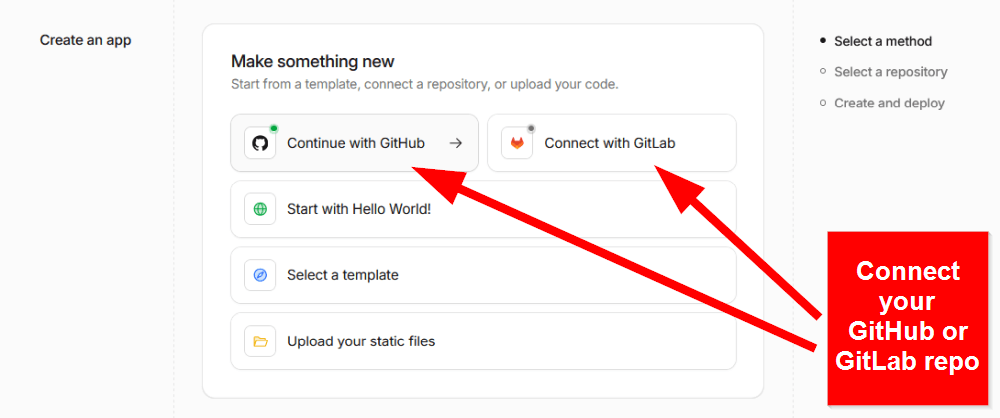
npm run buildnpm run previewOnce you've verified that the site works locally, push the repository to GitHub or GitLab, connect it from the Cloudflare dashboard, follow the steps in Cloudflare's Create an app wizard, and deploy the coffee blog. For example, here's mine:
From now on, whenever you push changes to your repository, Cloudflare will automatically redeploy your site.
8. Test the Coffee Blog for Performance
Finally, let's see how Astro performs on the live site. You can use Lighthouse in Chrome DevTools or our free website speed test tool.
Here are the results for the homepage in a DebugBear mobile test:
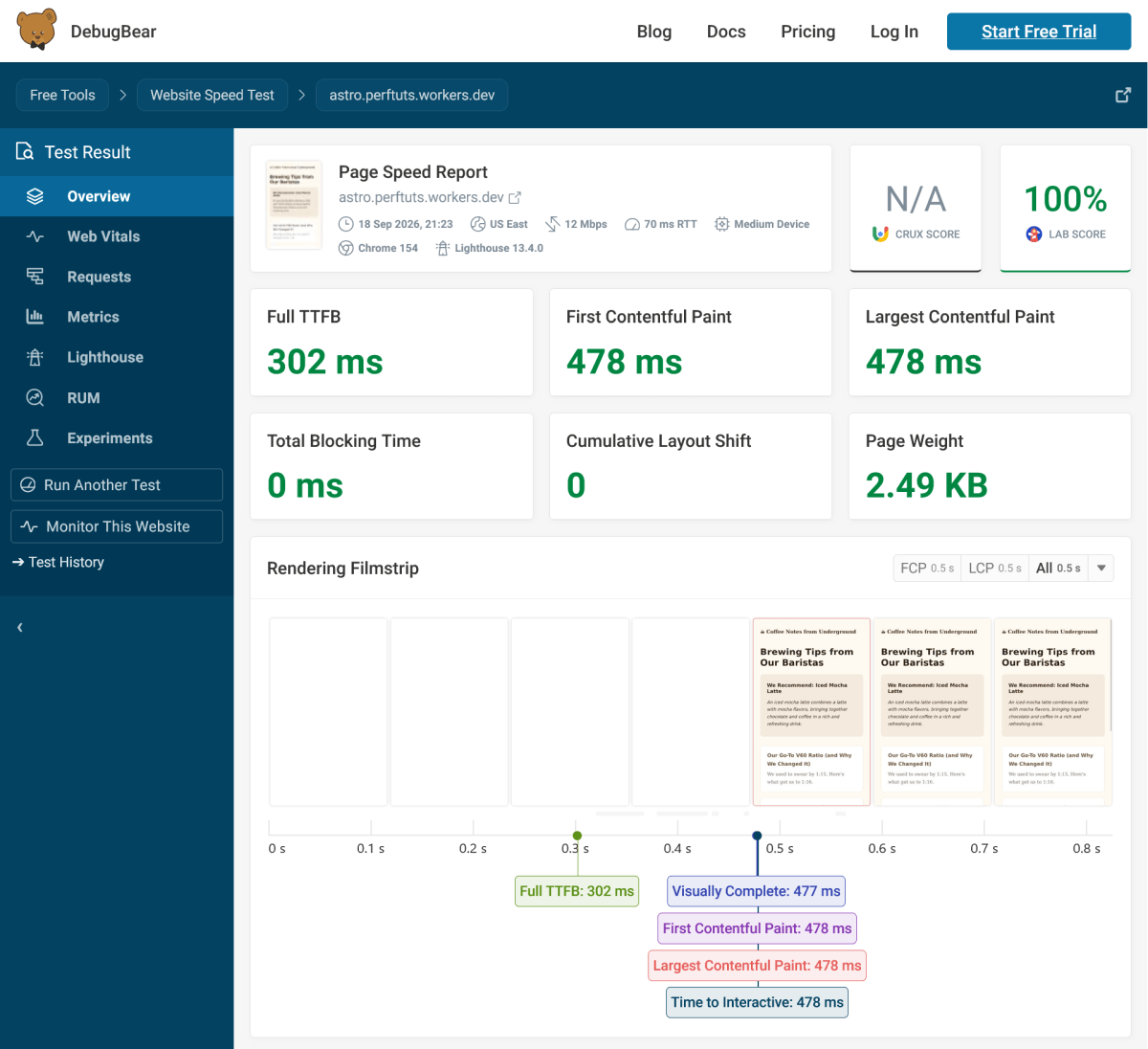
While these are strong results, keep in mind that the page doesn't contain any images or other media that could meaningfully affect its performance. For example, pulling in Sample APIs' coffee images for the live content collection could be a good next performance test.
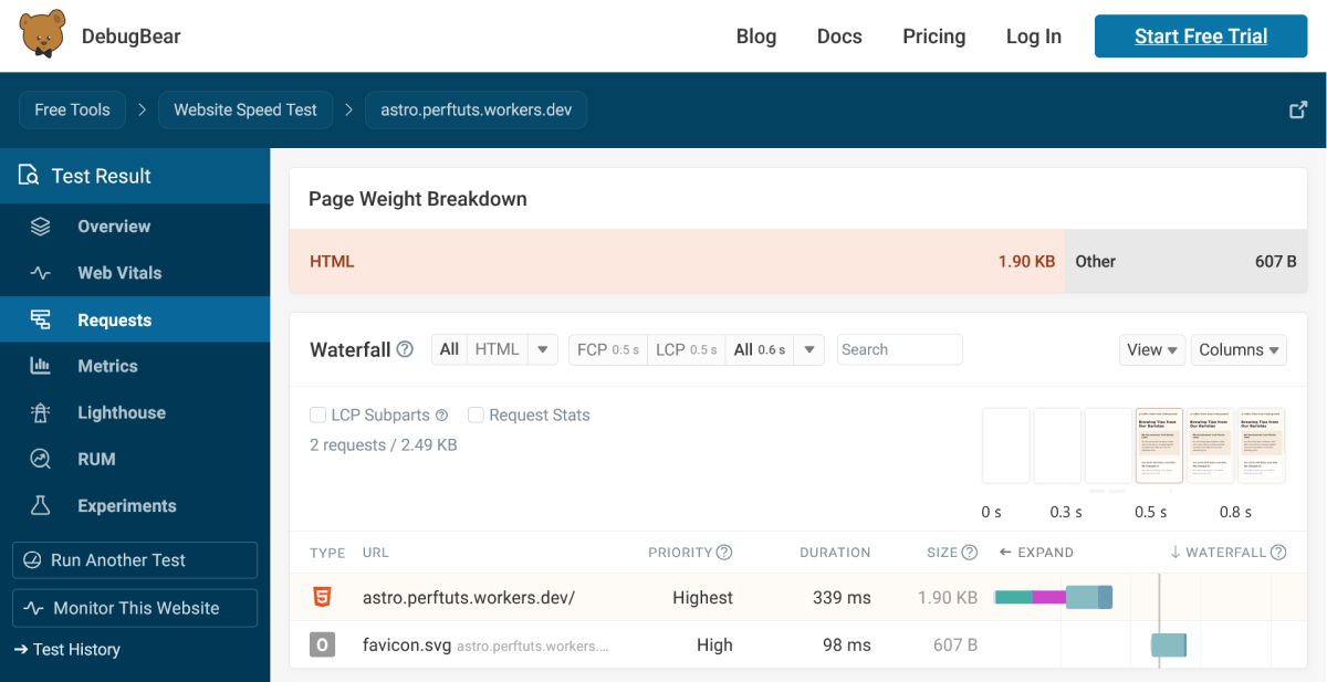
If you click the Requests menu, you'll also see the request waterfall chart. It shows that the homepage makes just two requests: one for the HTML document and one for the favicon. There is no JavaScript to download, and the CSS is inlined in the HTML:
Let's run another mobile test for one of the blog posts:
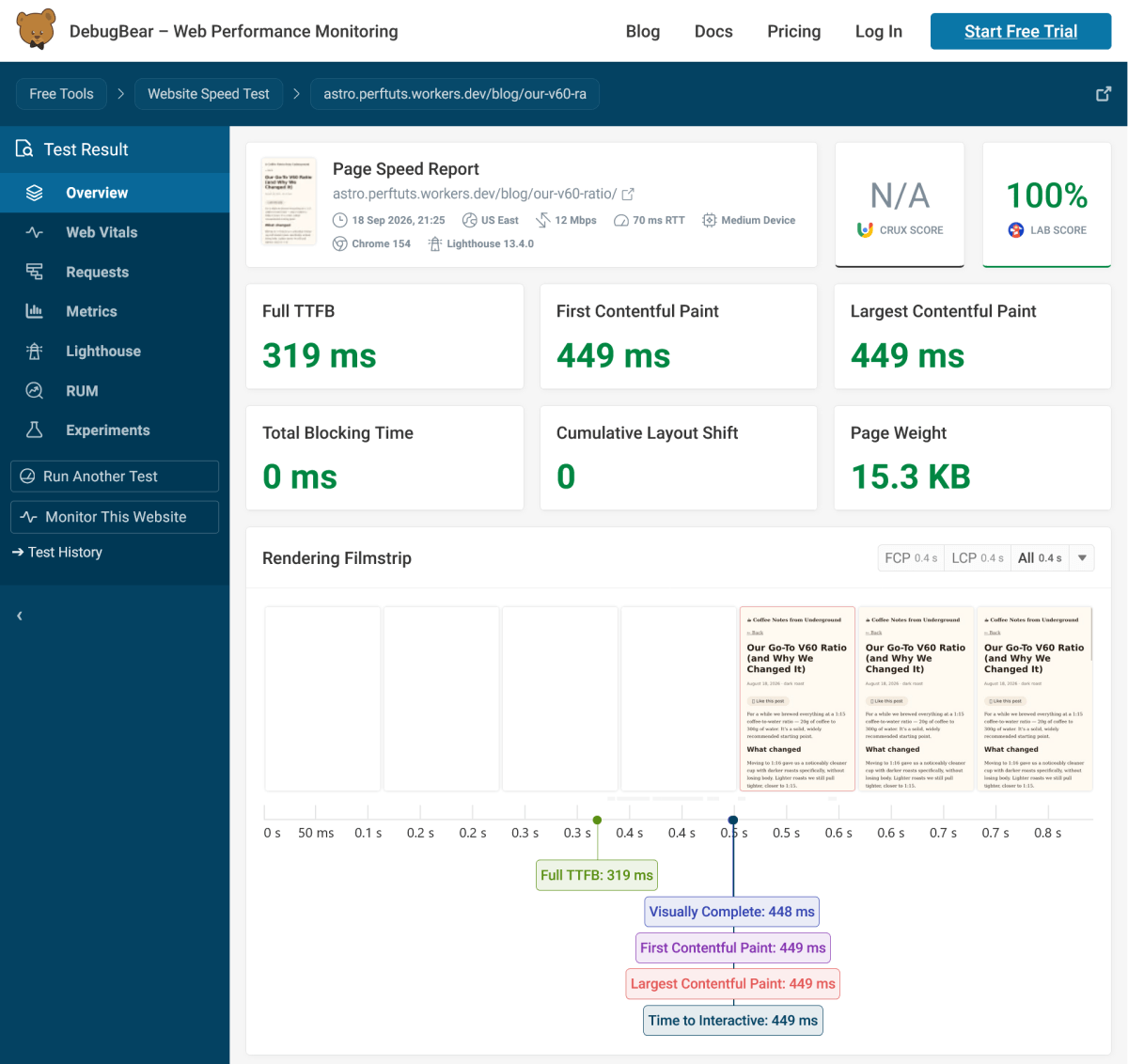
The scores are a little better compared to the homepage, even though the page also loads JavaScript here. Don't read too much into small differences in these lab measurements, however, as performance tests can slightly vary between runs.
A more useful comparison is the number and type of resources the browser has to load. If we navigate to the Requests menu, we can see that the blog post makes six requests in total, compared to just two for the homepage:
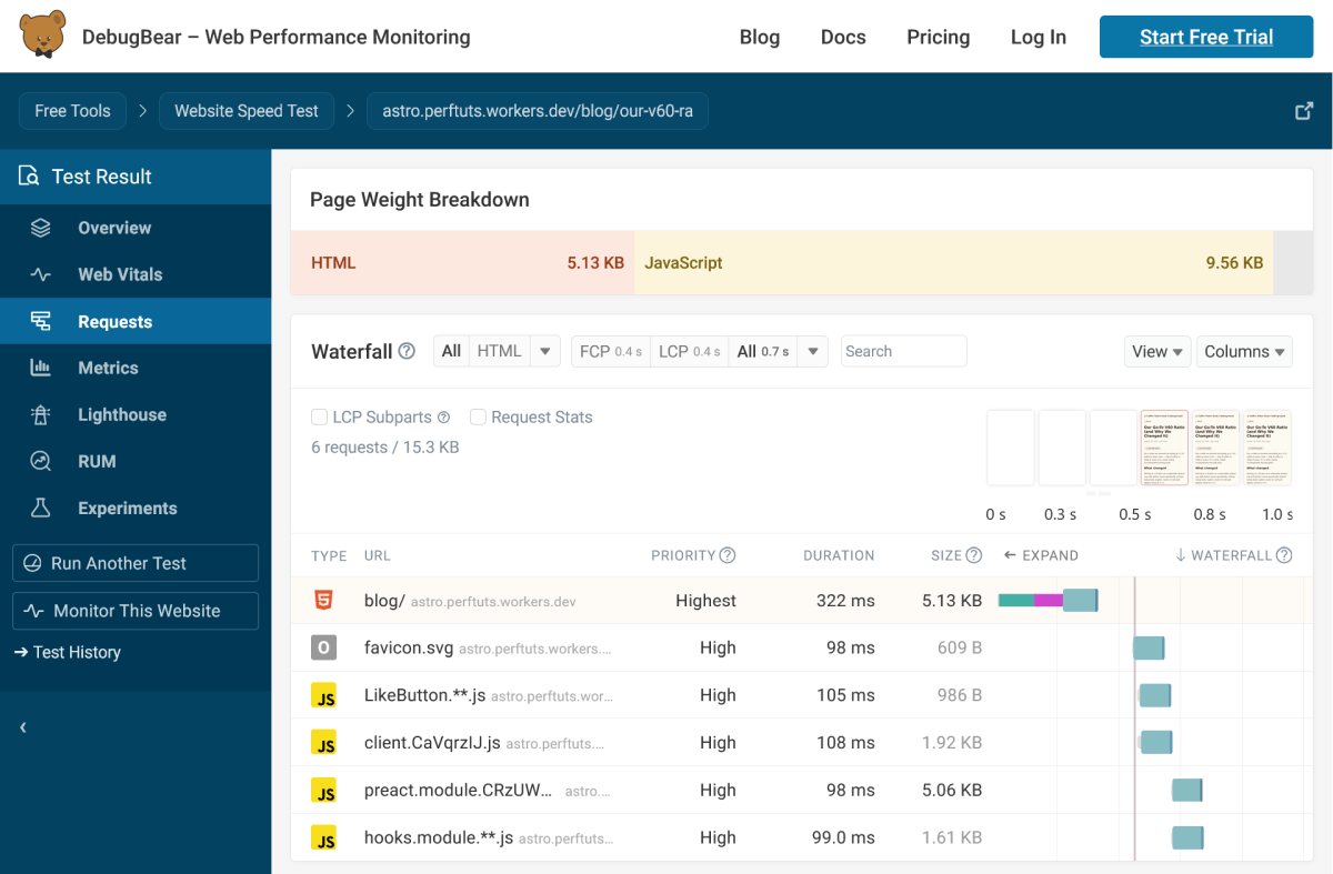
Three of the four JavaScript requests come from Preact. And while the files are not large, the question still arises: do we really need to ship the Preact runtime just to add a Like button?
Not necessarily. We could easily implement the Like button as a Web Component instead, using the browser's built-in APIs. That would let us remove Preact from this component and avoid the framework runtime and its associated JavaScript requests. This is the approach I'd use on a real-world Astro site.
Create Your Own Astro Site
Use this tutorial as a starting point for your own Astro site, or keep improving the coffee blog.
For example, you could make the Like button persistent or rebuild it as a Web Component. You could also use the tags already in the frontmatter of the blog posts to add tag archive pages, or take the blog in a completely different direction (e.g., Sample APIs provide many other APIs as well).
You could also refurbish your own old blog with some brand-new features, such as a live RSS feed, a dynamic portfolio, a /now page with live content, or anything else you think could move the web forward.
If you make something worth sharing, send us the link by email to matt [at] debugbear dot com with the subject line "PerfTuts example"; we'll add selected examples to this article and let the tutorial grow with the community.
See How Your Astro Site Performs for Real Users
You can also see how your Astro site performs from your visitors' perspective using DebugBear's real user monitoring (RUM) feature.
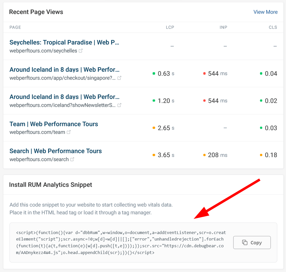
Sign up for our 14-day free trial (no credit card required) and add the RUM script you can find at the bottom of the RUM > Settings page to the <head> section of the /src/layouts/Layout.astro file:
In addition to real user monitoring, you can also run lab tests under different scenarios from various test locations around the world.
Get started with our 14-day free trial so you can test your Astro site both proactively and in real time.