My HTML boilerplate in 2026
Read the original on matuzo.at ↗Every element I use for the basic structure of a HTML document, with explanations why.
Five years ago, I shared the HTML boilerplate I use for most of my projects. Since then, a lot has happened in HTML. It's time to give it an update.
My boilerplate
This is the final document. Scroll down for details.
<!DOCTYPE html>
<html lang="en" class="no-js">
<head>
  <meta charset="UTF-8">
  <meta name="viewport" content="width=device-width">
  <meta name="text-scale" content="scale">

  <title>Unique page title - My Site</title>

  <script src="/js/render-blocking-scripts.js"></script>
  <script>
    document.documentElement.classList.replace('no-js', 'js');
  </script>

  <link rel="stylesheet" href="/css/styles.css">
  <link rel="stylesheet" href="/css/print.css" media="print">

  <script src="/js/non-render-blocking-script.js" type="module"></script>

  <link rel="icon" href="/favicon.ico">
  <link rel="icon" href="/favicon.svg" type="image/svg+xml">
  <link rel="apple-touch-icon" href="/apple-touch-icon.png">
  <link rel="manifest" href="/site.webmanifest">

  <link rel="canonical" href="https://web.site/page">
  <link rel="alternate" type="text/markdown" href="https://web.site/page.md">
  <link rel="me" href="https://mastodon.social/@username">
  <link rel="site.standard.publication" href="at://[DID]/site.standard.publication/[RKEY]">

  <meta name="description" content="Page description">
  <meta property="og:image" content="https://web.site/sm.jpg">
  <meta property="og:url" content="https://web.site/page">
  <meta name="theme-color" content="#FF5302">
  <meta property="fediverse:creator" content="@user@mastodon.social" >
</head>

<body>
  <!-- Content -->
  <script src="/js/non-render-blocking-script.js"></script>
</body>
</html>
Line by line explanation
Doctype required
<!DOCTYPE html>Since HTML is a living standard, we no longer need different doctypes, but we still have to define one for compatibility.
Natural language required
<html lang="en">The lang attribute is one of the most important attributes in HTML, because it’s powerful and responsible for many things. You can read more about it in On Use of the Lang Attribute and The lang attribute: browsers telling lies, telling sweet little lies. Applied to the html element, it defines page's natural language. It contains a single “language tag” in the format defined in Tags for Identifying Languages (BCP47), for example, en for English, de for German, or fr for French.
Selector for no JavaScript environments optional
<html class="no-js">I use the no-js class in case I want to apply styling to specific components in browsers that don’t support JavaScript or in browsers where the user has disabled JavaScript. This class will be removed in browsers that support and execute JavaScript. Even if you don't believe that websites should work without JavaScript in 2026, this class can still be useful for optimizing the rendering of web components before they're defined.
Character encoding required
<meta charset="UTF-8">This attribute declares the document’s character encoding. Leaving it off might cause specific characters to display incorrectly in some browsers.
It must come before the <title> element to avoid faulty characters in the page title.
Viewport essential
<meta name="viewport" content="width=device-width">The viewport meta tag allows us to adjust the viewport width, which is necessary for responsive web design. width=device-width sets the viewport width to the device's width. (That's a simplified explanation. For details, see the MDN page for this meta tag.)
Setting initial-scale=1, which controls the zoom level when the page is first loaded, shouldn't be necessary anymore. We only needed it for older versions of iOS and Android. The thing is, though, people keep telling me they think there are still edge cases where it's needed, but they don't remember which ones. Anyway, I don't think it's necessary, but if you want to play it safe, it doesn't hurt to add it.
<meta name="viewport" content="width=device-width, initial-scale=1">The viewport meta tag should come as early as possible in the document to ensure proper document rendering.
Text scaling optional
<meta name="text-scale" content="scale">By default, mobile browsers don't respect the text size set in the operating system. This new meta tag changes that.
Don't just copy and paste this line. It might break your layouts. You have to test whether the content still looks okay when you increase the text size on your mobile operating system.
- Try text scaling support in Chrome Canary - Josh Tumath
- A new meta tag for respecting text scaling on mobile
The page title required
<title>Unique page title - My Site</title>The unique title of the page. It’s displayed in many places, for example, on the browser tab, in search engine results, when you save a page as a bookmark, etc.
General render-blocking JS optional
<script src="/js/render-blocking-scripts.js"></script>Render-blocking JavaScript for the site. It comes before synchronous CSS because CSS blocks loading of the JavaScript. Put JavaScript without async, defer, or type="module" only in the head if you need the JavaScript parsed and ready before the rest of the page loads.
JavaScript support optional
<script>
  document.documentElement.classList.replace('no-js', 'js');
</script>
As mentioned earlier, I use this technique to create a dedicated class for the page state when JavaScript is disabled or unsupported. This solution is more reliable than the scripting media feature and can be used alongside <noscript>.
General CSS optional
<link rel="stylesheet" href="/css/styles.css">Render-blocking CSS for the site.
Print CSS optional
<link rel="stylesheet" href="/css/print.css" media="print">People still print web pages, and I consider serving a print style sheet good UX. A good print stylesheet also saves paper and ink.
General non-render-blocking JS optional
<script src="/js/non-render-blocking-script.js" type="module"></script>type=module implicitly defers the execution of the script after the document has been parsed, but before firing DOMContentLoaded event. For good performace try to default to this instead of adding render-blocking scripts.
Favicon essential
<link rel="icon" href="/favicon.ico">A 32×32px favicon for legacy browsers (Safari supports SVG favicons starting with 26.0). The favicon.ico should be located at the root of your website. Usually that's enough for browsers to pick it up automatically. You don't need the link element, but based on my tests with iOS 18, as soon as you define an SVG icon, the browser no longer falls back to the favicon.ico file in the root; it just doesn't display any icon. If you want to ensure that older browsers still show the ICO file while newer browsers get the SVG, you have to define both link elements. If you don't care about older versions of Safari, it's fine to just link the SVG.
<link rel="icon" href="/favicon.svg" type="image/svg+xml">Most modern browser support SVG favicons. The benefits of the favicon.svg are that it looks better when it’s scaled, because it’s a vector and not raster image, and we can add HTML and CSS to the SVG, which means that we can support dark mode.
<svg xmlns="http://www.w3.org/2000/svg" viewBox="0 0 80 80">
  <style>
    path {
      --fill: #153a51;
      fill: var(--fill);

      @media (prefers-color-scheme: dark) {
        --fill: #FFFFFF;
      }
    }
  </style>
  <path d="…"/>
</svg><link rel="apple-touch-icon" href="/apple-touch-icon.png">The 180×180px icon Apple devices will use if you add the page to your home screen. According to my tests, simply having a file named apple-touch-icon.png at the root of your project is enough. You don't need the link element, but I've only tested this with a simulated iOS 18 and a real device running iOS 26. I don't know about other operating systems and devices. So it's probably best to just keep it in your HTML.
Manifest essential
<link rel="manifest" href="/site.webmanifest">For Android devices we need a .webmanifest file, which provides browsers with the information where the icons needed for the home screen, dialogs, and the splash screen for PWAs or regular sites added to the home screen are located.
{
    "name": "My Website",
    "icons": [
        { "src": "/icon-192.png", "type": "image/png", "sizes": "192x192" },
        { "src": "/icon-512.png", "type": "image/png", "sizes": "512x512" },
        { "src": "/icon-512_maskable.png", "type": "image/png", "sizes": "512x512", "purpose": "maskable" }
    ]
}
The maskable variation of the icon is used when the icon is not displayed in a rectangular shape but, for example, in a circular one. The rule here is that your icon lives in a centered safe zone, which is approximately 80% of the size.
Canonical URL essential
<link rel="canonical" href="https://www.mywebsite.com/page">Use the canonical link element to prevent SEO issues caused by duplicate content by specifying the original source for pages that are available on multiple URLs.
Link to Markdown optional
<link rel="alternate" type="text/markdown" href="https://web.site/page.md">Link to a Markdown version of your page. LLMs work better with Markdown than with HTML, and serving content as Markdown significantly reduces token usage.
Verification on Mastodon optional
<link rel="me" href="https://mastodon.social/@username">This link tag can be used to verify that you actually own a page you've listed on your Mastodon profile.
That's not the only way to do it. You can also add rel="me" to a link to your profile anywhere on your website. Then you wouldn't need the link tag anymore.
<a rel="me" href="https://mastodon.social/@username">Mastodon</a>Standard site optional
<link rel="site.standard.publication" href="at://[DID]/site.standard.publication/[RKEY]">The link tag you need to publish on the atmosphere.
Page description essential
<meta name="description" content="Page description">The unique description of the page, for example, displayed on search result pages. It can be any length, but search engines truncate snippets to ~155–160 characters.
These days, search engines don't guarantee they'll use your description. They may use different content or create their own summary.
Preview image for social media, chats, etc. essential
<meta property="og:image" content="https://web.site/sm.jpg">The image displayed when you share the link to a page on social media, chat applications, or other sites that scrape URLs.
Canonical URL for social media essential
<meta property="og:url" content="https://web.site/page">The canonical URL of the page. A required property for valid Open Graph pages. This tag is necessary to ensure that platforms don't cache separate entities of your websites when links include GET parameters. If someone shares a link with, for example, ?utm_source= it must not be treated as a separate entity. It's hard to tell wether there is a fallback to the canonical meta tag if the og:url meta tag doesn't exist. That's why I would include it. It's the same value as for the canonical meta tag.
Theme optional
<meta name="theme-color" content="#FF5302">theme-color provides browsers with a CSS color to customize the display of the page or of the surrounding user interface.
This is currently only supported by Chromium based browsers on Android. From version 15 until 26, Safari also supported this meta tag, but starting with version 26, it either uses the body's background color or a color value from a position fixed element at the very top of the page.
Author attribution optional
<meta property="fediverse:creator" content="@user@mastodon.social" >This meta tag adds an additional line to links to your website posted on Mastodon, giving you credit.

For this to work, you have to add your domains to the allow list on Mastodon under Preferences -> Public profile -> Verification -> Author attribution.
General non-render-blocking JS optional
<script src="/js/non-render-blocking-scripts.js"></script>Non-render-blocking JavaScript for the site.
This isn’t the absolute minimum, but it’s what I need in most sites I build. To round things up, I’ve added a bunch of tags you might need from time to time.
Other noteworthy elements
Dedicated title for Social Media optional
<meta property="og:title" content="Unique title">The title used by URL scrapers on social media platforms like Bluesky or Mastodon. You only need this if you want the title in the preview to be different from the page title. If you don't define it, apps and websites default to the page title. If you define it, also define a dedicated Open Graph description, because some apps, such as Discord, won't pick up the standard meta description anymore.
Dedicated description for Social Media optional
<meta property="og:description" content="Unique description">The description used by URL scrapers on social media platforms like Bluesky or Mastodon. You only need this if you want the description in the preview to be different from thes standard meta description.
Alt for preview images optional
<meta property="og:image:alt" content="Image description">A description of the preview image. Whether the website or app uses it is really up to them. In my brief and incomplete tests, I found the situation very complicated.
- Bluesky ignores it.
- Mastodon respects it, but it's part of the card's accessible name. The link text of a preview card contains the description of the image, the title, and the description. Mastodon uses an empty alt if you omit the meta tag.
- Slack ignores it entirely.
- Discord respects it, but falls back to "Image" if you omit the meta tag.
I tried using an empty string, but it is also ignored by all the websites I tested. If you add alt text to the preview image, keep it short.
Type optional
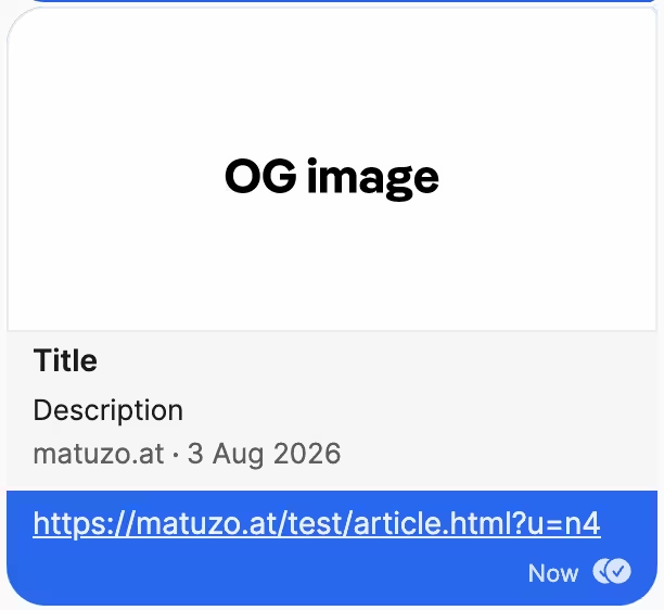
<meta property="og:type" content="article">The type of content you’re sharing, e.g. website, article, or video.movie. If you omit it, it defaults to website, which is what you want for most pages. Whether you see a difference when you change the type depends on the website or application rendering the preview. In my very limited testing, the only significant difference I saw was that if you set the type to article and added published and modified dates, Slack will display the published date and Signal the modified date.
<meta property="article:published_time" content="2026-08-01T09:00:00+02:00">
<meta property="article:modified_time" content="2026-08-03T14:30:00+02:00">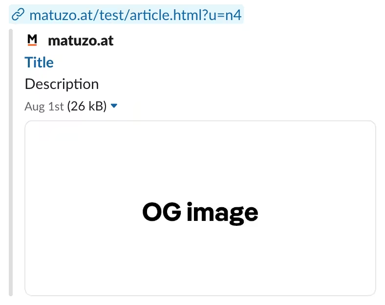
Language for social media previews optional
<meta property="og:locale" content="en_GB">An optional Open Graph property. It defines the page's natural language. Bluesky ignores this, but Mastodon does not. If you don't define the locale, Mastodon will just fall back to the page's lang attribute, which I assume most applications will do too. I guess it only makes sense to define the locale if the language of the title and preview description is different from the language of the post.
Preloading optional
<link rel="preload" href="font.woff2" as="font" type="font/woff2" crossorigin>Use preload if you want to ensure that specific resources are available earlier in the page lifecycle.
- Preloading content with rel="preload"
- Preload, Prefetch And Priorities in Chrome
- Prefetching, preloading, prebrowsing
RSS optional
<link type="application/atom+xml" rel="alternate" href="/feed.xml" title="My Blog - Manuel Matuzovic">RSS feed for your site.
The document's author optional
<meta name="author" content="Manuel Matuzović">Websites or apps may want to know who the author of the document is.
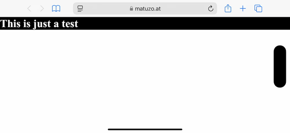
The notch optional
<meta name="viewport" content="width=device-width, viewport-fit=cover" />By default, the content on a device like the iPhone is within a safe area kept away from the notch and rounded corners.
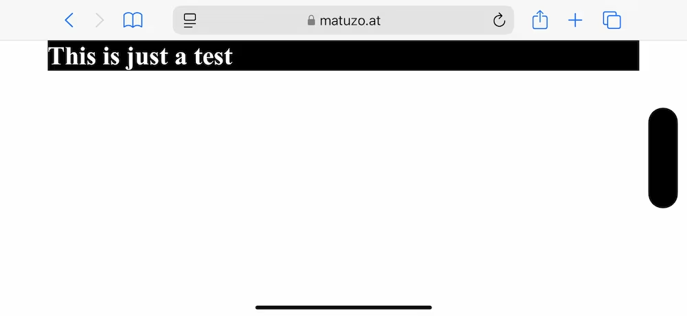
If this is an issue, you can opt out of that behavior and take up the entire screen edge-to-edge.
Viewport resize behavior optional
<meta name="viewport" content="width=device-width, interactive-widget=resizes-content">This option allows you to control how the viewport resizes on mobile when the keyboard is shown. With resizes-content, not just the visual viewport, but also the layout viewport, resizes. This fixes an issue where sticky or fixed elements at the bottom of the screen would disappear when the keyboard is shown. I haven't used it yet, so I don't know how it affects UX, performance, or accessibility. I guess the best advice is to use this option only where you need it and test it properly.
Color scheme
<meta name="color-scheme" content="dark light" />You can use this meta tag to indicate to the user agent which color schemes the website supports.
If you want to learn more about the <head> element and its children, check out Josh Buchea’s fantastic repository HEAD.
Did I get anything wrong or did I miss anything? Please find me on social media or via e-mail.
Thanks
Thank you, Vale, Nathan, Šime, Thain, and Matt, for your feedback!
My blog doesn't support comments yet, but you can reply via blog@matuzo.at.