Choosing the best color combinations for UX design
Read the original on blog.logrocket.com ↗Colors are a powerful tool to engage with users and ensure an interface is easy to use. Without thoughtful color combinations, you risk negative consequences like poor brand identity, low readability and accessibility, and no emotional connection with users — a disjointed UX.
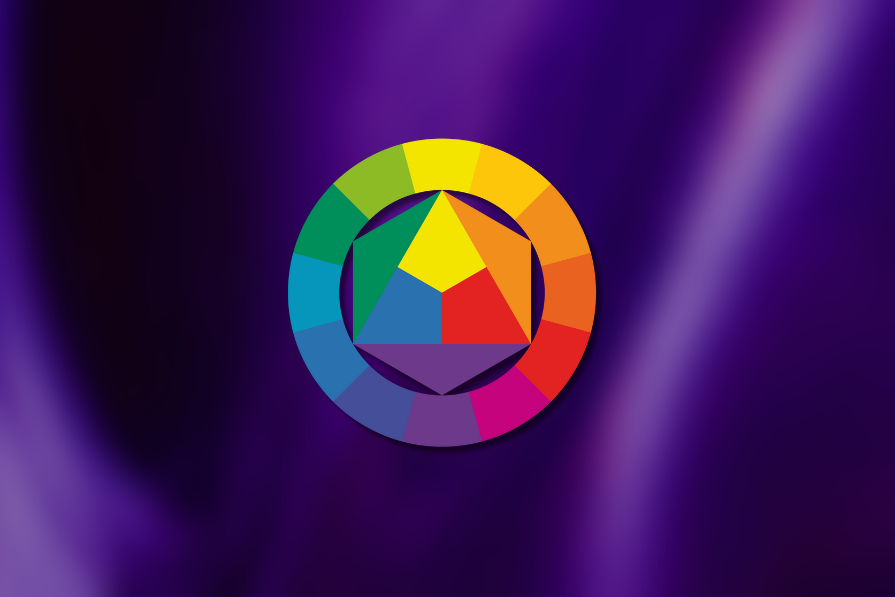
Color palettes are more than just aesthetics; they’re crucial to a user-friendly interface.
In this article, I’ll explore tips, tools, and resources to help you create an effective color combination for your next UX design project.
Editor’s note: This article was updated in October 2026 to expand its accessibility guidance, including WCAG 2.2 contrast requirements, dark mode, semantic color tokens, color-vision accessibility, and considerations for modern wide-gamut displays.
What is the best color combination for UX design?
Before you choose a color combination, you need to understand the psychology of colors. Specific colors are associated with certain emotions. Red is passionate, blue is calming, and so forth. These color-invoked emotions can have an impact on a user. Picking the right colors is vital to engaging users effectively.
Understanding the color wheel provides the foundation for choosing harmonious color palettes. The color wheel is a tool to understand how colors relate to each other. It’s generally broken up into three segments:
- Primary — These are colors that aren’t made by mixing colors. The primary colors are red, yellow, and blue
- Secondary — These colors are made by mixing two primary colors. The secondary colors are orange, purple, and green
- Tertiary — Mixing a primary and secondary color will give you tertiary colors. Examples include red-orange, yellow-green, and blue-purple
Designers often use the color wheel to find compatible color schemes, such as:
- Monochromatic — Based on one color and altering lightness and saturation to create a color palette; good for a clean and cohesive look
- Analogous — Three colors next to each other on the color wheel; good for creating a harmonious aesthetic
- Complementary — Two colors that are opposite each other on the color wheel; good for creating a striking contrast
- Split-complementary — Instead of choosing the color on the opposite side of the wheel, the split-complementary scheme opts for the two colors next to the opposing side. For example, if you pick yellow on the color wheel, the split-complementary scheme would include blue-purple and red-purple. These are good for creating a dynamic design without being overwhelming
- Triadic — Three colors that are equally distant from each other; good for high-contrast looks that are still balanced
When using the color wheel, you can also consider changing the colors’ saturation and lightness to extend the color palette. As a UX designer, you can experiment with shades and tones to achieve the desired aesthetic, emotional impact, and usability.
How to choose the best color combinations
There are four things I consider when picking the best color combinations for a project:
1. The 60-30-10 rule
Finding compatible colors is important, but a designer should also think about how to utilize them in the design. You don’t want a single color to overwhelm the design, and you need to ensure there is a visual hierarchy taking place.
The 60-30-10 rule is a good guideline for establishing balance. It suggests the overall design is:
- 60% of the dominant color — which is often neutral or muted, which sets the overall mood of the design
- 30% of the secondary color — to add visual interest and support the dominant color
- 10% of the accent color — used sparingly to ensure it grabs attention
Applying this rule ensures that the right elements stand out in your UX design. It can also reduce the feeling of being overwhelmed and help guide a user’s interactions. Remembering the 60-30-10 rule while you pick color combinations will help you choose the right supporting hues.
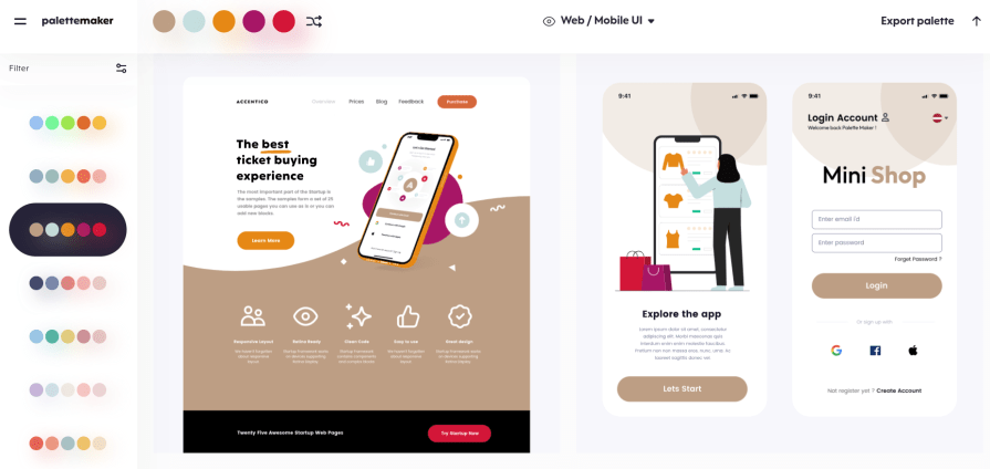
Use a tool like PaletteMaker to insert your color scheme and then view a web/mobile UI example. It applies the 60-30-10 rule automatically, so you can get a good idea of whether the color scheme has a good visual hierarchy. Here’s an example I tested:
2. Importance of contrast
Contrast is a non-negotiable part of color selection. Good contrast between text and its background improves readability, but accessibility goes beyond text alone. For a broader introduction, see color accessibility for designers.
WCAG 2.2 requires a contrast ratio of at least 4.5:1 for most text and 3:1 for large text. Designers should also consider non-text elements. UI components and meaningful graphical elements, such as input boundaries, icons, selected states, and controls, generally need at least 3:1 contrast against adjacent colors when that visual information is necessary to understand or use them.
A color contrast checker can help you test these relationships during design and development.
Contrast therefore needs to be considered throughout the interface. A button may have perfectly readable text but still be difficult to identify if its boundary disappears into the background. The same applies to charts, icons, form fields, focus states, and other visual cues. These considerations form part of broader accessibility in UX design.
Color also shouldn’t be the only way you communicate meaning. If an error state is indicated only by turning a field red, for example, some users may miss it. Pair color with another cue such as an icon, label, pattern, shape, or change in text.
Putting a design into grayscale can still be a useful check, but also test common forms of color-vision deficiency to make sure important states and categories remain distinguishable. For more guidance, see color blindness in UX design.
Gradients need similar attention. Text or controls placed over a gradient may meet contrast requirements in one area and fail in another, so make sure content remains readable across the entire background. The principles of accessible gradient design can help you evaluate these combinations more systematically.
3. Design across themes and displays
An accessible color palette also needs to hold up when the environment around it changes. The same colors can behave differently across light and dark themes, display technologies, and devices.
Don’t assume that colors that work against a light background will remain accessible in dark mode. Test contrast, visual hierarchy, interactive states, disabled states, charts, and illustrations separately in each theme. These checks are an important part of dark mode design.
If you’re working within a design system, semantic color tokens can make this easier to manage. Instead of treating a particular hex value as the “error color” or “primary text color,” define colors according to their role, such as text-primary, surface-secondary, border-subtle, or status-error.
Those roles can then map to different values in light mode, dark mode, or other themes while preserving their intended hierarchy and accessibility. This is one of the practical benefits of using design tokens.
Designers also need to account for the growing range of displays their interfaces appear on. Most web colors have traditionally been designed within the sRGB color gamut, but modern devices increasingly support wider gamuts such as Display P3, which can reproduce more saturated colors.
Wide-gamut colors can provide more expressive options, but avoid making important information depend on subtle color differences that may appear differently on another display. For more background, see wide-gamut color on the web.
When using wider-gamut colors, provide a suitable fallback for displays that don’t support them and test the palette across different screens, brightness levels, and display modes. The goal isn’t to make every device reproduce a color identically, but to make sure hierarchy, readability, and meaning survive those differences.
4. Testing and feedback
It’s not enough to just pick a harmonious color palette. You also need to confirm that users are responding to it well.
Conducting A/B testing can help show how different color choices affect user behavior. Heatmaps and other behavioral signals may also reveal whether particular elements are attracting attention or being overlooked.
However, A/B testing can tell you about preference or behavior, not whether a color palette is accessible. Accessibility should be evaluated independently against WCAG criteria and, where possible, tested with people who have different visual needs.
Continue monitoring how users interact with the interface after launch. Combining accessibility checks with behavioral feedback can help you refine the palette while preserving readability, hierarchy, and usability.
Resources to select the best color combinations for UX
There are several online tools and resources available to help you select a color combination that elevates the user experience.
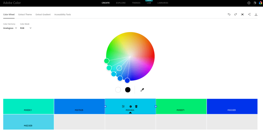
My personal favorite is Adobe Color. You can select the color scheme and move the base color around the color wheel. Then, it will show the corresponding colors for that scheme.
For example, I picked an analogous color scheme and selected a bright sky blue as the base color. Adobe Color gave me the other colors that match an analogous color scheme:
There are several other tools you can use to select effective color combinations, such as:
- Coolers — A fast and effective way to create a color palette. You can start by entering the hex code of a color to find matching colors. Alternatively, you can play around with several colors until you find a color palette that meets your needs
- Canva Color Palette Generator — Canva provides several tools to create a color palette. You can upload an image to source colors, use keywords to find a related color palette or use a color wheel to find a custom color scheme
- Color Hunt — One of the most prominent sources of color inspiration, Color Hunt provides a large selection of color palettes. You can find color schemes based on keywords or popular trends
You can also use a color picker tool to identify colors in images.
Many graphic design software have this feature, but I frequently use a Chrome extension like ColorZilla to determine colors in images. It’s especially useful if you have a mood board and want to source the color for inspiration.
Examples of best color combinations in UX design
Let’s take a look at some real-world examples of color combinations in UX design and their impact on the user experience:
Headspace
When you think of meditation apps, calming colors like blue and pastels come to mind. But Headspace chose an orange color for a logo. Orange is an energetic and creative color. Choosing an orange color helps its branding stand out from other meditation apps. It may also help appeal to younger audiences.
Headspace uses orange wisely, though.
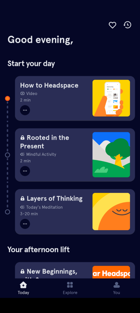
Since orange is a bold color, it can easily clash with the peaceful vibes of the meditation app. Instead, Headspace uses a dark blue, the complementary color of orange, more frequently in its design. It helps keep the UX design calm while using orange to help make key elements stand out.
Mondly
Mondly is a language-learning app. Educational software tends to lean toward blue or green color palettes. Mondly has chosen a split-complementary color scheme. It has blue as the primary color, orange and yellow as secondary colors, and purple as an accent.
The colors seem varied, but they are actually complementary to each other.

A split-complementary color scheme allows Mondly to have a dynamic color palette without any color overwhelming the others. It’s an effective way to establish a visual hierarchy and ensure users can follow the learning journey.
An example of poor contrast
I use an app to track the distance and time while I’m on a run. Yes, the app is useful, but the home page has 11 colors, including the text:
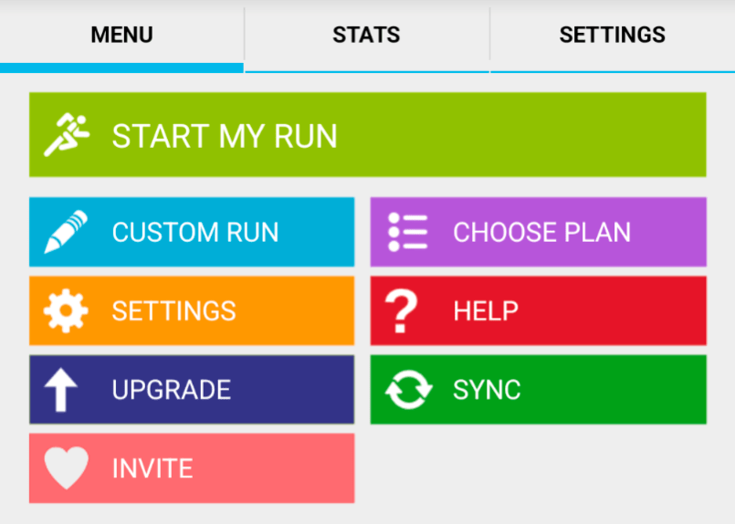
This is a good example of a bad contrast in UX. Too many colors are extremely vibrant, making it difficult to establish a visual hierarchy. The color choices create a lot of visual noise. It often leads me to ignore several important elements since there is no clear focus.
Overall, the multi-color design compromises usability and makes the app overwhelming to use — everything you need to avoid in your designs. Some color restraints could establish a visual hierarchy and make it more appealing to use.
Key takeaways
Choosing the right colors impacts usability and brand identity. People have a strong connection to colors, and designers can use that connection to create positive interactions. Balancing colors can help establish hierarchy, guide users, and make an interface more engaging.
Don’t be afraid to experiment with different combinations, but evaluate them from more than one angle. Accessibility checks, testing across themes and devices, and feedback from real users can all help you refine a color palette without sacrificing readability or usability.
The post Choosing the best color combinations for UX design appeared first on LogRocket Blog.